


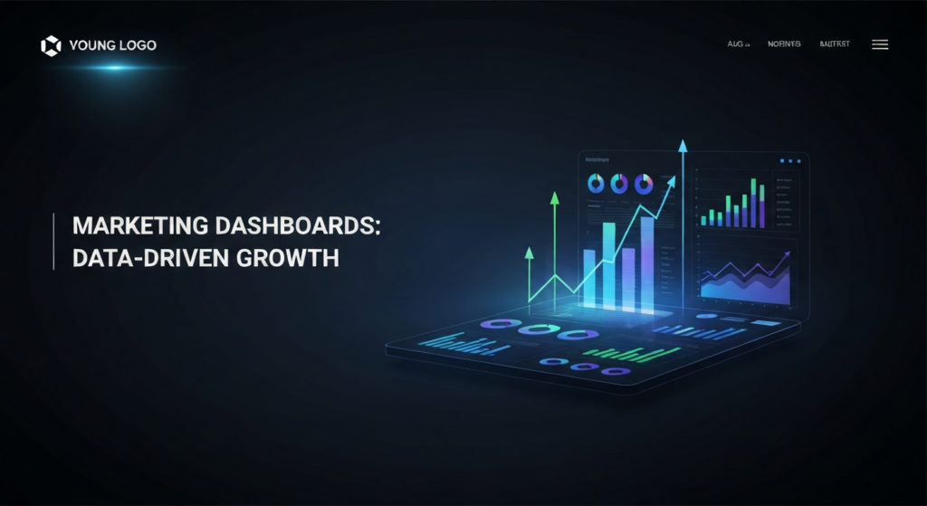


In digital marketing, data is the currency of success. Every click, conversion, and customer interaction generates valuable information. However, this data is often scattered across numerous platforms, including Google Analytics, social media channels, CRM systems, and ad networks. A marketing dashboard is a data visualization tool that consolidates these disparate data streams into a single, intuitive interface. It provides an at-a-glance view of your most important marketing metrics, or Key Performance Indicators (KPIs), in real time.
Think of it as the command center for your marketing operations. Instead of logging into multiple accounts and manually compiling spreadsheets—a tedious and error-prone process—a dashboard automatically pulls, organizes, and displays your data. This allows you to monitor performance, track campaign progress, and analyze results efficiently. By using charts, graphs, and scorecards, dashboards make complex data accessible to everyone, from channel specialists to the C-suite.
A marketing dashboard’s critical importance lies in its ability to facilitate data-driven decision-making, a cornerstone of sustainable business growth. By providing a clear and current picture of what’s working and what isn’t, dashboards empower marketing teams to be more agile and effective. They can quickly identify trends, spot opportunities, and diagnose problems before they escalate. For example, a sudden drop in a website’s conversion rate, made immediately visible on a dashboard, can trigger an investigation and a swift fix. Without this consolidated view, such an issue might go unnoticed for weeks. Furthermore, dashboards are essential for demonstrating marketing’s value. By clearly linking marketing activities to key business outcomes like leads, sales, and Return on Investment (ROI), they help secure budgets and build credibility within the organization.

Building a dashboard that truly drives decisions requires more than connecting data sources and placing charts on a screen. The most effective dashboards are built on clear principles that prioritize understanding and action over raw data. By adhering to these core tenets, you can transform your dashboard from a simple data repository into a powerful strategic tool.
The primary goal of a dashboard is to communicate information quickly and efficiently. A cluttered, disorganized dashboard defeats this purpose. It creates cognitive overload, forcing users to spend more time deciphering the visuals than interpreting the insights. The principle of clarity dictates that every element on your dashboard must serve a distinct purpose. Avoid the temptation to include every available metric. Instead, be ruthless in your curation. Ask yourself: “Is this information essential for decision-making?” If the answer is no, leave it out. A clean, focused dashboard with ample white space is far more impactful than one crowded with non-essential charts and numbers.
Data without context is meaningless. A number like “500 conversions” tells you very little on its own. Is that good or bad? Is it an improvement over last month? Are we on track to meet our quarterly goal? Context provides the narrative that turns data into insight. An effective dashboard must contextualize its metrics. This can be achieved in several ways:
Not all metrics are created equal. Some, often called “vanity metrics,” look impressive on the surface but don’t correlate with business success (e.g., social media likes, page views). Actionable metrics, on the other hand, directly tie to your business objectives and can inform strategic decisions. These include metrics like Customer Acquisition Cost (CAC), conversion rate, and Customer Lifetime Value (CLV). An effective dashboard prioritizes these actionable metrics. For every chart or KPI you include, you should be able to answer the question, “What action would I take if this number went up or down?” If you cannot answer that question, the metric is likely not actionable and should be reconsidered.

Before you build a single chart, the most crucial step is to define what you want to measure and why. A dashboard without clear goals is like a ship without a rudder—it might look impressive, but it’s not going anywhere meaningful. This foundational step ensures that your dashboard is not just a collection of interesting data points, but a focused tool designed to measure progress against what matters most to the business.
Marketing goals should not exist in a vacuum; they must directly support overarching business objectives. If a company’s primary goal is to increase annual revenue by 20%, the marketing team’s goals should align directly with that target. This could translate into specific marketing objectives like generating a certain number of marketing-qualified leads (MQLs), increasing the sales conversion rate from marketing-sourced leads, or improving customer retention. Start by asking stakeholders: “What are the top 1-3 business goals for this quarter/year?” From there, work backward to define the marketing activities and corresponding metrics that will contribute to achieving those goals. This alignment ensures your dashboard tells a story that resonates with leadership and clearly demonstrates marketing’s contribution to the bottom line.
A balanced dashboard includes a mix of leading and lagging indicators to provide a comprehensive view of performance. Lagging indicators measure past outcomes, telling you what has already happened. Leading indicators are predictive and offer insight into future performance.
While lagging indicators show if you’ve achieved your goals, leading indicators show if you’re on the right track. A good dashboard tracks both. For example, if your lagging indicator is sales revenue, your leading indicators might be the number of sales demos booked or the volume of high-intent keyword traffic, both of which can predict future sales.
| Indicator Type | Definition | Examples | Role on Dashboard |
|---|---|---|---|
| Lagging Indicator | Measures past performance and outcomes. | Revenue, ROI, Customer Lifetime Value (CLV), Churn Rate | Shows if you have achieved your ultimate business goals. |
| Leading Indicator | Measures activities that predict future success. | Website Visitors, New Leads, Demo Requests, Email Open Rate | Acts as an early warning system and shows if your current strategy is likely to succeed. |
To make your KPIs truly effective, they should be framed as SMART goals. This framework ensures each goal is clear, measurable, and tied to a specific outcome and timeline. SMART stands for:
For example, instead of a vague goal like “increase website traffic,” a SMART goal would be: “Increase organic website traffic from 10,000 to 15,000 unique visitors per month by the end of Q4.” This goal is specific (organic traffic), measurable (10k to 15k visitors), achievable (a 50% increase), relevant (more traffic can lead to more leads), and time-bound (by the end of Q4). Defining your KPIs this way makes it easy to visualize progress on your dashboard using gauges or scorecards with targets.

A common mistake in dashboard design is creating a one-size-fits-all solution. Different stakeholders have vastly different needs, and an effective dashboard must be tailored to its specific audience. The data a PPC specialist requires is fundamentally different from what a CEO needs to see. Understanding your audience is key to building a dashboard that is not just seen, but used.
The executive audience (CEO, CMO, CFO) has limited time and needs a high-level, strategic overview of marketing performance. They are primarily concerned with the big picture and the financial impact of marketing efforts. Their dashboards should focus on key business outcomes and lagging indicators.
Marketing managers operate between strategy and execution. They need a more detailed view to manage their teams, oversee campaigns, and allocate resources effectively. Their dashboards require a blend of strategic (lagging) and operational (leading) metrics to understand both overall performance and the drivers behind it.
Channel specialists (e.g., SEO analysts, PPC managers, social media marketers) are on the front lines of execution. They need highly granular, real-time data to optimize their specific channels on a daily or even hourly basis. Their dashboards are tactical and focused on the details of their domain.
| Audience | Primary Focus | Key Metrics | Time Horizon |
|---|---|---|---|
| C-Suite | Strategic Impact | ROI, CAC, CLV, Revenue Contribution | Monthly, Quarterly, Annually |
| Marketing Manager | Performance Management | Leads by Channel, CPL, Funnel Conversion Rates | Weekly, Monthly, Quarterly |
| Channel Specialist | Tactical Optimization | CTR, CPC, Conversion Rate, ROAS | Daily, Weekly |
With your goals defined and audience identified, it’s time to move into the practical phase of building your dashboard. This involves selecting the right technology, connecting your data sources, and thoughtfully designing the layout to ensure the final product is both functional and insightful.
The market is filled with Business Intelligence (BI) and data visualization tools, each with its own strengths and weaknesses. The right choice depends on your budget, technical expertise, and specific needs.
A dashboard’s power comes from consolidating data from multiple platforms. This is typically achieved through an Application Programming Interface (API), which allows different software applications to communicate. Modern dashboard tools have built-in “connectors” that simplify this process. When building your dashboard, you will authorize the tool to access your accounts on platforms like Google Analytics, Facebook Ads, and Salesforce. For a seamless experience, prioritize a tool with native connectors for your most-used marketing platforms. This ensures your data updates automatically and reliably, eliminating manual data entry.
A well-structured dashboard guides the user’s eye through the data in a logical sequence. Follow the “inverted pyramid” principle: start with the most important information, then drill down into the details.
Consider how people naturally read a screen (often in an “F-pattern” in Western cultures), placing your most important elements in the top-left corner. Group related metrics to create logical sections, such as one for website traffic, another for lead generation, and a third for conversions.

Effective data visualization is both an art and a science. Choosing the right chart type is essential for representing your data accurately and making it easy to understand. The wrong chart can obscure insights or even mislead the viewer. Here is a guide to selecting the appropriate visualization for your marketing metrics.
The choice between these common charts depends on your data. A line chart is best for visualizing continuous data over time. It excels at showing trends, patterns, and fluctuations. Use it to track metrics like monthly website traffic, weekly leads, or keyword rankings. A bar chart (or column chart) is used to compare discrete categories. It is ideal for comparing quantities across different groups, such as leads by marketing channel, conversion rates of different landing pages, or blog post performance by topic.
Pie charts and their cousins, donut charts, are designed for one purpose: to show the proportions of a whole. They are effective when displaying how segments contribute to a total, such as the percentage of website traffic from different sources (Organic, Direct, Social). However, they should be used with caution. They become difficult to read when there are more than four or five categories. If you have many segments, a bar chart is often a clearer alternative.
When you have a single, critical number to highlight, a scorecard is the perfect tool. It displays a key metric in large, bold text, making it impossible to miss. Scorecards are ideal for your main KPIs at the top of a dashboard, such as Total Revenue or Current Conversion Rate. A gauge is similar but adds context by visualizing the metric against a predefined goal. It quickly shows whether you are on track, behind, or ahead of target, often using color codes (red, yellow, green) for instant comprehension.
If location is a key factor in your marketing, a map chart is the most intuitive way to visualize geographic data. It can display performance metrics like website sessions, conversions, or sales by country, state, or city. This is invaluable for identifying strong or weak regions, planning location-based ad campaigns, or understanding your global customer base. For example, an e-commerce company could use a map to see which countries generate the most sales and decide where to focus international shipping efforts.
| Chart Type | Best Used For | Example Marketing Use Case |
|---|---|---|
| Line Chart | Showing trends in continuous data over time. | Tracking monthly organic website traffic over the past year. |
| Bar/Column Chart | Comparing values across discrete categories. | Comparing the number of leads generated by each marketing channel (e.g., SEO, PPC, Social). |
| Pie/Donut Chart | Showing parts of a whole (composition). Use for few categories. | Displaying the percentage breakdown of traffic sources. |
| Scorecard | Displaying a single, important KPI. | Showing total revenue for the current quarter. |
| Gauge | Showing progress towards a specific goal. | Visualizing current MQLs generated against a quarterly target. |
| Map Chart | Visualizing data by geographic location. | Showing sales conversions by state or country. |

A dashboard can have the best data, but if it is poorly designed, its insights will be lost. Good design is not about making a dashboard look pretty; it is about making it easy to understand and use. By applying fundamental design principles, you can enhance the readability and impact of your marketing dashboards, ensuring your audience can absorb information quickly and accurately.
Color is a powerful tool in data visualization, but it should be used with purpose, not for decoration. A limited, consistent color palette is more effective than a rainbow of colors that can distract the viewer. Use your brand colors for consistency, but also leverage color to convey meaning. For example, use shades of a single color to represent different values in a heat map. More importantly, use color to signal performance: green for positive results, red for negative results, and neutral colors like grey or blue for informational data. Always ensure high contrast between your text and background to maintain readability.
Visual hierarchy is the principle of arranging elements to show their order of importance. When someone looks at your dashboard, their eyes should be drawn to the most critical information first. You can establish a clear hierarchy using several techniques:
By consciously creating a visual hierarchy, you guide your audience through the dashboard’s story, ensuring they do not miss the key takeaways.
White space, or negative space, is the empty area around the elements on your dashboard. It is one of the most overlooked but crucial aspects of good design. Resisting the urge to fill every pixel of the screen is vital. White space serves several important functions:
A well-balanced use of white space makes your dashboard look more professional, clean, and, most importantly, easier to digest.

A marketing dashboard is not a passive reporting tool; it is an active decision-making engine. Its ultimate value is realized when it is used consistently to derive actionable insights that guide strategy and improve performance. The process of moving from data visualization to informed action is where the real ROI of your dashboard is found.
One of a dashboard’s primary functions is to reveal trends over time. By regularly reviewing line charts that track key metrics, you can move beyond day-to-day fluctuations and see the bigger picture. Are your SEO efforts leading to a steady increase in organic traffic? Is there a seasonal pattern to your sales that you can capitalize on? Identifying these long-term trends is crucial for strategic planning. For example, noticing a consistent dip in engagement every summer might prompt you to shift your content calendar or launch a specific summer campaign to counteract the slump.
Dashboards are excellent early warning systems. A sudden, unexpected spike or drop in a metric—an anomaly—demands investigation. A sharp decline in conversion rate could signal a technical issue on your website, like a broken checkout button. A sudden surge in traffic from a specific referral source could be an unexpected PR win. Each anomaly is a learning opportunity. Investigating the “why” behind the data can uncover critical problems to fix or hidden opportunities to pursue. For instance, discovering that a particular blog post is suddenly driving a huge amount of traffic could be an opportunity to promote it further or create more content on that topic.
Dashboards can transform team meetings from subjective discussions into objective, data-driven strategy sessions. Instead of relying on anecdotes or gut feelings, use the dashboard as the central point of discussion. Start your weekly marketing meetings by reviewing the key dashboard metrics. This creates a single source of truth and ensures everyone is aligned on current performance.
Using a dashboard this way fosters a culture of accountability and continuous improvement, where decisions are based on evidence, not opinions.

To make the concept more concrete, let’s explore examples of dashboards tailored for specific marketing functions. Each dashboard is designed to answer a unique set of questions by focusing on the metrics that matter most for that discipline.
This dashboard provides a comprehensive overview of a company’s organic search health and content marketing effectiveness.
Designed for managing paid search and social campaigns, this dashboard focuses on efficiency and return on ad spend.
This dashboard moves beyond vanity metrics to measure the true impact of social media marketing on audience growth and engagement.
This dashboard tracks the performance of email campaigns and the health of the subscriber list.

While marketing dashboards are incredibly powerful, they are not immune to misuse or poor design. To ensure your dashboard remains a valuable asset, it’s important to be aware of and avoid several common pitfalls that can undermine its effectiveness.
One of the most frequent mistakes is focusing on vanity metrics. These are metrics that are easy to measure and often look good on the surface, but they fail to correlate with real business outcomes. Examples include social media likes, page views, and number of followers. While not entirely useless, they don’t tell you if your marketing is driving revenue. A dashboard filled with vanity metrics might make the team feel good, but it won’t guide strategic decisions. Always prioritize actionable metrics like conversion rate, cost per acquisition, and customer lifetime value that directly connect to your bottom line.
In an effort to be comprehensive, it’s easy to fall into the trap of information overload. This is the “kitchen sink” approach, where every available metric is crammed onto a single dashboard. The result is a cluttered, overwhelming interface that is difficult to navigate and interpret. A dashboard’s purpose is to simplify, not to complicate. If everything is presented as important, then nothing is. Be selective and focus only on the most critical KPIs for the dashboard’s specific audience and purpose. It’s often better to have multiple, focused dashboards for different teams than one monolithic dashboard that tries to do everything.
A dashboard is not a “set it and forget it” project. It is a living tool that needs to evolve with your business. A common pitfall is to build a dashboard and then fail to maintain it. Over time, data sources can break, business goals can change, and KPIs can become irrelevant. Schedule regular reviews (e.g., quarterly) of your dashboards to ensure they are still accurate and aligned with your current strategic priorities. Check that all data connections are working correctly, assess whether the KPIs are still the right ones to be tracking, and solicit feedback from users to see if the dashboard is still meeting their needs.

Choosing the right platform is a key step in building an effective marketing dashboard. The best tool for you will depend on your budget, technical skills, and the complexity of your data. Here are some of the leading options in the market:

The world of data analytics is constantly evolving, and marketing dashboards are no exception. The future promises to make these tools even more intelligent, automated, and insightful. Several key trends are shaping the next generation of dashboards, moving them from backward-looking reports to forward-looking strategic guides.
Artificial Intelligence (AI) and Machine Learning (ML) are being integrated directly into dashboard platforms. Instead of requiring a human analyst to manually sift through data for insights, AI-powered tools can automatically surface significant trends, identify anomalies, and even provide written explanations in natural language. This “augmented analytics” makes deep insights accessible to all users, not just data scientists. For example, a tool might automatically flag that a specific ad campaign is underperforming with a certain demographic and suggest reallocating the budget.
Furthermore, the focus is shifting from descriptive analytics (what happened) to predictive and prescriptive analytics. Predictive analytics uses historical data and ML algorithms to forecast future outcomes. A future dashboard might not just show last month’s lead numbers; it could predict next month’s lead volume with a certain degree of confidence. Prescriptive analytics takes this a step further by recommending specific actions to achieve desired goals. Your dashboard might suggest, for instance, that increasing your content marketing budget by 15% is the most effective way to hit a quarterly sales target. This evolution is transforming marketing dashboards from passive reporting tools into active, intelligent partners in strategic decision-making.