


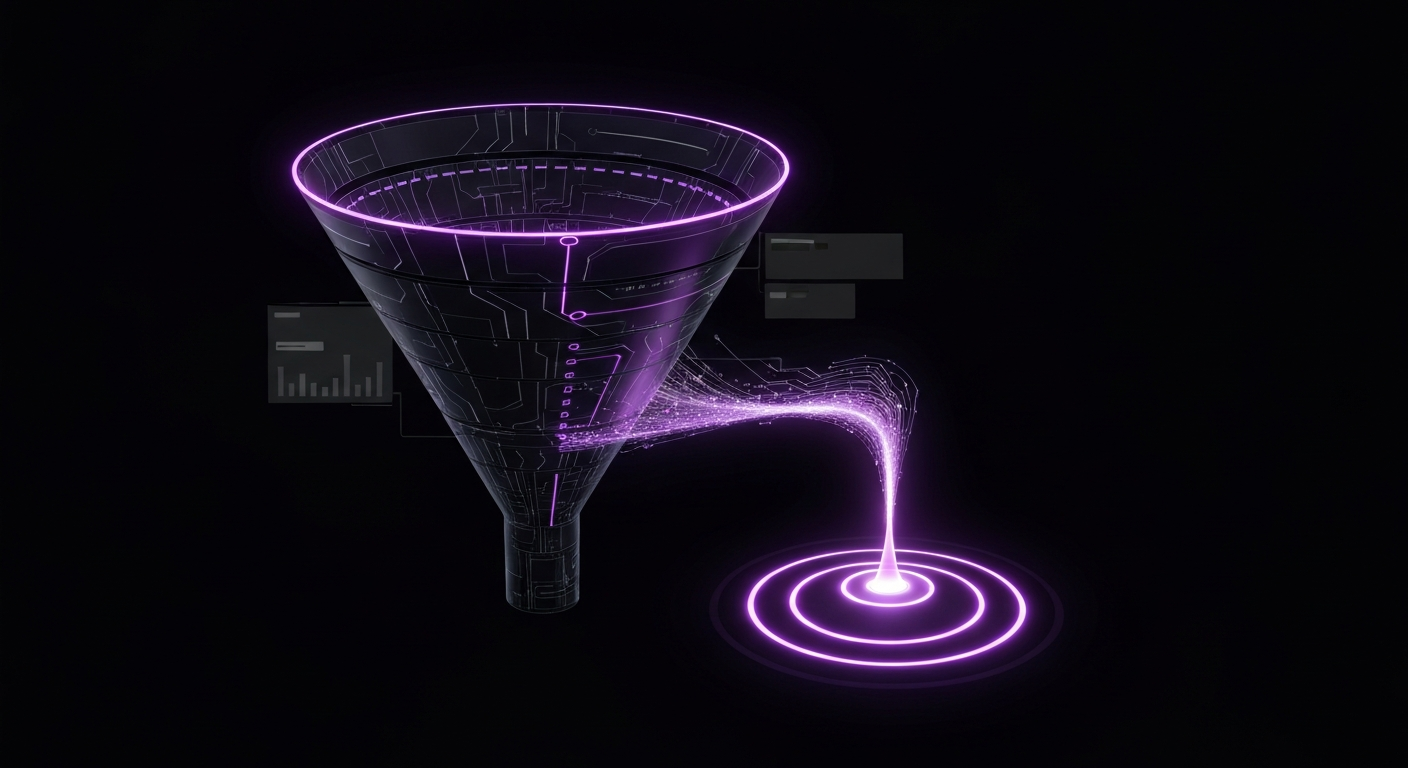
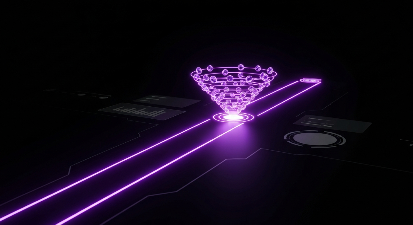
In digital marketing, the conversion funnel represents the structured journey for potential customers, guiding them from initial awareness to a final purchasing decision. However, many funnels are filled with obstacles and complexities that cause prospects to drop off at every stage. A frictionless conversion funnel addresses this by optimizing the customer journey to be as smooth, intuitive, and effortless as possible, systematically removing barriers that prevent users from converting.
By identifying and eliminating these points of friction, businesses create a path of least resistance. This approach is not just about convenience; it is a strategic imperative for maximizing Conversion Rate Optimization (CRO) efforts. It transforms the user’s journey from an obstacle course into a guided path, ensuring their motivation is not undermined by frustration. The goal is to make the desired action—a purchase, sign-up, or download—feel like the most natural next step.
In this context, ‘friction’ is any element that causes user frustration, confusion, or hesitation, slowing or stopping their progress through the funnel. It is the psychological or practical resistance a user experiences when interacting with your website, app, or marketing materials. Friction can manifest in many forms, both obvious and subtle.
Common examples of friction include:
Essentially, any element that increases a user’s cognitive load—the mental effort required to complete a task—is a form of friction.
A high-friction experience does more than lose a few sales; it can have a profound, negative impact on your business. The costs are multifaceted, affecting revenue, brand perception, and long-term customer relationships. When users encounter friction, they often leave for good, taking their business to a competitor with a smoother experience. The cumulative effect of these lost opportunities can be staggering.
Consider the financial implications. A high cart abandonment rate, often a direct result of checkout friction, means losing customers after you have already invested in attracting and guiding them. Furthermore, a poor User Experience (UX) damages your brand’s reputation, as frustrated users are more likely to share negative feedback. Since acquiring a new customer costs significantly more than retaining an existing one, a high-friction funnel actively works against customer loyalty and retention.
Conversely, the rewards for investing in a frictionless funnel are substantial and extend far beyond a simple uptick in sales. By prioritizing the user experience, you create a positive feedback loop that fuels sustainable growth. The primary benefit is a significantly higher conversion rate; making it easier for users to complete their goals naturally increases the percentage of visitors who become customers.
Beyond conversions, a frictionless experience leads to better UX. Customers who find your website easy and enjoyable to use are more likely to return, building trust and fostering brand loyalty. This loyalty, in turn, increases Customer Lifetime Value (LTV), as satisfied customers make repeat purchases and become brand advocates. A frictionless journey respects the user’s time and effort, making them feel valued—the foundation of any strong customer relationship.
Before you can eliminate friction, you must first identify where it exists. Many friction points are hidden barriers that can only be uncovered through a systematic, data-driven approach. Guesswork is inefficient and often wrong. To truly understand the user experience, you must combine quantitative data (the ‘what’) with qualitative insights (the ‘why’). This dual approach provides a comprehensive view of your funnel, highlighting the exact moments where users struggle, hesitate, or drop off, allowing for evidence-based optimizations.
A user journey audit is a qualitative exercise where you manually navigate your entire conversion funnel, simulating a new visitor’s experience. The goal is to experience your process firsthand and identify potential pain points. Start from the very beginning—clicking an ad, social media post, or search result—and follow the path to the final conversion and post-purchase confirmation.
During this audit, ask yourself critical questions at each step:
Document every hesitation, moment of confusion, and unnecessary step. This hands-on audit provides an invaluable list of hypotheses about potential friction points to investigate further with data.
Quantitative data reveals what is happening on your website at scale. Tools like Google Analytics are indispensable for this task. Start by setting up a goal funnel visualization to see precisely where users are abandoning the process. This report will show the drop-off rate between each step, such as from a product page to the cart or from the shipping page to payment.
Key metrics to analyze include:
This data helps you pinpoint the specific pages and stages in your funnel causing the most significant problems, allowing you to prioritize your optimization efforts.
While quantitative data shows where users drop off, qualitative insights explain why. These tools provide a window into users’ actual behaviors and thought processes.
Combining these qualitative insights with your quantitative data gives you a complete picture of the friction in your funnel, empowering you to make targeted, impactful improvements.
The top of the funnel (TOFU) is your first impression. Friction here is particularly damaging because users have little investment in your brand and will abandon your site without a second thought. A frictionless TOFU experience immediately provides clarity, value, and a seamless technical experience. The goal is to capture attention, communicate your core message effectively, and make it easy for users to take the first step.
When a user lands on your page, they should be able to answer three questions within five seconds: What do you offer? Who is it for? How will it benefit them? Your value proposition is the concise explanation of the value a user will receive by engaging with your product or service. It must be front and center, communicated through a powerful headline, a supportive sub-headline, and compelling visuals.
A frictionless value proposition is not cluttered with jargon or corporate speak. It uses the customer’s language to address their primary pain point and present your solution as the clear choice. For example, instead of “Synergistic B2B Asset Management Solutions,” a clearer value proposition would be “The Easiest Way for Small Businesses to Track Their Inventory.” Test your messaging to ensure it resonates with your target audience and instantly conveys the benefit of moving forward.
Technical friction is one of the most common and unforgiving barriers at the top of the funnel. No matter how great your value proposition is, it is useless if the page takes too long to load. Studies consistently show that even a one-second delay in page load time can significantly increase bounce rates. Use tools like Google PageSpeed Insights to analyze and improve your site’s performance by compressing images, leveraging browser caching, and minimizing code.
Equally important is mobile responsiveness, as the majority of web traffic now comes from mobile devices. A frictionless mobile experience means your landing page looks and functions perfectly on a smaller screen, with large, easy-to-tap buttons, readable fonts, and simple navigation. A ‘pinch-and-zoom’ experience is a classic sign of a high-friction mobile site that will drive potential leads away.
If the goal of your TOFU page is lead generation, the form is your most critical element. The rule here is simple: the less you ask for, the higher your conversion rate will be. Every additional field you add to a form creates more work for the user and increases the likelihood of abandonment. At the awareness stage, you often only need an email address to continue the conversation. You can gather more information later in the customer journey through a process called progressive profiling.
To create a frictionless form experience:
Once you have captured a user’s initial interest, they move into the middle of the funnel (MOFU). Here, they actively consider your solution and compare it against alternatives. Friction at this stage is often rooted in uncertainty, doubt, and a lack of information. Your goal is to build trust, answer questions proactively, and provide the confidence needed to move toward a purchase decision. A frictionless MOFU experience is built on transparency, validation, and accessible support.
A primary source of hesitation in the MOFU stage is a lack of trust. Users want assurance that they are making a safe and smart choice. Social proof, a powerful psychological principle, helps alleviate this concern by showing that others have used and valued your product or service. It validates their interest and reduces the perceived risk of making a purchase.
Integrate various forms of social proof throughout your site:
Confusion is a major form of friction. If a potential customer cannot easily understand your pricing or the specific features of your product, they will not invest the effort to figure it out. Hidden fees, complex pricing tiers, and overly technical product descriptions can quickly derail the consideration process. Transparency is key to a frictionless experience.
Your pricing page should be simple, clear, and honest. Use comparison tables to clearly outline the features included in each plan. If you have usage-based pricing, provide a calculator to help users estimate their costs. Avoid fine print and jargon. Similarly, your product and feature descriptions should focus on benefits rather than just technical specs. Explain how each feature helps the user solve their problem in plain, easy-to-understand language.
Even with the clearest information, users will have questions. Forcing them to search a dense FAQ page or wait 24 hours for an email response introduces significant friction. Proactive support tools provide instant answers and guidance, maintaining the user’s momentum.
Consider implementing:
Making support easily accessible via a persistent chat widget shows users that you are there to help, which builds confidence and removes the friction of uncertainty.
The bottom of the funnel (BOFU) is the final and most crucial stage. The user has decided to buy, and your only job is to make the transaction as quick and painless as possible. This is where businesses lose significant revenue due to preventable friction. A tiny bit of frustration in the checkout process can undo all the hard work you have done to get the customer this far. A frictionless BOFU experience is all about simplicity, security, and flexibility.
The checkout process must be a model of efficiency. Every extra click, form field, or page load is an opportunity for a user to second-guess their decision and abandon their cart. A seamless checkout design incorporates several best practices:
One of the most infamous friction points in e-commerce is forced account creation. Requiring a user to create a username and password before they can give you their money is a major conversion killer. Many users do not want the commitment of another account or the hassle of remembering another password. Always offer a prominent ‘Guest Checkout’ option.
To further reduce friction, you can also offer social logins (e.g., ‘Log in with Google’ or ‘Log in with Apple’). This allows users to create an account or sign in with a single click, using credentials they already know and trust. This combines the convenience of a guest checkout with the benefits of having a customer account for future marketing and order tracking.
A lack of preferred options at the final step can be a deal-breaker. Customers have strong preferences when it comes to how they pay and receive their products. A frictionless checkout caters to these preferences by offering flexibility.
| Category | Frictionless Options | High-Friction Limitations |
|---|---|---|
| Payment | Credit/Debit Cards, Digital Wallets (PayPal, Apple Pay, Google Pay), Buy Now, Pay Later (Klarna, Afterpay) | Only accepting one type of credit card or bank transfer. |
| Shipping | Standard, Expedited, and Overnight options with clear delivery estimates and costs. In-store pickup. | A single, slow, and expensive shipping option with no clear delivery date. |
By providing a variety of trusted payment gateways and transparent shipping choices, you remove the final barriers to purchase and allow the customer to complete the transaction in the way that is most convenient and comfortable for them.
Creating a frictionless funnel is not just about technical optimization; it’s about understanding human psychology. The decisions people make online are heavily influenced by cognitive biases and mental shortcuts. By designing a journey that aligns with how the human brain processes information and makes choices, you can create an experience that feels intuitive, safe, and persuasive. Understanding these psychological principles allows you to move beyond simply fixing usability issues and start proactively designing for conversion.
Cognitive load is the total amount of mental effort being used in a person’s working memory. When a website is cluttered, confusing, or requires a user to think too much, their cognitive load increases. High cognitive load leads to decision fatigue, frustration, and abandonment. A frictionless experience is fundamentally about minimizing cognitive load at every step.
You can reduce cognitive load by:
Common wisdom might suggest that more choice is always better. However, psychologists have identified a phenomenon known as the ‘paradox of choice,’ which states that an overabundance of options can lead to anxiety, indecision, and even paralysis. When faced with too many choices, users may struggle to make a decision and ultimately choose to make no decision at all.
In the context of a conversion funnel, this means carefully curating the options you present. Instead of showing 50 different products on one page, use smart filtering and categorization. On a pricing page, highlight a ‘Most Popular’ plan to guide the user’s decision. During checkout, do not overwhelm them with a dozen secondary offers. By limiting choices to a few well-selected options, you make the decision-making process easier and less stressful, which increases the likelihood of conversion.
The human brain is hardwired to avoid risk. When users interact with a new website, especially when it involves sharing personal or financial information, their internal security alarms are on high alert. Any element that seems untrustworthy or insecure creates powerful psychological friction. Building trust is an ongoing process that must be woven into every stage of the funnel.
Key elements for building trust include:

Creating and maintaining a frictionless conversion funnel requires a robust toolkit. Technology is the engine that powers your ability to analyze user behavior, test hypotheses, and automate personalized experiences. The right combination of tools will provide the data-driven insights needed to identify friction points and the capabilities to systematically eliminate them. These tools generally fall into three core categories: analytics and testing, automation and customer relationship management, and user experience feedback.
These platforms are the foundation of your optimization efforts. They provide the quantitative data to understand what is happening in your funnel and the framework to test potential improvements scientifically. Without this data, you are simply guessing.
This category of software helps you manage customer relationships and deliver personalized, timely communication, which is crucial for reducing friction in the middle and bottom of the funnel. They help you nurture leads and guide them through their journey with relevant content and support.
These tools provide the qualitative ‘why’ behind the quantitative data. They help you see your funnel through your users’ eyes and understand their frustrations and motivations on a deeper level.
| Tool Type | Examples | Primary Function |
|---|---|---|
| Heatmap & Session Recording | Hotjar, FullStory, Crazy Egg | Visually show where users click, scroll, and move. Record user sessions for playback to identify usability issues. |
| User Survey & Feedback | SurveyMonkey, Typeform, Hotjar | Collect direct feedback from users through on-page polls, exit-intent surveys, and post-purchase questionnaires. |
| User Testing Platforms | UserTesting.com, Maze | Recruit users from your target demographic to perform specific tasks on your site and provide verbal feedback on their experience. |
Building a frictionless funnel is an ongoing process of improvement, not a one-time project. To ensure your efforts are effective, you must continuously track the right metrics. These Key Performance Indicators (KPIs) act as your guide, telling you whether the changes you’re making are successfully reducing friction and improving the overall health of your funnel. By focusing on these specific metrics, you can quantify the impact of your optimizations and identify new areas for improvement.
Your overall conversion rate is important, but it does not tell the whole story. A truly insightful approach is to measure the micro-conversion rate at each distinct stage of your funnel. For example, track the percentage of visitors who move from the landing page to a product page, from the product page to the cart, and from the cart to a completed purchase. This granular view allows you to pinpoint exactly which part of the funnel is benefiting most from your friction-reduction efforts. If you streamline your checkout, you should see a specific increase in the cart-to-purchase conversion rate.
The cart abandonment rate is one of the most direct indicators of friction at the bottom of the funnel. It represents the percentage of users who add an item to their cart but leave the site without completing the purchase. A high rate is a clear signal of problems in your checkout process, such as unexpected costs, a complicated form, or a lack of payment options. Consistently monitoring this metric and seeing it decrease over time is a strong sign that you are successfully removing BOFU friction.
These two metrics help you understand the long-term impact of a frictionless experience. ‘Time to conversion’ measures how long it takes for a user to move from their first touchpoint to a final purchase. A shorter conversion time often indicates a smoother, more efficient customer journey with fewer points of hesitation. ‘Customer Lifetime Value (LTV)’ measures the total revenue a business can expect from a single customer account. A frictionless funnel contributes to a higher LTV because a positive, effortless experience fosters loyalty, encourages repeat purchases, and turns customers into brand advocates. An increasing LTV is a powerful indicator that your focus on user experience is paying off in long-term, sustainable growth.
Theory is valuable, but seeing frictionless principles in action provides the clearest understanding of their power. Some of the world’s most successful companies have built their empires on the foundation of an incredibly optimized, low-friction customer journey. By examining their strategies, we can extract actionable lessons to apply to our own funnels.
Amazon is perhaps the ultimate example of a company obsessed with removing friction. Its patented ‘1-Click’ ordering system, introduced in 1999, completely revolutionized e-commerce. By securely storing a customer’s payment and shipping information, Amazon allows returning customers to purchase an item with a single click, bypassing the entire shopping cart and checkout process. This is the pinnacle of BOFU optimization. It removes nearly all cognitive load and hesitation at the moment of purchase intent, leading to a massive increase in impulse buys and overall conversions. The lesson is clear: the closer you can get your checkout process to a single, effortless action, the more you will sell.
For Software-as-a-Service (SaaS) companies, the initial onboarding process is a critical part of the conversion funnel (converting a free user to an engaged, and eventually, paid user). Slack has mastered a frictionless onboarding experience. When a new user signs up, they are not dropped into a complex, empty interface. Instead, Slack uses a friendly chatbot to guide them through the initial steps of creating a channel and inviting teammates. The process is broken down into small, simple tasks, with clear instructions and positive reinforcement along the way. This guided tour dramatically reduces the initial learning curve and helps users experience the ‘aha!’ moment—the core value of the product—as quickly as possible, reducing churn and increasing the likelihood of long-term adoption.
HubSpot, a leader in marketing automation, uses a brilliant frictionless strategy for its lead generation funnel. They offer a vast library of valuable content like ebooks, templates, and webinars. When a user downloads their first piece of content, they fill out a short form. However, when that user returns to download another piece of content, HubSpot’s smart forms recognize them. The form fields are pre-populated with the information they already have, and sometimes they only ask for one new piece of information (progressive profiling). This respects the user’s time and removes the repetitive friction of filling out the same form over and over, creating a seamless experience that encourages deeper engagement with their content and brand.
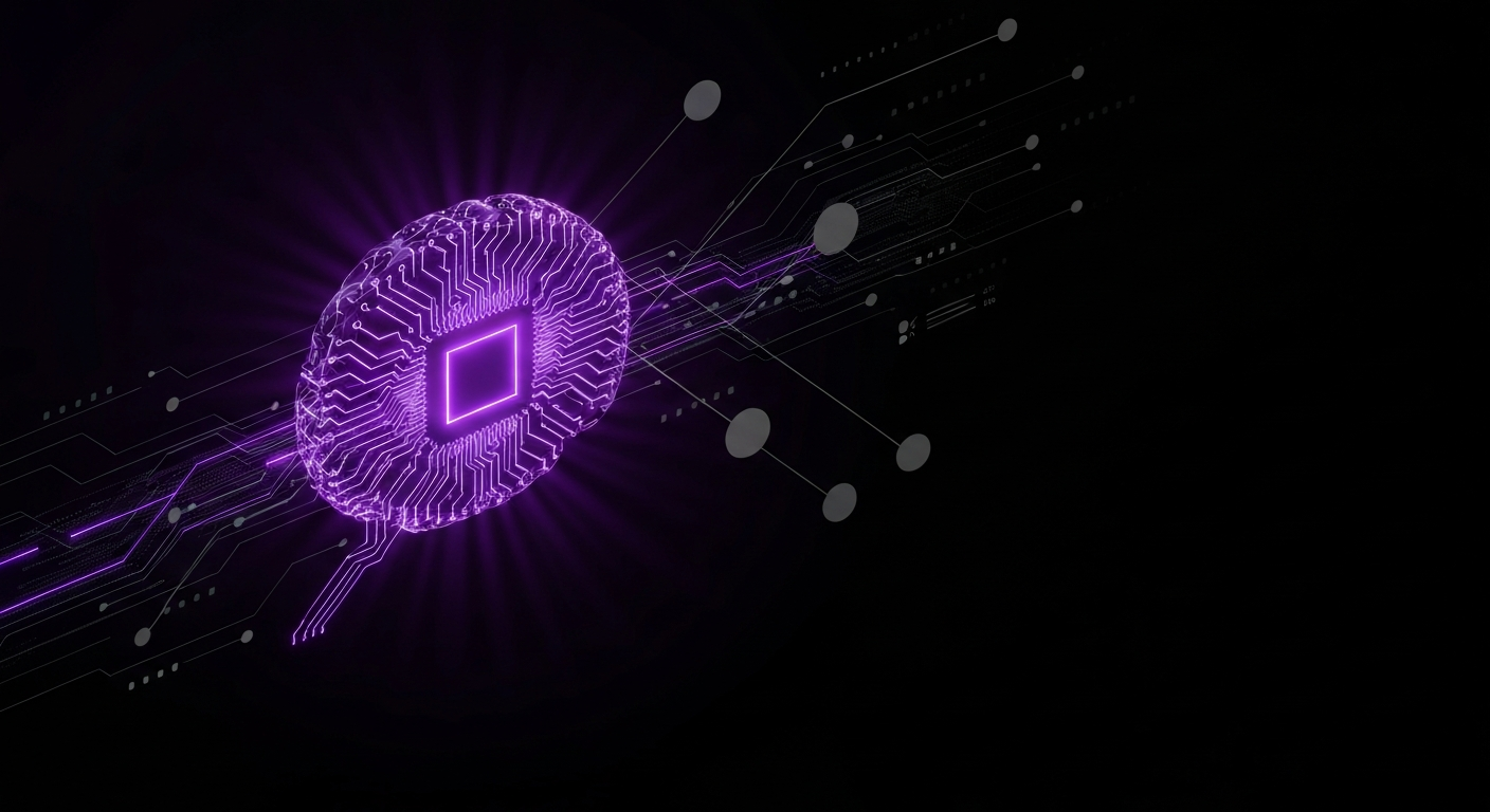
The quest to create a truly frictionless customer journey is constantly evolving. As technology advances, so do the opportunities to create more seamless, intuitive, and personalized experiences. The future of the frictionless funnel lies in moving from reactive problem-solving to proactive, predictive optimization. Technologies like Artificial Intelligence (AI) and machine learning are at the forefront of this evolution, promising to understand and adapt to individual user needs in real time.
Imagine a website that predicts a user’s question before they ask it, or a checkout process that automatically surfaces the user’s preferred payment method. This level of hyper-personalization, powered by AI, is the next frontier. It will enable businesses to eliminate friction on an individual basis, creating a unique, tailored journey for every visitor. While the tools are becoming more intelligent and predictive, the goal remains the same: to make the path to conversion as effortless as possible.