


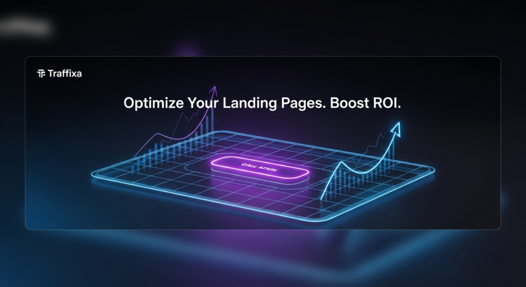


In digital marketing, driving traffic to your website is only half the battle. The real challenge is converting that traffic into tangible business results, such as leads, sales, or sign-ups. This is where Landing Page Optimization (LPO) becomes a critical strategy. LPO is the systematic process of improving every element on a landing page to increase its conversion rate. By focusing on a single, dedicated goal, a well-optimized landing page acts as your most effective digital salesperson, working 24/7 to turn visitors into customers.
Ignoring LPO is equivalent to wasting your marketing budget. Even the most brilliant ad campaign will fail if it directs users to a page that is confusing, slow, or unconvincing. A methodical approach to optimization ensures you make the most of every click and maximize your return on investment. LPO is a core component of a broader Conversion Rate Optimization (CRO) strategy, focusing specifically on the standalone pages built for marketing campaigns.
Landing Page Optimization (LPO) is the process of enhancing a landing page’s design, copy, and user experience (UX) to achieve a higher conversion rate. Unlike general website optimization, LPO is hyper-focused on a single objective, such as capturing an email address, registering for a webinar, or driving a purchase. The optimization process uses data, analytics, and user feedback to make informed changes that persuade more visitors to take a specific action. Common tactics include A/B testing headlines, refining the call-to-action (CTA), simplifying forms, and improving mobile responsiveness. The ultimate goal is to remove friction and create the most direct, persuasive path to conversion.
The impact of LPO on your business’s bottom line is direct and substantial. By increasing the percentage of visitors who convert, you effectively lower your Cost Per Acquisition (CPA). For example, spending $1,000 on an ad campaign to drive 1,000 visitors to a page with a 1% conversion rate yields 10 leads at $100 per lead. By optimizing that page to achieve a 3% conversion rate, the same ad spend generates 30 leads, dropping the cost per lead to just $33.33. This efficiency gain directly boosts your Return on Investment (ROI).
In lead generation, LPO is paramount. An optimized page captures more leads and can also improve their quality. By clearly communicating your value proposition and using a well-crafted form, you attract prospects who are genuinely interested in your offer. This allows your sales team to spend less time on unqualified leads and more time closing deals, accelerating the entire sales funnel.
A common mistake is sending campaign traffic to a homepage. This approach is often ineffective because a homepage serves a broad audience with multiple goals, such as exploring products, learning about the company, or finding contact information. A landing page, in contrast, is a specialist designed for a single purpose. It delivers one message tailored to the audience from a specific campaign, eliminating distractions and guiding the user toward a single action. Understanding this distinction is crucial for effective campaign management.
| Aspect | Landing Page | Homepage |
|---|---|---|
| Purpose | To convert visitors for a single, specific campaign goal (e.g., sign up, download, purchase). | To serve as a general entry point, providing an overview and navigation to the entire site. |
| Audience | Highly targeted traffic from a specific source (e.g., a PPC ad, email link). | Broad and diverse audience, including new visitors, returning customers, and job seekers. |
| Content | Focused on one offer with a single, clear message and call-to-action. | Broad content covering multiple products, services, company info, and news. |
| Navigation | Typically has no navigation bar or external links to keep the user focused on the conversion goal. | Features a full navigation menu to encourage exploration of the entire website. |
| Call-to-Action (CTA) | One primary CTA that is the focal point of the page. | Multiple CTAs for different user journeys (e.g., “Learn More,” “View Products,” “Contact Us”). |
A high-converting landing page is not a random collection of elements but a carefully constructed experience where every part works in harmony toward a single goal. While specifics vary by industry and offer, all effective landing pages share core components that serve as the building blocks of persuasion, clarity, and trust. From the moment a visitor arrives, each element should guide them seamlessly toward the call-to-action by answering questions, addressing concerns, and reinforcing the offer’s value.
The headline is the first element a visitor reads and is arguably the most important on the page. It must immediately grab their attention and clearly communicate the primary benefit of your offer. A great headline connects with the user’s pain point or desire and promises a solution. It should be clear, concise, and aligned with the ad or link the visitor clicked to arrive. The subheadline supports the main headline by providing additional context, a key benefit, or a compelling detail that encourages the visitor to keep reading. For example, a headline might be “Build Your Website in Minutes,” while the subheadline adds, “No coding skills required. Choose from over 100 professionally designed templates.”
The hero shot is the primary visual on your landing page—a high-quality image or video that shows your product or service in context, helping visitors visualize themselves using it and experiencing its benefits. A static product image, a photo of a happy customer, or a short explainer video can all be effective. The key is relevance and emotional connection. A good hero shot should be authentic, directly support the headline’s message, and provide an instant visual cue about the offer, making the page more engaging and easier to understand at a glance.
A Unique Value Proposition (UVP) is a clear statement that explains the benefits of your offer, how you solve a customer’s problem, and what distinguishes you from the competition. It is the core of your marketing message and should be communicated succinctly, often within the headline and subheadline. The UVP answers the visitor’s fundamental question: “What’s in it for me?” It should be specific, pain-focused, and exclusive. Avoid vague jargon and focus on tangible outcomes. For instance, instead of “Innovative cloud solutions,” a stronger UVP would be “The simplest way to back up all your business data securely in 60 seconds.”
The body copy expands on the promise made in the headline, elaborating on the features and, more importantly, the benefits of your offer. Good copy is scannable and easy to digest. Use short paragraphs, bold text for emphasis, and benefit-oriented bullet points to break down complex information. Each bullet point should translate a feature into a direct benefit for the user. For example, instead of listing a feature like “24/7 customer support,” frame it as a benefit: “Get expert help anytime, day or night, so you’re never stuck.” This helps the user connect what your product does with how it improves their life or work.
The call-to-action (CTA) is the tipping point of your landing page—the button or link prompting the user to take the desired action. An effective CTA must be visually prominent, using a contrasting color that makes it stand out. The copy on the button should be clear, concise, and action-oriented. Instead of generic words like “Submit” or “Click Here,” use specific, value-driven language like “Get Your Free Guide,” “Start My 30-Day Trial,” or “Reserve My Spot.” The CTA should be the logical conclusion to the compelling narrative you’ve built on the rest of the page.

Effective landing page design is more than just aesthetics; it is a strategic tool for communication and persuasion. The visual presentation of your page plays a critical role in building trust, conveying information efficiently, and guiding the user’s attention toward the conversion goal. By applying foundational design principles, you can create a seamless, intuitive user experience that reduces friction and makes it easy for visitors to say “yes.” A well-designed page feels professional, trustworthy, and effortless to navigate, all of which contribute directly to a higher conversion rate.
Visual hierarchy is the arrangement of elements to signal their order of importance. It is how you control what the user sees first, second, and third. You can establish a strong hierarchy using size, color, contrast, and placement. Your most important element—typically the headline—should be the largest and most prominent. The CTA button should use a high-contrast color to draw the eye. By strategically organizing content, you create a natural visual path that leads the user from the headline, through the value proposition and benefits, and directly to the call-to-action, minimizing distractions and cognitive load.
White space, or negative space, is the empty area around elements on a page. It is not wasted space but an active design element that improves readability, focus, and comprehension. A cluttered page overwhelms the user, making it difficult to identify the key message and the desired action. By using ample white space, you give your content room to breathe, creating a clean, modern, and professional feel. A clean, single-column layout is often most effective for landing pages, as it provides a clear, linear path for the user to follow without getting sidetracked.
Color is a powerful tool for evoking emotion and driving action. The colors you choose for your landing page should align with your brand identity and the emotional response you want to elicit. For example, blue often conveys trust and security, making it popular for financial services, while green is associated with growth and health. Crucially, your CTA button should use a color that contrasts sharply with the background to make it stand out. Maintaining brand consistency with your ads and main website builds trust and creates a cohesive user experience, reassuring visitors that they are in the right place.
With most web traffic now coming from mobile devices, a mobile-first design approach is non-negotiable. This means designing the mobile version of your landing page first and then adapting it for larger screens, rather than the other way around. Mobile optimization, also known as mobile responsiveness, ensures your page looks and functions perfectly on any device. This includes using large, legible fonts, easily tappable buttons, and a single-column layout that eliminates the need for pinching and zooming. A poor mobile experience leads to high bounce rates and lost conversions, making it a critical focus for any LPO strategy.
While design creates the structure and visual appeal of your landing page, it’s the copy that does the heavy lifting of persuasion. Your words must connect with the visitor on an emotional level, clearly articulate value, and compel them to take action. Great landing page copywriting isn’t about clever wordplay; it’s about clarity, empathy, and a deep understanding of your audience’s needs. It bridges the gap between a visitor’s problem and your solution, making the decision to convert feel like the natural and obvious next step.
The foundation of all persuasive copy is a profound understanding of your target audience. You need to know their pain points, goals, hesitations, and the language they use to describe them. Voice of Customer (VoC) research is the process of capturing this insight directly from your audience. You can gather VoC data by:
By using the exact words and phrases your customers use, your copy will resonate more deeply and feel more authentic and trustworthy.
One of the most common copywriting mistakes is focusing on features instead of benefits. Features describe what your product or service *is* or *does*. Benefits describe what the user *gets* or *feels* as a result. People don’t buy a drill; they buy a hole in the wall. Your copy must always connect the feature to the benefit. A simple way to do this is to use the “so what?” test. For every feature you list, ask “so what?” until you arrive at a core human benefit.
| Feature-Driven (What it is) | Benefit-Driven (What it means for you) |
|---|---|
| Our software has a 256-bit AES encryption. | Keep your sensitive data completely secure and private, safe from any prying eyes. |
| This mattress is made with memory foam. | Enjoy a deeper, more restful sleep and wake up without back pain. |
| The course includes 10 video modules. | Learn at your own pace and master a new skill in just one weekend. |
| Our app integrates with your calendar. | Never miss an appointment again and stay effortlessly organized. |
AIDA is a classic marketing framework that provides a simple yet powerful structure for persuasive copywriting. It outlines the four stages a visitor goes through on their path to conversion.
Humans are wired for stories. A well-told story can make your offer more memorable, relatable, and emotionally resonant. Instead of just listing facts, weave a narrative around your product or service. You can tell the story of a customer who overcame a challenge using your solution (a mini-case study) or the origin story of your product, highlighting the problem you set out to solve. Storytelling helps build an emotional connection, making your brand more than just a faceless entity. It transforms a simple transaction into a shared journey, which is far more persuasive.

The Call-to-Action (CTA) is the final gateway to conversion. It’s the moment of truth where the visitor decides whether to take the next step or leave. Optimizing your CTA is a blend of art and science, involving psychology, design, and precise language. A weak, confusing, or hidden CTA can nullify all the hard work you’ve put into the rest of your page. Conversely, a strong, clear, and compelling CTA acts as a powerful magnet, drawing users toward the conversion goal and making the decision to act feel easy and rewarding.
The copy on your CTA button matters immensely. Generic phrases like “Submit,” “Download,” or “Click Here” are functional but uninspiring. The best CTA copy is specific, action-oriented, and communicates value. Start with a strong action verb and clearly state what the user will get. For example, change “Submit” to “Get My Free Ebook” or “Download” to “Start My Free Trial.” Using first-person language (“Get My Free Ebook” vs. “Get Your Free Ebook”) can also increase clicks by making the action feel more personal and ownership-driven.
For a CTA to be effective, it must be seen. Design plays a crucial role in making your CTA stand out.
Psychological triggers like urgency and scarcity can significantly boost conversion rates by encouraging immediate action. People are more likely to act when they fear missing out on an opportunity. You can create urgency by using time-sensitive language, such as “Offer ends Friday” or adding a countdown timer. Scarcity can be applied by highlighting limited availability, such as “Only 10 spots left” or “Limited edition.” These tactics should be used ethically and truthfully to be effective; fabricating scarcity can damage trust.
For a standard landing page with a single conversion goal, the best practice is to have only one primary CTA. Offering multiple choices (e.g., “Download Ebook,” “Watch Demo,” “Contact Us”) can lead to decision paralysis and dilute the page’s focus. By removing all other competing links and CTAs, you create a 1:1 attention ratio, where the only action to take is the one you want. While you might test a secondary, lower-commitment CTA on very long pages, a single, focused CTA is almost always the highest-converting option.
The form is often the biggest point of friction on a landing page. It’s where you ask the visitor for their personal information in exchange for your offer. Every field you add increases the user’s cognitive load and potential reluctance to convert. Therefore, optimizing your form is a delicate balancing act. You need to gather enough information to qualify the lead without overwhelming the user and causing them to abandon the page. A well-designed, user-friendly form can dramatically increase your lead capture rate.
The fundamental trade-off in form design is between conversion quantity and lead quality. A shorter form (e.g., just an email address) will almost always generate more conversions because the barrier to entry is low. However, these leads may be less qualified. A longer form (e.g., asking for name, company, job title, and phone number) will generate fewer conversions, but the leads you do get will be of higher quality and intent. The right balance depends on your goal. For a top-of-funnel content download, a short form is appropriate. For a bottom-of-funnel demo request, a longer form is necessary to qualify the lead for your sales team.
The design and usability of the form itself can significantly impact conversions. Follow these best practices for a frictionless experience:
Users are increasingly protective of their personal data. You can reduce their anxiety and build trust directly within the form area. Add a short privacy statement below the CTA button, such as “We respect your privacy and will never share your information.” Including a relevant testimonial or a small trust badge (like a security seal) near the form can also reassure users that their information is safe and that they are making a good decision. This small addition can significantly reduce form abandonment.
If you must collect a lot of information, a long, intimidating form can be a conversion killer. In these cases, a multi-step form is an excellent solution. By breaking the form into two or more smaller, logical steps, you reduce the initial psychological friction. The first step might ask for basic information like name and email. Once the user has committed to starting the process, they are more likely to complete the subsequent steps (a psychological principle known as consistency). Multi-step forms feel less daunting and can even include a progress bar to encourage completion.
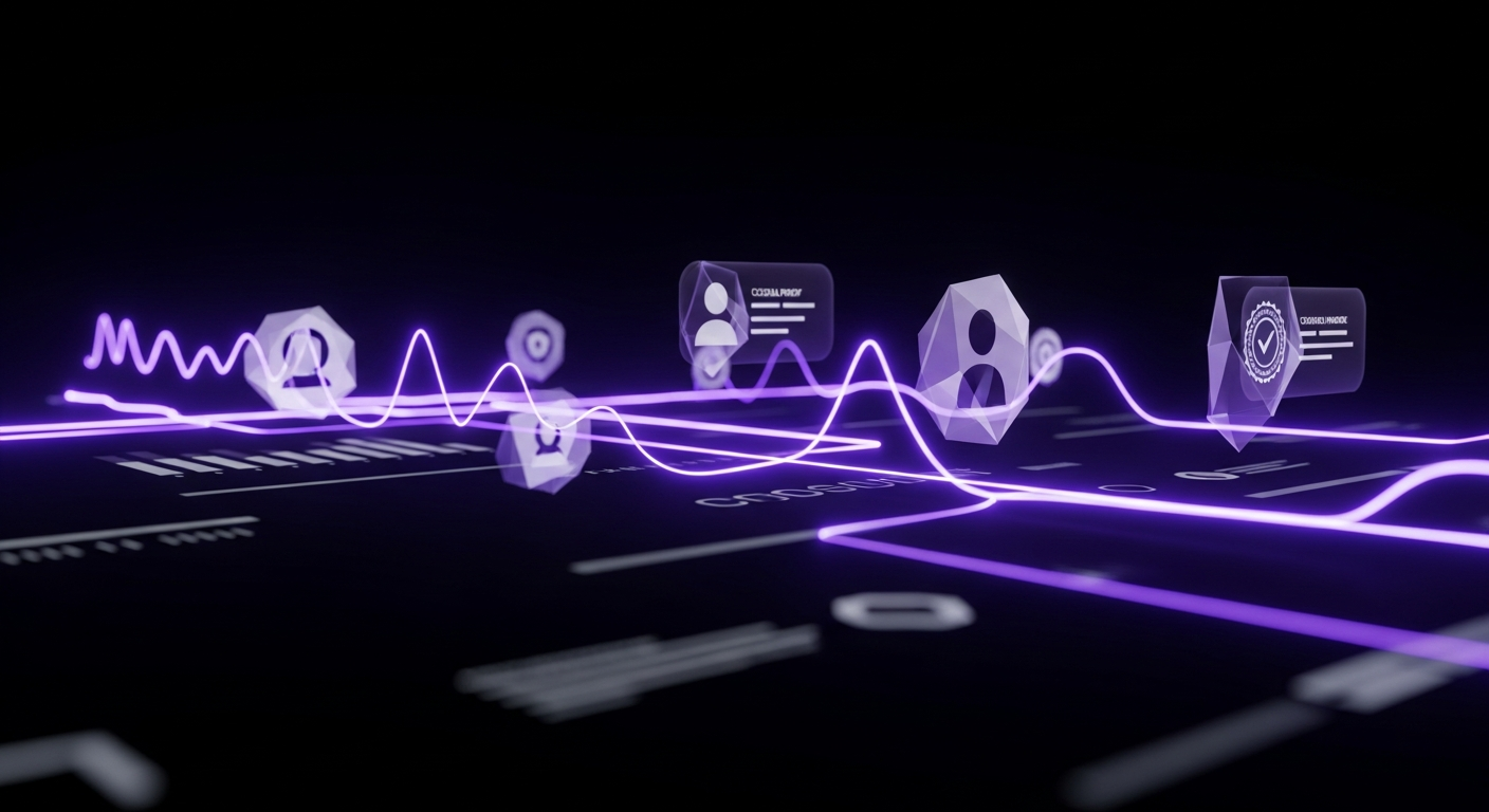
Before a visitor will give you their email address, let alone their credit card information, they need to trust you. In an online world filled with scams and low-quality offers, building trust and credibility is essential for conversion. You cannot just claim to be the best; you have to prove it. This is where social proof comes in. Social proof is the psychological phenomenon where people assume the actions of others in an attempt to reflect correct behavior. By showing that other people trust and value your brand, you make it easier for new visitors to do the same.
Testimonials are one of the most powerful forms of social proof. A quote from a happy customer that highlights a specific benefit or result they achieved is far more persuasive than any marketing copy you could write. For maximum impact, include a photo, full name, and company/title of the person providing the testimonial. This adds authenticity and makes it more relatable. Embedding reviews from third-party sites like Google, Capterra, or Yelp can also add a layer of unbiased credibility.
Trust badges are symbols placed on your landing page to instill confidence. These can include:
These visual cues act as third-party endorsements, quickly communicating that your business is legitimate and respected.
For B2B companies, showcasing the logos of well-known clients you’ve worked with is a powerful form of social proof. It instantly borrows credibility from those established brands. If a visitor sees that a company they know and respect uses your services, they are more likely to trust you. A link to a detailed case study can be even more persuasive. Case studies provide in-depth proof of your ability to deliver results, telling a compelling story of how you solved a specific problem for a client, complete with data and tangible outcomes.
While the primary goal of a landing page is to limit distractions, providing a subtle way for skeptical visitors to learn more about your company can build trust. This can be a small link in the footer to your main website’s “About Us” or “Contact” page. A professional, well-designed main website with a clear mission, team photos, and a physical address signals that you are a real, established business. This transparency helps alleviate concerns and reassures visitors that there are real people behind the offer.
You can follow all the best practices in the world, but you will never know for sure what works best for your specific audience until you test it. A/B testing, also known as split testing, is the scientific foundation of Landing Page Optimization. It’s the process of comparing two versions of a page (a control and a variation) to see which one performs better. By systematically testing one element at a time and measuring the impact on your conversion rate, you can make data-driven decisions that lead to continuous, incremental improvements over time.
When starting with A/B testing, it’s easy to get overwhelmed by the possibilities. It is best to start with high-impact elements that are most likely to influence user behavior. Create a testing roadmap based on hypotheses. Good candidates for your first tests include:
Running a successful A/B test requires a structured approach. Follow these steps to ensure your results are reliable:
Correctly interpreting test results is crucial. The most important concept is statistical significance, which is the probability that the result was not due to random chance. Most tools will calculate this for you, and you should aim for a confidence level of 95% or higher before declaring a winner. Common pitfalls to avoid include ending tests too soon, testing too many elements at once (which makes it impossible to know what caused the change), and ignoring external factors like seasonality or traffic source changes that could skew your results.
While A/B testing is the most common method, there are other techniques for more advanced optimization. Multivariate Testing allows you to test multiple variations of several different elements on a page simultaneously to find the best-performing combination. For example, you could test three headlines and two button colors at the same time. This is more complex and requires significantly more traffic than A/B testing. Split URL Testing is similar to A/B testing, but instead of testing variations on the same URL, you test two completely different URLs against each other. This is ideal for testing radical redesigns or pages that are hosted separately.

Optimization is an iterative process driven by data. To know if your efforts are working, you must track the right metrics. These Key Performance Indicators (KPIs) provide insight into user behavior, page performance, and the overall effectiveness of your campaign. By regularly monitoring these metrics, you can identify areas for improvement, validate your A/B test results, and demonstrate the tangible business impact of your optimization work. Tools like Google Analytics are essential for gathering this quantitative data.
The conversion rate is the most important landing page metric. It is the percentage of visitors who complete the desired goal (e.g., fill out a form, make a purchase), calculated as: (Number of Conversions / Total Number of Visitors) * 100. A rising conversion rate is the clearest sign that your optimization efforts are successful. This metric directly ties your landing page’s performance to your business objectives, making it the north star for all LPO activities.
Bounce rate is the percentage of visitors who leave after viewing only one page. A high bounce rate can indicate a disconnect between your ad and your landing page message, poor design, or slow loading times. While not a direct measure of conversion, it is a strong indicator of user engagement. Conversely, Time on Page (or Average Session Duration) measures how long visitors stay. A longer time on page can suggest that your copy is engaging, though it should be analyzed in context with the conversion rate. If people spend a lot of time on the page but do not convert, there may be an issue with your CTA or form.
Cost Per Acquisition (CPA), also known as Cost Per Conversion, measures the total cost of acquiring a single customer or lead through a specific campaign. It is calculated by dividing the total cost of the campaign by the number of conversions. LPO directly impacts CPA; as your conversion rate increases, your CPA decreases, making your marketing spend more efficient. It is also important to track Lead Quality, a qualitative metric often monitored in your CRM. Are leads from the page turning into qualified prospects and customers? A successful landing page balances a low CPA with high-quality leads.
While analytics tools provide quantitative data (the “what”), tools like heatmaps and session recordings provide qualitative data (the “why”).
These tools provide invaluable insights that can fuel your next A/B testing hypotheses.

To effectively create, test, and optimize landing pages, you need the right set of tools. The modern marketing technology stack provides solutions for every stage of the LPO process, from initial design and copywriting to A/B testing and user behavior analysis. Investing in the right tools can streamline your workflow, provide deeper insights, and ultimately lead to better results faster. Here are the essential categories of tools for any serious LPO practitioner.
Dedicated landing page builders are the cornerstone of any LPO program. Platforms like Unbounce, Instapage, and Leadpages allow marketers to create and publish beautiful, mobile-responsive landing pages quickly without needing a developer. Their drag-and-drop editors make it easy to design pages from scratch or use customizable templates. Crucially, these platforms have built-in A/B testing functionality, making it simple to set up and run experiments. They also offer features like dynamic text replacement, which matches your landing page headline to the user’s search query for improved relevance.
Data is the fuel for optimization, and analytics platforms are how you collect it. Google Analytics is the industry standard for tracking website traffic, user behavior, and conversion goals. It’s an essential free tool for measuring your core KPIs. To get qualitative insights, platforms like Hotjar or Crazy Egg are invaluable. They provide heatmaps, scroll maps, and session recordings that help you understand *how* users are interacting with your page. For more robust A/B and multivariate testing, tools like VWO and Optimizely offer advanced capabilities, while tools like Google Optimize are being sunset.
Crafting compelling copy is critical, and several tools can assist in this process. Grammarly and Hemingway Editor help you refine your writing for clarity, tone, and correctness. For generating ideas and overcoming writer’s block, AI copywriting assistants like Jasper or Copy.ai can be incredibly helpful. These tools use artificial intelligence to generate headlines, body copy, and CTA ideas based on your inputs. While they should not replace a human copywriter, they are excellent tools for brainstorming and creating initial drafts.
For teams with dedicated designers, professional design and prototyping tools are essential for creating high-fidelity mockups before development. Software like Figma, Sketch, and Adobe XD allows designers to create detailed page layouts, experiment with visual hierarchy, and build interactive prototypes. This enables the team to test the user experience and gather feedback on the design before a single line of code is written, saving time and ensuring the final product is built on a solid, user-centric foundation.