


In the competitive landscape of online retail, driving traffic to your website is only half the battle. The real challenge is converting those visitors into paying customers. This is where Conversion Rate Optimization (CRO) becomes indispensable. E-commerce CRO is the systematic process of increasing the percentage of website visitors who complete a desired action—most commonly, making a purchase—by refining your website and user experience. It involves a deep understanding of how users navigate your site, what actions they take, and what barriers prevent them from converting.
A well-executed CRO strategy does not rely on guesswork or chasing design trends. Instead, it is a data-driven discipline that uses analytics, user feedback, and methodical testing to make informed improvements. By focusing on optimizing your existing traffic, you can significantly increase revenue without proportionally increasing your marketing spend. This leads to a higher return on investment (ROI) from all your traffic acquisition efforts, including SEO, paid advertising, and social media marketing. Ultimately, CRO creates a smoother, more intuitive, and more persuasive path to purchase, benefiting both your customers and your bottom line.
In e-commerce, a “conversion” is the successful completion of a specific goal. While the ultimate macro-conversion is a completed purchase, many valuable micro-conversions contribute to the customer’s journey. These can include signing up for a newsletter, creating an account, adding a product to the cart, or downloading a lookbook. E-commerce CRO is the practice of optimizing your website to increase the rate at which visitors complete any of these valuable actions. It is a holistic approach that examines every element of the User Experience (UX), from the homepage’s value proposition to the final click on the “Place Order” button. It asks critical questions: Is the navigation intuitive? Are product images compelling? Is the checkout process seamless? By systematically identifying and removing points of friction, CRO aims to make the journey from visitor to customer as effortless as possible.
To improve your conversion rate, you first need to measure it accurately. The formula is straightforward and provides a clear benchmark for your optimization efforts. Your e-commerce conversion rate is calculated by dividing the total number of conversions (usually sales) by the total number of website visitors (or sessions) over a specific period, then multiplying the result by 100 to get a percentage.
The formula is:
(Number of Conversions / Total Number of Visitors) x 100 = Conversion Rate %
For example, if your online store had 500 sales last month from 25,000 unique visitors, your conversion rate would be:
(500 / 25,000) x 100 = 2%
Tracking this key performance indicator (KPI) over time is essential. It allows you to measure the impact of changes you make to your website and understand how seasonality, marketing campaigns, and site updates affect user behavior. Most analytics platforms, like Google Analytics, can track this for you automatically once e-commerce tracking is set up correctly.
Investing in a strategic CRO plan can deliver one of the highest returns on investment in digital marketing. Unlike paid advertising, which stops yielding results the moment you stop paying, improvements made through CRO are lasting and compound over time. A small increase in your conversion rate can have a dramatic impact on revenue. For instance, lifting a 2% conversion rate to 3% represents a 50% increase in sales from the same volume of traffic.
This efficiency gain extends to your customer acquisition cost (CAC). By converting more of the visitors you already have, you effectively lower the cost of acquiring each new customer. This makes your marketing budget go further, allowing you to reinvest in growth or improve profitability. Furthermore, the principles of CRO—focusing on user experience, building trust, and clarifying your value proposition—often lead to higher customer satisfaction and increased customer lifetime value (CLV). A customer who has a smooth, positive purchasing experience is more likely to return and become a loyal advocate for your brand.

Before you can optimize your website, you must first understand the people who use it. Effective Conversion Rate Optimization is built on a foundation of deep customer empathy and a clear understanding of their journey. This involves moving beyond simple metrics like page views and bounce rates to uncover the motivations, pain points, and decision-making processes of your target audience. By mapping their path from initial awareness to final purchase, you can identify critical touchpoints where friction occurs and opportunities for improvement exist.
This foundational stage is less about making immediate changes and more about gathering insights. It requires a combination of quantitative data analysis and qualitative user feedback. While analytics reveal *what* users are doing, qualitative methods like surveys and session recordings uncover *why*. Combining these perspectives provides a holistic view, enabling you to form strong, evidence-based hypotheses for future website enhancements and A/B tests. Skipping this step is like navigating without a map—progress may occur, but it will be inefficient and directionless.
Customer Journey Mapping is the process of creating a visual representation of a customer’s experience with your brand. It documents the typical stages a user goes through: Awareness (how they discover you), Consideration (how they evaluate your products), Purchase (the checkout process), and Retention (the post-purchase experience). For each stage, you should identify the user’s goals, their likely actions, the questions they have, and potential pain points. For example, during the Consideration stage, a user’s goal is to find the right product. A potential pain point could be confusing category navigation or a lack of filtering options. By mapping this out, you can pinpoint specific areas of your website that need optimization to better serve user needs at each step.
Your website analytics platform, such as Google Analytics, is a treasure trove of quantitative data that can reveal where users struggle. The Behavior Flow and Goal Funnel Visualization reports are particularly useful for identifying drop-off points. These reports show the paths users take through your site and at which pages they tend to leave. A high exit rate on a specific step in your checkout process, for example, is a clear red flag indicating a point of friction. Similarly, a high bounce rate on key product pages might suggest your product descriptions are not compelling or that the images are of poor quality. Use this data to prioritize which pages and processes to investigate further.
To understand the ‘why’ behind the data, you need to gather qualitative feedback directly from your users. There are several effective methods for this:
Your homepage is often a potential customer’s first impression of your brand. It serves as the digital front door to your store, and its primary job is to answer three critical questions for the visitor immediately: Who are you? What do you sell? And why should I buy from you? A high-converting homepage quickly communicates its value, builds trust, and guides users effortlessly toward the products they are looking for. It must be clean, professional, and focused on its core objectives.
Many e-commerce sites make the mistake of cluttering their homepage with too many competing messages, fast-moving carousels, or confusing navigation. This creates cognitive overload and can cause visitors to bounce before they explore your offerings. In contrast, the most effective homepages are models of clarity and purpose. They feature a compelling hero image, a clear value proposition, intuitive navigation, and prominent trust signals that work together to create a welcoming and reassuring user experience.
Your Value Proposition is the single most important element on your homepage. It is a concise statement that explains the unique benefit you provide and what distinguishes you from the competition. It should be placed prominently “above the fold” (the part of the page visible without scrolling) and be instantly understandable. A strong value proposition is not just a slogan; it’s a promise. For example, instead of a vague statement like “High-Quality Shoes,” a better value proposition would be “Handcrafted Italian Leather Shoes with a Lifetime Guarantee.” This is specific, highlights quality, and addresses a potential customer concern (durability), making it far more persuasive.
If visitors cannot find what they are looking for, they cannot buy it. Your main navigation menu should be simple, logical, and use terminology your customers understand. Avoid jargon or overly creative category names. A mega-menu can be effective for stores with large catalogs, as it allows you to display subcategories visually. Equally important is a powerful on-site search function. The search bar should be highly visible on every page. It should provide auto-complete suggestions, handle typos and synonyms gracefully, and deliver relevant results quickly. A frustrating search experience is a fast track to a lost sale.
New visitors are inherently skeptical, so you need to build trust within the first few seconds of their arrival. Social proof and trust signals are crucial for overcoming this initial hesitation. Displaying customer testimonials, user-generated photos, logos of well-known publications that have featured you (“As Seen In…”), or star ratings can be incredibly effective. Additionally, prominently display security badges, such as SSL certificates (the padlock icon in the browser) and logos of accepted payment methods like Visa, Mastercard, and PayPal. These visual cues reassure visitors that your store is legitimate and that their personal and financial information will be kept secure.

The product detail page (PDP) is where the purchase decision is made. It is the moment of truth for your e-commerce store. After a visitor navigates from your homepage to a category and clicks on a specific item, the PDP must do the heavy lifting of convincing them that this is the right product. A high-converting product page is a masterful blend of compelling visuals, persuasive copy, and reassuring social proof. It anticipates and answers customer questions, overcomes objections, and makes the product’s value crystal clear.
Every element on the product page should serve a purpose: to inform, persuade, and build desire. From the quality of the images to the clarity of the shipping information, each detail contributes to the user’s confidence in their potential purchase. Neglecting any of these components can introduce doubt and friction, leading to page abandonment. The goal is to create an experience that is the next best thing to holding the product in their hands, providing all the information and reassurance they need to confidently click “Add to Cart.”
Since online shoppers cannot physically touch or examine your products, high-quality visuals are non-negotiable. Your product pages should feature a gallery of high-resolution images taken from multiple angles. Include close-up shots to show detail and texture, as well as “in-context” or lifestyle photos that show the product in use. A zoom function is essential. Better still, incorporate product videos. A short video can demonstrate a product’s features, functionality, and benefits far more effectively than static images or text alone. For apparel, videos showing how the fabric moves can be a game-changer. Visuals are the most powerful tool you have to bridge the gap between the digital and physical worlds.
While visuals grab attention, the copy often closes the deal. Your product descriptions should go beyond listing dry specifications. Focus on the benefits and the emotional connection. How will this product improve the customer’s life? Use storytelling to paint a picture of the customer enjoying the product. Structure the copy for scannability by using short paragraphs, subheadings, and bullet points to highlight key features and benefits. The tone of voice should align with your brand and resonate with your target audience. A well-written description anticipates potential questions, addresses common objections, and gives the shopper the confidence needed to make a purchase.
Social proof is one of the most powerful psychological drivers in e-commerce. Shoppers trust other shoppers. Displaying customer reviews and ratings prominently on your product pages is essential for building trust and credibility. Research shows that products with reviews convert at a significantly higher rate than those without. Allow users to filter reviews (e.g., by star rating or most recent) and encourage them to upload photos with their reviews. A Question & Answer (Q&A) section is also incredibly valuable. It allows potential buyers to ask specific questions and receive answers from your team or previous customers. This not only provides helpful information but also creates a community around your products and demonstrates your commitment to customer transparency.

Category pages are the essential connective tissue of an e-commerce website. They act as a digital showroom, guiding users from the broad intent of the homepage to the specific items on product pages. A well-optimized category page makes it easy and enjoyable for shoppers to browse your catalog and discover products they love. If this experience is cluttered or confusing, users will become frustrated and likely abandon their search. The primary goal is to reduce the time and effort it takes for a user to find a relevant product.
Effective category pages balance inspiration with efficiency. They must visually showcase products in an appealing way while also providing powerful tools that allow users to narrow down the selection to their specific needs. This involves a thoughtful approach to layout, clear calls-to-action, and, most importantly, robust filtering and sorting capabilities. By empowering users to take control of their browsing experience, you help them find what they’re looking for faster, which directly correlates with higher conversion rates and a better overall user experience.
For any store with more than a handful of products, advanced filtering and sorting are a necessity. This functionality, often called “faceted search,” allows users to refine product listings based on specific attributes like size, color, price range, brand, or customer rating. The more relevant filters you can provide, the better. Sorting options are equally important. Users should be able to sort products by “Best Selling,” “Newest,” “Price: Low to High,” and “Price: High to Low.” These tools transform a potentially overwhelming catalog into a manageable and personalized shopping experience, dramatically improving product discovery.
How you present products on a category page significantly impacts usability. A clean, consistent grid layout is standard for a reason: it’s easy to scan. Ensure there is enough white space around each product to prevent a cluttered look. The visual hierarchy should be clear, with the product image as the most prominent element, followed by the product title, price, and any key indicators like a “sale” badge or average star rating. Consider offering users the choice between a grid view and a list view, as some may prefer one over the other, especially for products with detailed specifications. Consistency in image size and style is key to creating a professional and polished appearance.
Every product listing on a category page should have a clear Call-to-Action (CTA). This might be a standard “Add to Cart” button or a “Quick View” option that opens a pop-up with more details without forcing the user to leave the page. The CTA button should be visually distinct from other elements, using a contrasting color that draws the eye. The text on the button should be action-oriented and unambiguous. A/B testing different CTA colors, text, and placements can reveal what works best for your audience. The goal is to make the next step in the purchasing journey obvious and effortless.
You have successfully guided a visitor from the homepage to a product page, and they’ve clicked “Add to Cart.” This is a critical moment, but the sale is far from guaranteed. The shopping cart and checkout process are where many e-commerce conversions are lost. Numerous studies show the average shopping cart abandonment rate is around 70%. This staggering statistic highlights the immense friction that exists in the final stages of the purchase journey. Every unnecessary field, unexpected cost, and moment of confusion increases the likelihood that a motivated buyer will give up and leave.
Optimizing the checkout process is one of the highest-impact activities in e-commerce CRO. The goal is to make the path from cart to confirmation as simple, fast, and transparent as possible. This means removing distractions, eliminating unnecessary steps, building trust, and providing clarity on costs and delivery. A streamlined checkout respects the user’s time and reduces their cognitive load, ensuring their initial excitement to buy is carried all the way through to a completed transaction.
While the debate between single-page and multi-page checkouts continues, the guiding principle is to reduce the number of *perceived* steps for the user. A long, multi-step checkout can feel daunting. A single-page checkout, where all fields are visible on one screen, can reduce friction and feel faster. If you opt for a multi-step process, use a clear progress bar (e.g., Step 1: Shipping > Step 2: Payment > Step 3: Review). This manages user expectations and shows them how close they are to the finish line. Whichever format you choose, eliminate all non-essential fields. Do you really need their phone number or date of birth? If not, remove it.
Forcing users to create an account before they can purchase is a notorious conversion killer. Many first-time buyers are not ready to commit to a relationship with your brand; they just want to buy the product. Requiring account creation erects a significant barrier. The solution is simple: offer a prominent guest checkout option. Make it the default or most visually appealing choice. You can always invite them to create an account on the post-purchase thank you page by explaining the benefits, such as easier order tracking and faster future checkouts. By offering guest checkout, you prioritize the immediate sale and respect the user’s preference for a quick transaction.
A lack of preferred payment options is a common reason for cart abandonment. To maximize conversions, you should cater to a wide range of customer preferences. In addition to standard credit and debit cards, integrate popular digital wallets like PayPal, Apple Pay, and Google Pay. These services offer a faster, more secure checkout experience, especially on mobile. Consider offering “Buy Now, Pay Later” (BNPL) services like Klarna or Afterpay, which can increase conversions and average order value. Transparency is also key. Be upfront about all costs, including shipping fees and taxes, early in the process. Surprise costs revealed at the final step are the number one reason shoppers abandon their carts.

Human decision-making is heavily influenced by psychological principles. As an e-commerce business, you can ethically leverage these triggers to encourage visitors to complete a purchase. Two of the most powerful principles in marketing are urgency and scarcity. Urgency is the idea that one must act quickly due to a time constraint, while scarcity suggests a product is in limited supply. When used thoughtfully, these triggers tap into the natural human fear of missing out (FOMO) and can effectively nudge a hesitant buyer toward a decision.
It is crucial to use these tactics authentically. Fabricating scarcity or creating perpetual urgency can erode customer trust and damage your brand’s reputation. However, when applied to genuine situations—such as a limited-time sale, low inventory levels, or a seasonal collection—they can be incredibly effective at increasing conversion rates. The goal is not to pressure customers but to provide them with relevant information that helps them make a timely decision.
A countdown timer is a classic and highly effective tool for creating urgency. When a visitor sees a timer ticking down on a special offer or a site-wide sale, it creates a tangible deadline. This visually reinforces that the opportunity is temporary and encourages them to act now rather than later. Countdown timers are ideal for flash sales, holiday promotions, or daily deals. They can be placed on homepages, in promotional banners, and directly on product pages to maximize visibility. The key is to ensure the deadline is real; if a user sees the same sale with a resetting timer on every visit, the effect will be lost.
Scarcity can be a powerful motivator. Displaying real-time stock information, such as “Only 3 left in stock!” or a “Low Stock” badge, signals that the product is popular and may soon be unavailable. This can prompt a customer who is on the fence to complete their purchase to avoid the disappointment of the item selling out. This tactic is particularly effective for popular items or products in a clearance sale. It provides valuable information to the customer while simultaneously leveraging the principle of scarcity to drive conversions. It is an honest and transparent way to communicate limited availability.
These features leverage a combination of personalization and social proof. A “Frequently Bought Together” section (e.g., “Customers who bought this also bought…”) is a powerful cross-selling tool. It not only increases the average order value but also acts as a subtle recommendation, implying that other shoppers have found value in purchasing these items as a bundle. A “Recently Viewed” items widget is a helpful navigational tool that makes it easy for users to find their way back to products they were previously considering. It reminds them of their interest and simplifies their journey, reducing the friction of re-finding a product.
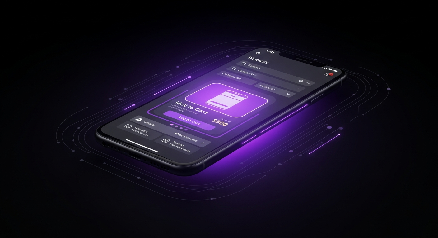
In today’s digital landscape, optimizing for mobile is no longer optional—it is imperative. Mobile commerce (m-commerce) now accounts for the majority of e-commerce traffic and a significant portion of sales. However, conversion rates on mobile devices traditionally lag behind those on desktop. This gap exists because many websites are still designed for a desktop experience and then scaled down for mobile, resulting in a clunky, frustrating user experience. A true mobile-first approach flips this paradigm. It means designing for the smallest screen and its inherent constraints first, then adapting the experience for larger screens.
A mobile-first CRO strategy focuses on speed, simplicity, and thumb-friendly interactions. Mobile users are often on the go, using less stable internet connections, and have a lower tolerance for friction. They expect pages to load instantly and navigation to be effortless. Every element of your site, from menu structure to checkout forms, must be re-imagined through the lens of the mobile user. Closing the mobile conversion gap represents one of the single biggest opportunities for growth for most e-commerce businesses.
A responsive design is the technical foundation of a mobile-friendly site. It ensures that your website’s layout, images, and text automatically adjust to fit the screen size of any device. However, responsiveness alone is not enough. Page speed is arguably the most critical factor for mobile conversions. Studies by Google have shown that as page load time goes from one to five seconds, the probability of a user bouncing increases by 90%. To optimize for speed, you should compress images, leverage browser caching, and minimize code. Use tools like Google’s PageSpeed Insights to regularly test and improve your site’s mobile performance.
People primarily navigate their smartphones using their thumbs, and your design must account for this. Key interactive elements, such as call-to-action buttons, menu icons, and form fields, should be large enough to be easily tapped without accidental clicks. They should also be placed within the “thumb zone”—the area of the screen that can be comfortably reached without shifting one’s grip on the phone. This often means placing main navigation and checkout buttons at the bottom of the screen rather than the top. A sticky header or footer that keeps the cart and search icons visible at all times can also significantly improve the mobile user experience.
Typing on a small touchscreen keyboard is tedious and prone to errors. Therefore, simplifying forms is essential for mobile CRO. Only ask for the absolute minimum information required to complete a transaction. Where possible, use dropdowns, steppers, and visual pickers instead of open text fields. Utilize HTML5 input types to trigger the correct mobile keyboard (e.g., the numeric keypad for phone numbers). Enable browser autofill capabilities for addresses and payment information. Integrating one-click payment options like Apple Pay and Google Pay can almost entirely eliminate the need for manual form entry, providing the most seamless mobile checkout experience possible.

Conversion Rate Optimization is not about making changes based on hunches or competitor actions. It is a scientific, data-driven process, and at its heart is A/B testing. A/B testing, or split testing, is a method of comparing two versions of a webpage or app element to determine which one performs better. By showing version A to one group of visitors and version B to another, you can collect empirical data on which version leads to a higher conversion rate.
This methodical approach removes guesswork and allows you to make incremental, evidence-based improvements to your user experience. Every test, whether it “wins” or “loses,” provides valuable insights into your customers’ behavior and preferences. Over time, this continuous cycle of hypothesizing, testing, and analyzing builds a deep understanding of what truly motivates your audience, leading to significant and sustainable growth. A structured A/B testing program is the engine that drives a successful CRO strategy.
A successful A/B test begins with a strong hypothesis. A hypothesis is not a random idea; it is an educated, testable statement that predicts the outcome of a change, based on insights from your data analysis and user research. A well-structured hypothesis typically follows this format: “Based on [qualitative/quantitative data], we believe that changing [element X] to [variation Y] for [audience Z] will result in [expected outcome] because [reasoning].” For example: “Based on heatmap data showing users aren’t clicking our current CTA, we believe changing the button color from grey to orange for all visitors will increase add-to-carts because it will create higher visual contrast.” This structure ensures your tests are purposeful and that you learn from the results, regardless of the outcome.
To run A/B tests and gather user data, you will need a set of specialized tools. A wide range of platforms is available, each with its own strengths. A good CRO toolkit often includes a combination of the following.
| Tool Category | Examples | Primary Use Case |
|---|---|---|
| A/B Testing & Personalization | VWO, Optimizely, Convert | Running controlled experiments on your website (e.g., testing different headlines, layouts, or CTAs). |
| Analytics & Heatmapping | Google Analytics, Hotjar, Crazy Egg | Analyzing quantitative traffic data and visualizing user behavior through heatmaps, scroll maps, and session recordings. |
| User Feedback & Surveys | Qualaroo, SurveyMonkey, Hotjar | Gathering qualitative insights directly from users through on-site polls, exit-intent surveys, and feedback widgets. |
Once a test has concluded, the final step is to analyze the results. The most important metric is statistical significance, which is often expressed as a confidence level (e.g., 95% confidence). This tells you the probability that the observed results were not due to random chance. Do not declare a winner until your test has reached this threshold and has run long enough to capture a representative sample of your traffic, typically at least one to two weeks. Analyze not only the primary conversion goal but also secondary metrics to understand the full impact of the change. Whether your hypothesis was proven correct or not, document the learnings. Use these insights to inform your next hypothesis and begin the cycle again. CRO is not a one-time project; it is a commitment to continuous improvement.

As the e-commerce landscape becomes more saturated, a generic, one-size-fits-all experience is no longer enough. The future of Conversion Rate Optimization lies in personalization. Advanced CRO strategies leverage artificial intelligence (AI) and machine learning to deliver tailored experiences for each user. Instead of showing everyone the same homepage, product recommendations, and offers, personalization dynamically adapts website content based on a user’s behavior, demographics, and past purchase history.
This one-to-one marketing approach makes the shopping experience feel more relevant, helpful, and engaging. When customers feel that a brand understands their unique needs and preferences, it builds a stronger connection and significantly increases the likelihood of conversion. AI-powered tools can analyze vast datasets to uncover patterns and make predictions that would be impossible for a human to identify, enabling a level of personalization once only possible for retail giants.
Standard product recommendation engines that show “best-sellers” or “related items” are a good start, but AI takes this to the next level. AI-powered recommendation algorithms analyze a user’s real-time browsing behavior, their purchase history, and the behavior of millions of similar users to predict which products they are most likely to be interested in next. These hyper-relevant recommendations can be placed on product pages, in the shopping cart, and in email marketing campaigns. This not only improves the user experience by helping customers discover products they will love but also significantly boosts average order value and conversion rates.
Dynamic content allows you to show different versions of your website content to different user segments. An AI-driven personalization platform can automate this process at scale. For example, you could show a “Welcome! Get 10% Off Your First Order” banner to new visitors, while a returning customer might see a banner showcasing new arrivals in a category they frequently browse. Content can also be personalized based on a user’s location (e.g., showing winter coats to someone in a cold climate), the time of day, or the marketing channel they arrived from. This level of relevance ensures your messaging resonates more deeply with each user, making it far more persuasive.
Friction and unanswered questions are major causes of site abandonment. AI-powered chatbots provide a solution by offering instant, 24/7 customer support. These chatbots can handle a wide range of common queries, from tracking an order’s status to answering basic product questions. They can guide users through the site, help them find specific products, and even assist with the checkout process. By providing immediate answers and support, chatbots reduce customer frustration and remove potential barriers to purchase. This also frees up human support agents to focus on more complex issues, improving overall customer service efficiency and satisfaction.

Embarking on a Conversion Rate Optimization journey is a powerful step toward growing your business, but the path has potential pitfalls that can lead to wasted time, skewed data, and frustrated teams. A successful CRO program requires patience, discipline, and adherence to a scientific process. Many well-intentioned efforts fail not because of a lack of ideas, but because of a flawed methodology. Understanding common mistakes is the first step to ensuring your testing program is built on a solid foundation, leading to reliable results and a sustainable culture of data-driven decision-making.
One of the most frequent mistakes is changing multiple elements on a page and testing them all at once in a single A/B test. For example, changing the headline, main image, and CTA button color simultaneously. If conversions increase, you have no way of knowing which specific change was responsible. Was it the new headline, the image, the button, or a combination? This approach, known as a multivariate test, has its place but is far more complex to run and analyze. For most teams, it is more effective to conduct simple A/B tests, changing only one significant element at a time. This provides clear, actionable results and allows you to learn precisely what works for your audience.
It is easy to get lost in the quantitative data from platforms like Google Analytics. While metrics like bounce rate, time on page, and conversion rate are crucial for identifying *what* is happening on your site, they do not tell you *why* it is happening. Ignoring qualitative data from user surveys, session recordings, heatmaps, and customer feedback is a massive mistake. This data provides the context behind the numbers, revealing the user’s motivations and frustrations. The most powerful CRO insights come from combining quantitative and qualitative data to form a complete picture of the user experience.
Patience is a virtue in A/B testing. Ending a test prematurely is a surefire way to make a decision based on unreliable data. There are two key factors to consider: statistical significance and business cycles. You must run a test until it reaches a statistical significance level of at least 95%. This confirms your results are not just due to random chance. Additionally, you should run the test for at least one full business cycle, typically one to two weeks, to average out daily fluctuations in traffic (e.g., weekend vs. weekday behavior) and ensure your data is representative of your typical audience. Calling a test after only a day or two, even if it shows a dramatic lift, can be highly misleading.