


You’ve analyzed your analytics, built detailed dashboards, and run A/B tests. You know *what* is happening on your website—where users drop off, which pages have high bounce rates, and which calls-to-action get ignored. But do you know *why*? This is the critical question in Conversion Rate Optimization (CRO), and the answer is often hidden within the user’s experience. While analytics show you the numbers, usability testing reveals the human stories behind them. It is the most direct way to uncover the friction, confusion, and frustration that prevent potential customers from converting.
This comprehensive guide provides a step-by-step process for conducting usability tests specifically designed to diagnose and resolve conversion blockers. We will cover everything from defining objectives to analyzing feedback and, most importantly, translating those insights into high-impact A/B tests that drive growth. By the end, you’ll have a repeatable framework for understanding your users on a deeper level and systematically improving your conversion rates.

Before diving into the methodology, it’s essential to understand the foundational role of usability testing in any serious CRO program. It’s not just an optional User Experience (UX) activity; it’s a strategic tool for unlocking conversion potential that data alone cannot reveal. By observing real people interacting with your website, you gain an unparalleled perspective on the barriers they face.
At its core, usability testing is a research method where you observe representative users as they attempt to complete tasks on your website or app. In the context of CRO, these tasks are the critical actions that lead to a conversion. This could be finding a specific product, understanding a pricing page, signing up for a newsletter, or completing the checkout process. The goal is to identify points of friction—moments where a user gets stuck, becomes confused, or expresses frustration. These usability issues are often the direct causes of low conversion rates. A button that’s hard to find, a form that’s too long, or an unclear value proposition can be fatal to a user journey.
A key distinction for any CRO practitioner is the difference between quantitative and qualitative data. Your analytics platforms, like Google Analytics, provide the ‘what.’ They tell you that 70% of users abandon their cart on the shipping page. This information is vital, but it doesn’t explain the cause. Is the shipping too expensive? Is the form broken on mobile devices? Are the delivery options unclear?
Usability testing provides the ‘why.’ By watching just a handful of users attempt to check out, you might hear them say, “I can’t see the shipping cost until the very end, and I’m not comfortable with that,” or “I have to create an account? I don’t have time for this.” These qualitative insights are invaluable. They transform a data point (‘70% drop-off’) into a human-centered problem (‘Users feel anxious about hidden costs and forced account creation’). This understanding is the foundation of a powerful optimization strategy.
Many A/B tests fail because they are based on guesswork or copying competitors. Testing a blue button versus a green one may yield no meaningful result if the button’s color was never the real problem. Usability testing removes the guesswork. It provides evidence-based reasons why users are failing to convert, allowing you to create targeted, impactful A/B test hypotheses.
For example, instead of a weak hypothesis like, “Changing the button color will increase clicks,” a usability-informed hypothesis would be: “We believe that changing the button text from ‘Submit’ to ‘Get Your Free Quote’ will increase conversions because users in our tests were unsure what would happen after clicking ‘Submit’.” This approach connects a proposed solution directly to an observed user problem, significantly increasing the likelihood that your A/B test will produce a positive and insightful result.

A successful usability study begins with a clear, focused plan. Without specific objectives, you risk gathering interesting but unactionable observations. Your goal is to pinpoint conversion barriers, which requires a strategic approach to what you want to learn and where you need to look.
Start by asking: “What is the single most important thing we need to learn about our users right now?” Your objective should be specific, measurable, and directly tied to a business outcome, such as a key performance indicator (KPI) in your conversion funnel. Avoid vague goals like “See if the site is easy to use.” Instead, focus on problem areas identified in your analytics.
Good examples of CRO-focused usability study goals include:
Once you have a goal, map the user journey associated with it. A user journey map visualizes the steps a person takes to accomplish a goal on your site. For CRO, focus on the most valuable conversion funnels by tracing the path from entry point to conversion, step by step.
For an e-commerce site, a critical journey might be:
For a SaaS company, it might be:
Mapping this path helps you design tasks that cover the entire funnel, ensuring you can observe users at each potential point of failure.
With your goal and user journey defined, break them down into specific research questions. These are the explicit questions your usability study is designed to answer, and they will guide your task design and analysis. Think of them as a checklist for your insights.
If your goal is to reduce cart abandonment, your questions might be:
These questions provide the focus needed to extract actionable CRO insights from your sessions.
Usability testing is not a one-size-fits-all methodology. The method you choose will impact your budget, timeline, and the type of insights you gather. The key is to select the approach that best aligns with your CRO objectives and resources.
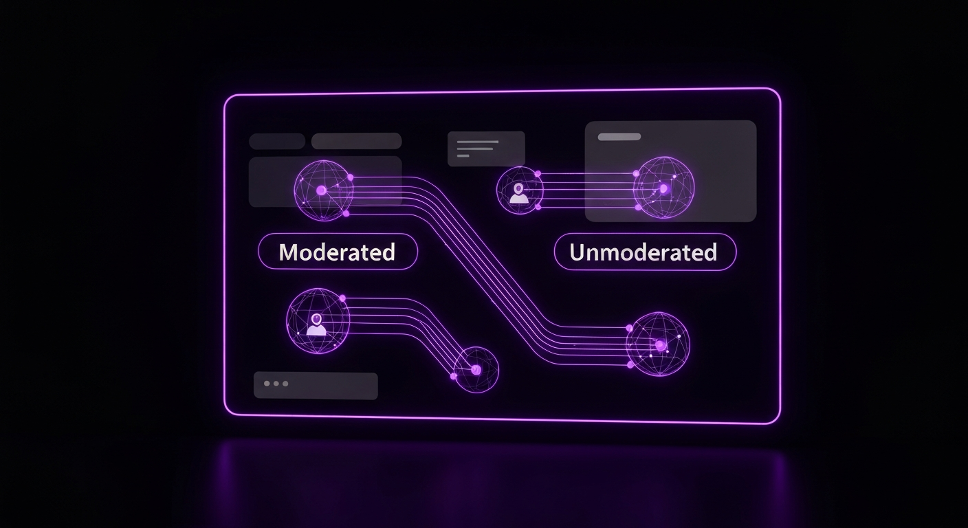
This is one of the most significant choices you’ll make. A moderated test involves a live facilitator who guides the participant, asks follow-up questions, and probes for deeper insights. An unmoderated test is automated; participants receive instructions from a software platform and complete tasks on their own while their screen and voice are recorded.
For initial discovery and diagnosing complex conversion issues, moderated testing is often the superior choice. The ability to ask “Why did you do that?” in real-time is invaluable for uncovering the root causes of user behavior. Unmoderated testing is better for validating known issues, testing simple tasks at scale, or gathering quick feedback on specific design changes.
| Factor | Moderated Testing | Unmoderated Testing |
|---|---|---|
| Depth of Insights | Very high. Ability to ask follow-up questions and probe deeper. | Lower. Relies on participants to ‘think aloud’ without prompting. |
| Flexibility | High. The moderator can adapt tasks based on user behavior. | Low. Tasks are pre-scripted and cannot be changed mid-test. |
| Time Investment | High. Requires scheduling and a facilitator’s time for each session. | Low. Can be run quickly with many users simultaneously. |
| Cost | Generally higher due to facilitator time and incentives. | Generally lower, especially at scale. |
| Best for CRO | Discovering unknown conversion barriers and complex user journeys. | Validating specific issues or gathering quick feedback on simple tasks. |
Another key decision is whether to conduct tests remotely via screen-sharing software or in person. Today, remote testing has become the default for most companies due to its significant cost and logistical advantages.
Remote testing allows you to recruit participants from any geographic location, providing access to a broader and more diverse user pool. It’s faster to set up and significantly cheaper, as there are no travel costs or facility rentals. The main advantage of in-person testing is the ability to observe body language and non-verbal cues, which can be useful but is often not essential for identifying website conversion blockers. For most CRO purposes, the benefits of remote testing far outweigh the drawbacks.
Usability testing is fundamentally a qualitative method. Its primary purpose is to collect insights, observations, and direct quotes—the stories behind the clicks. The goal is not statistical significance but rather to identify patterns of behavior and user sentiment. You are looking for themes of confusion or frustration that emerge across multiple participants.
However, you can collect some quantitative data during a usability test, including:
While these numbers can be helpful for benchmarking, the real power for CRO lies in the qualitative data. Knowing that four out of five users failed to find the shipping information is useful, but hearing all four of them say, “I never buy from a site if I can’t see shipping costs upfront” is the insight that will lead to a winning A/B test.

The insights you gather are only as good as the participants you test. Recruiting people who accurately represent your target audience is a critical step. Testing with the wrong users can lead you to solve problems that your real customers don’t have, wasting valuable time and resources.
A screener is a short survey designed to filter a large pool of potential participants down to those who match your target user persona. This is your primary tool for ensuring recruitment quality. A good screener asks questions about demographics, online behaviors, and domain knowledge relevant to your product or service.
Key principles for writing an effective screener:
For example, if you sell high-end kitchen equipment, your screener might ask about cooking habits, frequency of online purchases for home goods, and income level to ensure you’re speaking with your ideal customers.
This is a common question with a surprisingly simple answer. Research firm Nielsen Norman Group has shown that you can uncover about 85% of the most common usability problems by testing with just five users. The reasoning is that you will quickly start to see the same major issues repeated across participants. After the fifth user, you reach a point of diminishing returns where you observe the same problems repeatedly.
For Conversion Rate Optimization, running tests in small, iterative batches is highly effective. A study with 5-8 participants is usually enough to generate a solid list of high-impact problems to solve. After implementing fixes and running A/B tests, you can conduct another small study to validate the changes and uncover the next layer of issues.
You have several options for finding participants, each with its own pros and cons:

The heart of your usability test is the set of tasks you ask participants to perform. Poorly designed tasks can lead users, create bias, and prevent you from observing their natural behavior. The goal is to create realistic scenarios that prompt users to interact with your site as they would in real life, allowing their true goals and frustrations to surface.
The most common mistake in task design is telling the user exactly what to do and which UI elements to click. This turns the test into an instruction-following exercise rather than an observation of problem-solving. A good task provides a goal or motivation but doesn’t prescribe the solution.
Compare these two task instructions:
The second example gives the user a realistic scenario and a clear goal. It allows you to see how they navigate, whether they use search or browse categories, what filters they apply, and what product page information is important to their decision. This is how you uncover valuable insights about your conversion funnel.
Crafting scenarios helps immerse the participant in a realistic mindset. Here are a few examples tailored for CRO:
E-commerce Scenarios:
SaaS Scenarios:
Questionnaires bookend your test session, providing valuable context and summary feedback. A brief pre-test questionnaire, asked before the tasks begin, helps you understand the participant’s background and mindset. You might ask about their prior experience with your brand or their general comfort level with technology.
A post-test questionnaire is administered after all tasks are complete to gather overall impressions. You can ask open-ended questions like, “What was the most frustrating part of your experience today?” or include standardized questionnaires like the System Usability Scale (SUS) to get a quantitative benchmark of perceived usability.

This is where your planning pays off. During the live test session, your role as moderator is to be a neutral, encouraging guide who creates a comfortable environment for the participant to share their honest thoughts. The quality of your moderation directly impacts the quality of the insights you receive.
Effective moderation is a skill, but following a few key principles will help you succeed. Your primary job is to make the participant feel like an expert and emphasize that you are testing the website, not them.
The ‘think-aloud protocol’ is the cornerstone of usability testing. It involves asking participants to continuously verbalize their thoughts, feelings, and intentions as they perform tasks. This gives you access to the ‘why’ behind their actions. Remind them at the beginning of the session and gently prompt them if they go quiet with a simple, “What are you looking at now?” or “What’s going through your mind?”
You want to hear their internal monologue: “Okay, I’m looking for the price… I don’t see it here. That’s annoying. I guess I’ll check the main features page. Hmm, still not there. I’m getting frustrated. I expect to see the price upfront.” This kind of feedback is invaluable for CRO.
You cannot possibly remember everything that happens in a session, so recording is essential. Most video conferencing tools like Zoom, Google Meet, or Microsoft Teams have built-in recording capabilities that capture the user’s screen, face, and voice. Specialized tools like Lookback offer a more integrated experience, allowing you to timestamp notes directly onto the video recording.
It is also highly beneficial to have a dedicated note-taker join the session. This frees the moderator to focus entirely on the participant. The note-taker can capture important quotes, log user errors, and track task completion in a shared document. Using a note-taking template ensures consistency across sessions and makes the analysis phase much more efficient.

After the sessions, you’ll have hours of video recordings and pages of notes. The goal of analysis is to transform this raw, qualitative data into a clear, prioritized list of usability issues that are harming your conversion rates. A systematic approach is key to avoiding bias and focusing on the most impactful problems.
Even with a great note-taker, it’s crucial to review the recordings to catch nuances and non-verbal cues missed during the live session. A practical way to structure this is to create a spreadsheet with columns for: Participant #, Task #, Observation/Issue, Direct Quote, and Timestamp.
Go through each recording and log every instance where a user struggled, expressed confusion, or encountered an error. Be specific. Instead of writing “user was confused by navigation,” write “User tried to find ‘Contact Us’ in the footer, but it was only in the main header, causing 30 seconds of searching.” This level of detail is vital for understanding the problem’s context.
Once you’ve logged observations from all participants, synthesize the data to find patterns. This is where individual anecdotes become powerful evidence. Sort or group your spreadsheet by task or issue type and look for problems encountered by multiple participants. Pay close attention to any issue that affected three or more of your five to eight participants, as these recurring themes are your most significant usability problems.
For example, you might find that four out of five users hesitated on the shipping page, all mentioning they were looking for an estimated delivery date before proceeding. This is no longer a single user’s opinion; it’s a clear pattern of behavior indicating a significant conversion barrier related to user uncertainty.
Not all usability issues are created equal. A typo is a minor annoyance; a broken “Add to Cart” button is a critical conversion blocker. To help prioritize, categorize each identified issue by its severity using a simple scale:
This prioritization framework helps you focus development and testing resources on the problems that will have the biggest impact on your conversion rate.

The final and most crucial step is to bridge the gap between your research findings and your CRO program. Insights from your usability test are the fuel for creating powerful, evidence-based A/B test hypotheses. This is how you turn user frustration into measurable business growth.
With a prioritized list of usability issues, you can use a simple 2×2 matrix to decide what to tackle first. Plot each issue on a chart with two axes: Potential Conversion Impact (Low to High) and Implementation Effort (Low to High). The ideal candidates for your next A/B tests are in the top-left quadrant: High-Impact, Low-Effort. These are the quick wins that can deliver significant results with minimal development resources.
Issues that are High-Impact but High-Effort should be planned as larger projects. Low-Impact issues can be added to the backlog. This matrix provides a clear, strategic roadmap for your optimization efforts.
A strong hypothesis is the foundation of a good A/B test. It should be clear, testable, and rooted in a specific user insight. A widely used format is:
“Based on [this qualitative insight], we believe that [making this change] for [this audience] will result in [this measurable outcome] because [this reason].”
Let’s apply this format to our previous finding:
This hypothesis is powerful because it connects a specific change to an observed problem and a measurable KPI, while also explaining the psychological reason why the change is expected to work.
Your usability test provides the blueprint for your test variation (the ‘Challenger’). The insights tell you exactly what to design. If users said your value proposition was unclear, your variation will test new, clearer copy. If users couldn’t find the call-to-action button, your variation will test a more prominent design or placement. If users complained about too many form fields, your variation will test a shorter, streamlined form.
By grounding your A/B testing strategy in the real-world problems of your users, you move away from random guessing and toward a systematic process of identifying barriers, creating targeted solutions, and validating their impact. This is the essence of a mature and successful Conversion Rate Optimization program.

While you can conduct usability tests with just a video conferencing app and a spreadsheet, several tools can streamline the process of recruiting, testing, and analysis. The right tool depends on your budget, team size, and chosen testing method.
These platforms provide a complete solution, including access to a large panel of testers, tools for building screeners and unmoderated tests, and features for analyzing and sharing video feedback. Platforms like UserTesting are an industry standard for enterprise teams, while others like Maze and Lyssna are excellent for rapid, unmoderated testing of prototypes and live sites, often integrating directly into design workflows.
For conducting live, moderated interviews, you need a reliable screen-sharing and recording tool. While standard video conferencing software like Zoom or Google Meet works perfectly well, specialized tools like Lookback are built for user research. Lookback offers features like timestamped notes, a virtual observation room for stakeholders, and tools to create and share highlight reels, which can significantly speed up analysis.
You don’t need an enterprise budget to get started. A DIY approach can be incredibly effective. Use your own email list or social media channels to recruit participants, offering a small gift card as an incentive. For the sessions, a free Google Meet or Zoom account can handle screen sharing and recording. For analysis, a simple Google Sheets template is all you need to log observations and identify patterns. The most important thing is to start talking to users; the tools are secondary to the process.

The most significant mistake is treating usability testing as a one-time project. For a truly effective CRO program, usability testing must be an ongoing, integrated part of your workflow. It’s a continuous cycle: analytics tells you where to look, usability testing tells you why there’s a problem, and A/B testing validates your proposed solution. The results of that A/B test then feed back into your analytics, highlighting the next area for investigation.
Consider establishing a regular cadence for testing, such as running a small study on a key conversion funnel each quarter. Conduct tests before launching any major new feature or redesign to catch issues before they impact all your users. By making direct user feedback a consistent input into your optimization strategy, you create a powerful competitive advantage. You will build a deeper understanding of your customers, allowing you to create experiences that not only convert better but also build long-term loyalty and trust.

Usability testing is a qualitative method used to understand *why* users struggle by observing their behavior. A/B testing is a quantitative method that compares two versions of a page to see *which* one performs better against a specific goal. In short, usability testing finds the problem, and A/B testing validates the solution.
According to research by the Nielsen Norman Group, testing with just 5 users is often enough to uncover about 85% of the most common usability problems. For CRO, it’s effective to run tests in small, iterative batches.
Costs vary widely, from nearly free (a DIY approach using existing customers) to thousands of dollars. Using platforms to recruit specific demographics typically costs $50-$150 per participant, plus platform fees.
Yes. While a UX professional adds significant value, the basic principles of defining a goal, writing a task, and observing a user are accessible to anyone. Starting small is better than not testing at all.
Common barriers include confusing navigation, an unclear value proposition, a complicated checkout process, unexpected fees or shipping costs, technical bugs, and a poor mobile experience.
For an effective CRO program, usability testing should be a continuous process. A good practice is to run small tests before launching new features, after a site redesign, or on a quarterly basis to analyze key conversion funnels.