


In modern marketing, data is essential for success. Every click, conversion, and customer interaction generates information, but raw data alone isn’t enough to guide strategy. To navigate this complex landscape and drive growth, you need a well-designed marketing dashboard. A powerful dashboard transforms raw data into a clear, actionable story, enabling you to make smarter, faster decisions. It shifts your team from reactive reporting to proactive, data-driven strategy.
However, building a dashboard that truly drives growth is both an art and a science. It’s easy to create a cluttered collection of charts that obscures rather than reveals the truth. The difference between a dashboard that gathers digital dust and one that becomes your marketing command center lies in a strategic approach grounded in best practices. This guide will walk you through defining your purpose, selecting the right KPIs, designing for clarity, and turning insights into action. Let’s build a dashboard that doesn’t just report on the past, but helps you shape the future.
In today’s fast-paced digital environment, marketing dashboards are more than just reporting tools; they are strategic assets that provide a centralized, real-time view of your marketing engine’s performance. The days of waiting for a monthly report to understand past performance are over. Modern marketing requires agility, and dashboards provide the at-a-glance intelligence needed to pivot strategies, reallocate budgets, and capitalize on opportunities as they arise.
First, dashboards foster a culture of data-driven decision-making. By democratizing access to performance data, they empower every team member, from the CMO to the channel specialist, to make informed choices based on evidence rather than intuition. This aligns the entire organization around a single source of truth. When the team shares the same KPIs, conversations shift from debating data accuracy to strategizing on how to improve results. This shared understanding promotes accountability and ensures all marketing activities are tied to overarching business objectives.
Furthermore, a consolidated dashboard provides a holistic view of the entire marketing funnel. Marketers often operate in silos with separate tools for social media, email, SEO, and paid advertising. A dashboard breaks down these silos by integrating data from disparate sources like Google Analytics, CRM platforms, and ad networks. This unified view allows you to see how different channels interact and contribute to the customer journey. You can track a user’s path from a social media ad to a final website conversion, helping you optimize the entire experience and calculate a more accurate Return on Investment (ROI). By clearly visualizing what works and what doesn’t, dashboards enable you to invest more in high-performing channels and reduce inefficient spending.

Before connecting a single data source or choosing a chart, you must define the dashboard’s strategic foundation. A dashboard built without a clear purpose is merely a collection of data points destined to be ignored. To create a valuable tool, begin with the end in mind: What questions must this answer, who will use it, and what decisions will it inform? This foundational work ensures every element on your dashboard serves a specific, strategic function.
The first question to ask is, “Who is this for?” The needs of a Chief Marketing Officer (CMO) are vastly different from those of a PPC Campaign Manager. A dashboard designed for everyone is useful to no one. You must tailor the content and level of detail to the specific audience.
Creating simple personas for your dashboard users is a valuable exercise. Understand their role, primary goals, and the key decisions they make. This will guide every choice you make in the building process.
A marketing dashboard should not exist in a vacuum; it must directly reflect broader business goals. If the company’s primary objective is to increase enterprise sales, a dashboard focused solely on social media likes is misaligned. The KPIs you display must connect day-to-day marketing activities to the company’s strategic priorities. For example, if the business objective is to expand into a new market, the dashboard should track brand awareness in that region, leads from the target geography, and conversion rates for localized campaigns. This alignment ensures the dashboard is a navigational tool, keeping the team focused on what truly matters to the business.
To crystallize your dashboard’s purpose, have stakeholders answer a series of probing questions before you start. The answers will form your dashboard’s blueprint.
Dedicating time to this strategic planning phase is the best investment you can make. It prevents you from building a visually appealing but strategically useless dashboard and ensures you create a powerful tool for decision-making.

Once you have a clear purpose and audience, the next step is to select the data that will populate your dashboard. Many marketers go wrong here by tracking too much information or focusing on the wrong things. The key is to choose a focused set of Key Performance Indicators (KPIs) that directly measure progress toward your goals. These KPIs are the vital signs of your marketing health; they tell you at a glance whether you are succeeding.
It’s crucial to understand the distinction between a metric and a KPI. A metric is any quantifiable measure, such as website traffic, email open rates, or Twitter followers. A Key Performance Indicator (KPI) is a specific metric tied directly to a strategic business objective. It measures performance against a critical goal.
Think of it this way: all KPIs are metrics, but not all metrics are KPIs. The number of visitors to your blog is a metric. The conversion rate of blog readers into demo requests is a KPI because it connects a marketing activity (blogging) to a business objective (generating qualified leads). Your dashboard should be built around a handful of true KPIs, supported by a secondary layer of diagnostic metrics that provide context.
The right KPIs vary depending on your business model and marketing channels. A B2B SaaS company will prioritize different KPIs than a B2C e-commerce brand. The table below illustrates potential KPIs for common marketing channels.
| Channel | Primary KPIs | Supporting Metrics |
|---|---|---|
| Search Engine Optimization (SEO) | Conversion Rate from Organic Traffic, Number of Marketing Qualified Leads (MQLs) from Organic, Organic Revenue | Organic Sessions, Keyword Rankings, Bounce Rate, Backlinks Acquired |
| Pay-Per-Click (PPC) Advertising | Return on Ad Spend (ROAS), Cost Per Acquisition (CPA), Lead-to-Customer Rate | Click-Through Rate (CTR), Cost Per Click (CPC), Quality Score, Impression Share |
| Content Marketing | Lead Generation Rate, Asset Downloads, Time on Page, Subscriber Growth | Page Views, Unique Visitors, Social Shares, Comments |
| Email Marketing | Conversion Rate, Revenue per Email Sent, Lead Nurturing Success Rate | Open Rate, Click-Through Rate (CTR), Unsubscribe Rate, List Growth Rate |
| Social Media Marketing | Conversions from Social Channels, Leads Generated, Social Media ROI | Engagement Rate (Likes, Comments, Shares), Reach, Follower Growth, Website Clicks |
One of the biggest dangers in performance measurement is the allure of vanity metrics. These are metrics that are easy to measure and often look impressive but fail to correlate with business outcomes. Examples include social media likes, page views, and follower counts. While not entirely useless, they can be misleading if treated as primary indicators of success.
A million page views mean nothing if none of those visitors convert. Ten thousand new followers are irrelevant if they are not part of your target audience and never become customers. Vanity metrics create a false sense of accomplishment and can lead to poor strategic decisions. To avoid this trap, constantly ask of every metric: “Does this number help me make a decision that will improve our business results?” If the answer is no, it’s likely a vanity metric and should not be a central focus of your dashboard. Focus instead on actionable metrics that reflect the health of your marketing funnel, such as conversion rates, customer acquisition cost, and lifetime value.

An effective marketing dashboard acts as a centralized hub, pulling data from multiple, often disconnected, sources. The technical challenge of data integration is a critical step. Choosing the right tools and connecting your data sources correctly will determine the reliability, accuracy, and scalability of your dashboard. This step bridges the gap between your strategic plan and a functional, automated visualization.
A modern marketing stack is complex, with data spread across a dozen or more platforms. A key function of a dashboard is to unify this fragmented data landscape. Common sources you’ll need to connect include:
Numerous Business Intelligence (BI) and data visualization tools are available, each with its own strengths. The right choice depends on your budget, technical expertise, and specific needs.
| Tool | Best For | Key Features | Pricing Model |
|---|---|---|---|
| Google Looker Studio | Beginners, small to mid-sized businesses, and those heavily invested in the Google ecosystem. | Free to use, user-friendly interface, seamless integration with Google products (Analytics, Ads, Sheets). | Free |
| Tableau | Data analysts, enterprise-level companies, and users needing complex, highly customized visualizations. | Extremely powerful and flexible, supports complex data modeling, advanced analytics features. | Subscription-based, per user |
| Microsoft Power BI | Organizations that use the Microsoft suite (Azure, Office 365, etc.). | Strong integration with Microsoft products, robust data preparation and modeling capabilities. | Free version available, tiered subscription for pro features |
| Databox / Klipfolio | Marketing agencies and teams looking for quick setup and pre-built templates. | Hundreds of native integrations, drag-and-drop builder, pre-configured report templates. | Subscription-based, tiered by features and users |
When connecting data sources to your dashboard tool, you’ll encounter two primary methods: native integrations and APIs.
For most marketers, starting with a tool that offers a wide range of native integrations is the most efficient path. This allows you to consolidate your most important data sources quickly and focus on visualization and analysis.

Once your data is flowing into your chosen tool, the next challenge is to present it clearly and intuitively. Effective data visualization is not about creating flashy charts; it’s about communicating information as efficiently as possible. A well-designed dashboard guides the user’s attention to the most important information and makes it easy to spot trends, patterns, and anomalies.
Selecting the appropriate chart type is fundamental to clear communication. Each chart has a specific purpose, and using the wrong one can obscure meaning.
The layout of your dashboard should follow a logical structure that tells a story. A cluttered or disorganized dashboard creates cognitive friction.
Color is a powerful tool in data visualization but should be used with purpose, not just for decoration.

This section provides a simplified walkthrough of how to build a basic marketing performance dashboard using Google Looker Studio, a free and powerful tool. We will connect to a Google Analytics data source to create a high-level website performance overview.
Step 1: Connect to Your Data
Open Google Looker Studio and click “Blank Report.” You will be prompted to add a data source. Select the “Google Analytics” connector, authorize access to your Google account, and choose the specific Analytics Account, Property, and View you want to use. Click “Add” to connect it to your report.
Step 2: Set Up Your Canvas and Add a Title
On the blank canvas, use the “Text” tool to add a clear title at the top, such as “Website Performance Overview.” Next, add a “Date range control” from the toolbar. This crucial element allows users to filter the entire dashboard to a specific time period (e.g., Last 30 Days, This Quarter).
Step 3: Add High-Level KPIs with Scorecards
Scorecards are perfect for displaying your most important metrics. From the menu, select “Add a chart” and choose “Scorecard.” Place it in the top-left corner. In the properties panel on the right, under “Metric,” search for and select “Users.” Repeat this process to create three more scorecards for “Sessions,” “Bounce Rate,” and “Goal Completions.”
Step 4: Visualize Trends with a Time Series Chart
To see how your traffic is trending, add a line chart. Go to “Add a chart” and select “Time series chart.” Place it below your scorecards. The dimension will default to “Date.” Set the primary metric to “Users.” This chart will visually represent your user traffic day-by-day for the selected date range, making it easy to spot performance spikes or dips.
Step 5: Break Down Data with a Pie Chart and a Table
To understand where your traffic is coming from, add a pie chart (“Add a chart” > “Pie chart”). In the properties panel, set the “Dimension” to “Default Channel Grouping” and the “Metric” to “Users.” To see which content is performing best, add a table (“Add a chart” > “Table”). Set the “Dimension” to “Page title” and add metrics like “Users,” “Average Time on Page,” and “Bounce Rate.” This table will show your most popular pages and how engaged users are with them.
Step 6: Arrange, Style, and Share
Arrange your charts logically on the canvas: high-level KPIs at the top, trends in the middle, and breakdowns at the bottom. Use the styling options in the right-hand panel to adjust colors and fonts. Once you are satisfied, click the “Share” button to give stakeholders access, either via a direct link or a recurring email.
This simple dashboard now provides a powerful, at-a-glance view of your website’s health, answering key questions about who is visiting, how they are finding you, and what they are doing on your site.

Creating an accurate dashboard is only half the battle. Its true value is realized when it is actively used to inform strategy and drive action. A dashboard should be a catalyst for conversation and decision-making, not a static report. To bridge the gap between data and decisions, you must build processes and a culture around analytical thinking.
Numbers on their own are meaningless without context and interpretation. Your role as a marketer is to use the dashboard to tell a coherent story. Don’t just state the “what”; explain the “why” and propose the “what next.” For example, instead of saying, “Organic traffic is down 15% this month,” tell a story: “We’ve observed a 15% decline in organic traffic (the what), which coincides with a recent search algorithm update (the why). This suggests our key product pages may no longer align with search intent. I propose we conduct a content audit of these pages and prioritize updates (the what next).” This narrative approach transforms data into a compelling case for action.
A dashboard that isn’t regularly reviewed is a wasted resource. Integrate the dashboard into your team’s workflows and meetings to make it a central part of your operational rhythm. Establish a clear cadence for review:
By making dashboard review a recurring agenda item, you create accountability and ensure that data consistently guides strategy.
The ultimate goal of a dashboard is to spark action. Every insight should lead to a tangible next step. A simple but effective framework for this is: Insight -> Hypothesis -> Action -> Measurement.
Consider this example:
This structured approach ensures that insights are systematically tested and implemented to drive continuous improvement.
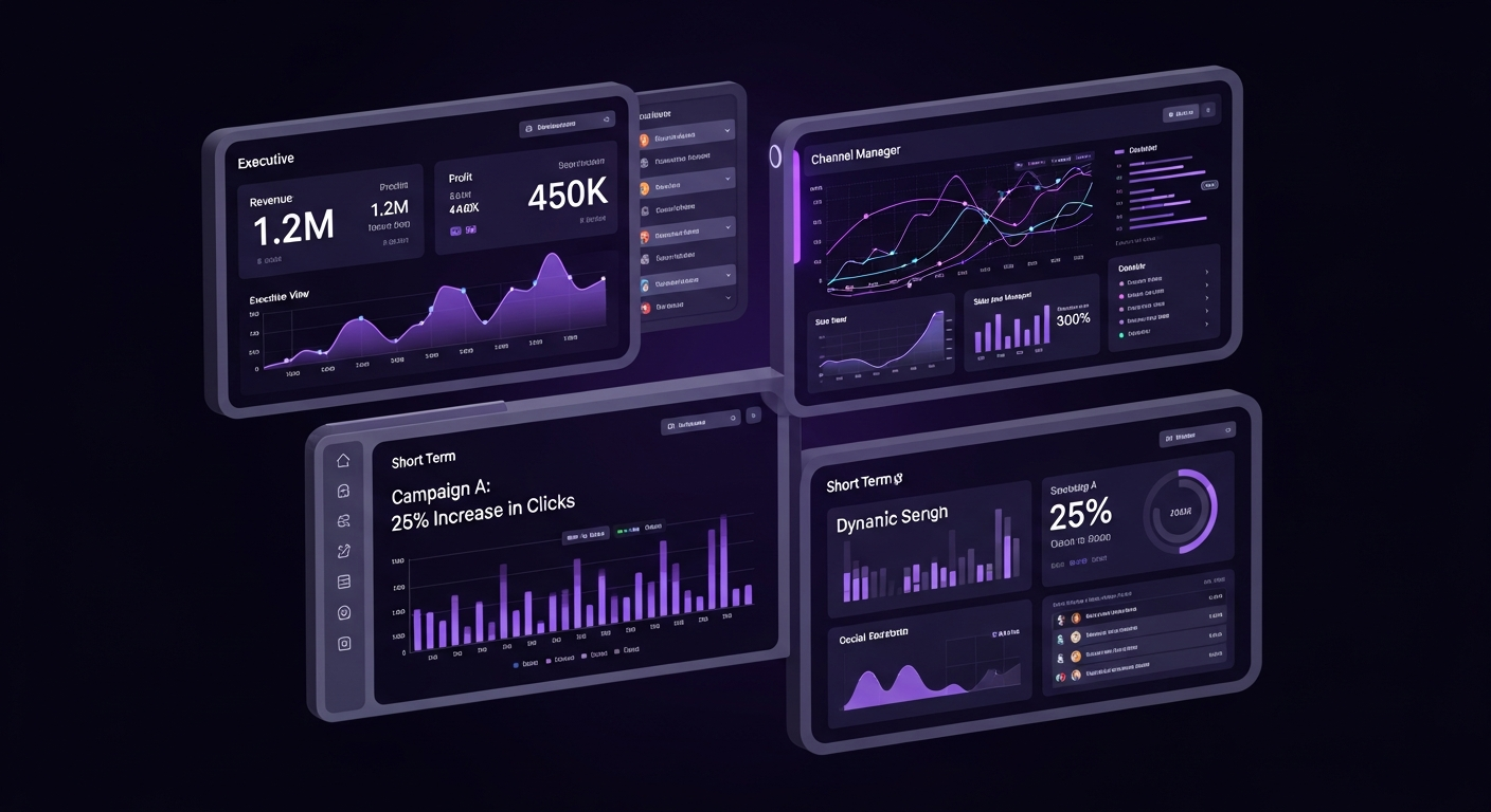
A one-size-fits-all approach to dashboard design is ineffective. To maximize adoption, you must create tailored views that provide the right information at the right level of detail for each audience. A well-structured strategy involves creating multiple, interconnected dashboards, each designed for a particular role or purpose. This ensures every stakeholder can quickly access relevant data without distraction.
The executive dashboard is designed for a 30,000-foot view of marketing’s health and business impact. The CMO needs to know if the marketing department is generating a positive ROI and contributing to company growth.
A channel manager for SEO, PPC, or social media needs a dashboard with deep, tactical insights into their specific domain. This dashboard is a daily tool for optimization and performance monitoring, providing granular data to diagnose problems and identify opportunities.
For major marketing initiatives like a product launch or a holiday promotion, a dedicated, temporary dashboard is the best approach. This dashboard consolidates all data related to that specific campaign, providing a single source of truth for its performance across all channels.

A dashboard is only as valuable as the data it contains. If stakeholders lose trust in the numbers, the dashboard becomes useless. The principle of “garbage in, garbage out” is critical in data visualization. Ensuring data integrity is an ongoing process of validation, documentation, and maintenance.
First, implement regular data audits. On a scheduled basis, cross-reference the data in your dashboard with the source platforms. For example, check if the total ad spend shown in your dashboard matches the total reported within the Google Ads platform. Significant variances can indicate a broken data connection or a misconfigured metric. Finding and fixing these issues promptly is crucial for maintaining trust.
Clear documentation is another pillar of data integrity. Create a data dictionary that defines each KPI on your dashboard. This document should specify what the metric measures, where the data comes from, and how it is calculated. This prevents ambiguity and ensures everyone interprets the data the same way. This practice promotes consistency and makes your dashboards easier for all stakeholders to use and understand.

Building an effective dashboard involves navigating potential mistakes. Being aware of these common pitfalls can help you create a truly valuable tool. One of the most frequent errors is information overload, where a dashboard is crammed with dozens of charts and metrics. This approach overwhelms the user and hides key insights in a sea of noise. The best dashboards are focused and minimalist, highlighting only the most critical KPIs.
Another major pitfall is an over-reliance on vanity metrics. As discussed earlier, focusing on numbers like page views or social media followers that don’t directly correlate with business success can create a misleading picture of performance. Always prioritize actionable metrics tied to business objectives. Similarly, poor data visualization choices can undermine your dashboard’s effectiveness. Using a pie chart with too many slices or choosing low-contrast colors can make data difficult to interpret. Stick to simple, clear chart types that best represent your data.
Finally, a critical mistake is the “set it and forget it” mentality. A dashboard is not a static project. Your business goals, marketing strategies, and data sources will evolve. Your dashboard must evolve with them. Treat your dashboard as a living product that requires regular review, user feedback, and iteration to remain relevant and useful.

The world of data analytics is constantly evolving, and marketing dashboards are on the cusp of a major transformation driven by Artificial Intelligence (AI) and machine learning. The future of dashboards is not just about reporting what has happened, but about predicting what will happen next and prescribing the best course of action. This shift from reactive to predictive intelligence will make dashboards even more powerful.
One of the most exciting developments is the rise of AI-powered insights. Modern BI tools are beginning to incorporate algorithms that automatically scan your data for anomalies, trends, and correlations a human might miss. Instead of you having to find the insight, the dashboard can surface it for you with notifications like, “Your conversion rate from mobile users in the UK has dropped 30% this week compared to the average.” This saves time and helps you address issues more quickly.
Predictive analytics takes this a step further. By analyzing historical data, future dashboards will be able to forecast outcomes. For example, your dashboard could project your end-of-quarter revenue based on current lead flow and conversion rates, telling you, “At your current pace, you are projected to reach 92% of your sales target.” This allows you to make proactive adjustments. Furthermore, the integration of Natural Language Processing (NLP) will change how we interact with data. Instead of filtering charts, you will be able to ask your dashboard questions in plain English, such as, “Show me my top-performing ad campaigns by ROAS in the last 60 days,” making data analysis more accessible to everyone.

The most important metrics depend on your business goals but typically include KPIs that measure business impact, such as Customer Acquisition Cost (CAC), Return on Ad Spend (ROAS), Conversion Rate, Customer Lifetime Value (CLV), and Lead-to-Customer Rate.
A marketing dashboard is a dynamic visualization tool for monitoring real-time performance at a glance, focusing on current progress against goals. A report is a static document that provides a deep, comprehensive analysis of performance over a specific period, such as a month or quarter.
This varies by role. Channel managers might check daily to monitor active campaigns, while marketing leaders might review weekly or bi-weekly to track progress against strategic goals.
Popular tools include Google Looker Studio for its ease of use and Google integrations, Tableau for advanced and complex visualizations, and specialized platforms like Databox or Klipfolio for pre-built templates and numerous native integrations.
To make a dashboard actionable, focus on KPIs tied to business objectives, add context to explain trends, segment data to uncover specific opportunities, and establish a regular meeting cadence to discuss findings and plan next steps.