


In a digital landscape saturated with content, the battle for user attention is fiercer than ever. Traditional, static landing pages—consisting of a headline, a block of text, and a form—are often no longer enough to capture interest. This is where interactive landing pages come in, transforming passive visitors into active participants. Instead of simply reading, users are invited to click, calculate, and engage. This two-way conversation is more than a novelty; it’s a strategic component of modern marketing.
An interactive landing page is a standalone web page, designed for a specific campaign, that uses elements requiring user input to provide a personalized result or experience. This could be a quiz that recommends a product, a calculator that estimates cost savings, or a poll that reveals how a user’s opinion compares to others. The core principle is a value exchange: the user provides information or attention and, in return, receives immediate, personalized, and valuable feedback. This fundamentally changes the dynamic from a sales pitch to a helpful consultation.
Traditionally, Conversion Rate Optimization (CRO) has focused on tweaking elements like button colors, headline copy, and form field lengths. While these details remain important, they operate within a passive framework where the user’s only role is to consume information and decide whether to convert. Static pages talk *at* the visitor.
Interactive landing pages, however, talk *with* the visitor. They break the conversion process into smaller, more manageable steps. Instead of facing a daunting 10-field form, a user might answer a series of simple, engaging questions one at a time. This approach, often called the “breadcrumb technique,” reduces friction and builds momentum. Each small interaction is a micro-commitment, making the user more invested in the process and more likely to complete the final Call-to-Action (CTA), such as submitting their email to see their results.
The high performance of interactive landing pages isn’t magic; it’s rooted in fundamental human psychology. Several principles work together to make these experiences compelling and effective.
Data indicates that shifting from static to interactive content can yield significant returns. While specific numbers vary by industry and execution, the overall trends are clear and compelling.
These statistics paint a clear picture: in 2024, interactivity is no longer a “nice-to-have.” It is a core component of a high-performing landing page strategy that drives user engagement, improves lead quality, and ultimately, boosts your bottom line.
The beauty of interactive content is its versatility. You can choose from a wide array of elements to match your campaign goals and audience preferences. The most effective interactive pages use these elements not as gimmicks, but as tools to deliver genuine value. Here are some of the most powerful and popular interactive components.
Quizzes are one of the most popular forms of interactive content, tapping directly into our desire for self-discovery and benchmarking. A well-designed quiz asks a series of questions to better understand a user’s needs or knowledge level, then provides a personalized result or recommendation. For marketers, quizzes are a powerful tool for lead generation and segmentation, as you can categorize leads based on their answers for highly targeted follow-up marketing.
Example: A skincare brand uses a “What’s Your Skin Type?” quiz to recommend a specific product line and segment new leads for personalized email campaigns.
Calculators provide immediate, tangible, and often financial, value. They help users answer complex questions like, “How much can I save?” or “What will my return on investment be?” By turning an abstract benefit into a concrete number, calculators make your value proposition incredibly compelling. They are particularly effective in B2B marketing, where purchasing decisions are heavily scrutinized for ROI, but they also work well in finance, real estate, and other B2C sectors.
Example: A mortgage lender provides a calculator that helps potential homebuyers estimate their monthly payments, pre-qualifying them and capturing their information in the process.
Polls and surveys make your audience feel heard and valued. They are excellent tools for gathering market research, understanding customer pain points, and co-creating content. The interactive element comes from showing the user how their response stacks up against others in real-time. This social comparison is highly engaging and provides valuable context. While not always direct lead generation tools, they are fantastic for building community and gathering insights for future campaigns.
Example: A software company runs a poll on its landing page asking, “What’s your biggest project management challenge?” and uses the data to create a relevant webinar, for which participants can then register.
While infographics are great for simplifying complex information, they can still be a passive experience. Interactive infographics take this a step further by allowing users to click, hover, and filter data to explore what is most relevant to them. This approach is ideal for presenting research reports, industry trends, or complex processes in a digestible and memorable way. Users spend more time engaging with the content, leading to better brand recall and a deeper understanding of the subject matter.
Example: A non-profit organization creates an interactive map showing its global impact, allowing visitors to click on different regions to see specific projects and statistics.
Gamification applies game-like mechanics—such as points, badges, leaderboards, and rewards—to non-game contexts to increase user motivation and engagement. A landing page could feature a spin-to-win wheel for a discount, a leaderboard for a contest, or a short challenge to unlock exclusive content. These elements tap into our competitive nature and desire for reward, making the conversion process fun and exciting. They are especially effective for e-commerce and B2C campaigns aiming to drive immediate sales or social sharing.
Example: An online retailer runs a contest where users answer trivia about the brand for a chance to win a prize, collecting leads and boosting social media engagement simultaneously.
Before you write a single line of code or choose a template, a successful interactive landing page begins with a solid strategy. The interactive element should not be an afterthought; it must be intrinsically linked to your campaign’s objective and your audience’s needs. A well-planned strategy ensures that your interactive page is not just engaging, but also effective at driving business results.
What do you want to achieve with this landing page? Your primary goal will dictate every subsequent decision. Be specific. Instead of “get more leads,” aim for “generate 500 marketing-qualified leads (MQLs) from mid-sized tech companies this quarter.”
Your interactive element must solve a problem or answer a pressing question for your audience. What are they struggling with? What information do they need to make a decision? Conduct audience research through surveys, customer interviews, and discussions with your sales team. If your audience is struggling to justify the cost of your software, an ROI calculator is a perfect fit. If they are overwhelmed by product choices, a recommendation quiz will provide clarity.
Think through the entire user experience from start to finish. What is the first thing a user sees? What is the first question they answer? How do they progress through the experience? What happens after they submit their information? Visualize this flow to identify potential points of friction. The journey should feel logical, seamless, and progressively more engaging. The goal is to build momentum, not create obstacles. For example, ask easy, low-commitment questions first before moving to more personal ones.
With your goals and audience insights in hand, you can select the most appropriate interactive tool. The key is alignment. A fun, gamified contest might not be suitable for a serious B2B financial services campaign, where a detailed ROI calculator would be far more effective. The right element feels like a natural extension of your brand’s conversation with the customer.
| Campaign Goal | Recommended Interactive Element | Why It Works |
|---|---|---|
| Generate High-Quality B2B Leads | ROI Calculator or Assessment | Provides tangible, data-driven value that decision-makers need. Qualifies leads based on their input. |
| Drive E-commerce Sales | Product Recommendation Quiz | Simplifies choice, provides a personalized shopping experience, and leads directly to product pages. |
| Increase Brand Engagement | Polls or Gamified Contest | Encourages participation and social sharing, making the brand more memorable and fun. |
| Educate Your Audience | Interactive Infographic or Demo | Breaks down complex information into an engaging, self-paced learning experience. |
| Segment Your Email List | Survey or Multi-Path Quiz | Categorizes users based on their needs, goals, or preferences for hyper-targeted nurturing. |

Once your strategy is set, the next step is to translate it into a functional and visually appealing design. The User Experience (UX) of an interactive landing page is paramount. If the experience is confusing, slow, or frustrating, even the most brilliant concept will fail. The design must guide the user seamlessly through the interaction, making it feel effortless and rewarding.
Before beginning a high-fidelity design, start with a wireframe. A wireframe is a basic visual blueprint that outlines the page’s structure and the flow of the interactive element. Focus on the sequence of events: What is the first screen the user sees? When do you ask the first question? Where does the progress bar go? How are the results displayed? Wireframing allows you to map out the user journey and identify potential UX issues early, saving significant time and resources later. It forces you to think about logic and flow without the distraction of colors and fonts.
Your design should make it immediately obvious what the user needs to do next. This is achieved through strong visual hierarchy and intuitive navigation. The most important element on the page—the headline or the first interactive question—should be the most visually prominent. Use size, color, contrast, and whitespace to draw the eye and guide the user’s path. Buttons should look clickable, progress should be clearly indicated, and there should be no ambiguity about how to move from one step to the next. The goal is to eliminate cognitive load, allowing the user to focus on the interaction itself, not on figuring out the interface.
Your headline is the first thing a visitor reads, and its job is to convince them that participating in your interactive experience is worth their time. It must clearly communicate the benefit. Instead of a generic headline like “Take Our Quiz,” use a value-driven one like, “Find Your Perfect Marketing Software in 60 Seconds.” Your value proposition should answer the user’s implicit question: “What’s in it for me?” The promise of a personalized, valuable outcome is the hook that draws them into the experience.
A significant portion—often the majority—of web traffic comes from mobile devices. Therefore, designing for mobile is not optional; it is essential. An interactive experience that works perfectly on a desktop can be clunky and unusable on a smartphone. Adopt a mobile-first design approach: design the experience for the smallest screen first, then adapt it for larger screens. This ensures the core experience is optimized for all users. Pay close attention to tap targets, font sizes, and the layout of questions to ensure a smooth experience on any device.
With a solid plan and design in place, it’s time to bring your interactive landing page to life. You don’t need to be a developer to create sophisticated interactive experiences. A wide range of tools is available to suit different needs, skill levels, and budgets. The key is to choose a platform that aligns with your specific requirements for interactivity, integration, and scalability.
Modern landing page builders like Unbounce and Instapage have democratized web page creation. They offer drag-and-drop interfaces that allow marketers to build and launch beautiful, mobile-responsive pages without writing any code. While their primary strength is in creating static pages, many are expanding their capabilities to include simple interactive elements like multi-step forms and pop-ups. They are an excellent choice for campaigns where the interactivity is relatively straightforward and you need to launch quickly.
For more advanced interactive experiences, specialized platforms are the way to go. Tools like Outgrow, involve.me, and Ceros are built specifically for creating quizzes, calculators, assessments, and interactive infographics. They offer vast libraries of templates, advanced logic capabilities like conditional questions, and powerful analytics to track user engagement. These platforms are designed to handle the complexities of interactive content, making them ideal for marketers serious about incorporating interactivity into their strategy.
While no-code tools cover most use cases, there are times when a custom-built solution is necessary. If you require a highly unique user experience, deep integration with proprietary backend systems, or have specific branding and performance requirements that off-the-shelf tools cannot meet, custom development is the best option. This approach offers unlimited flexibility but comes with a significantly higher cost and longer development time. It is typically reserved for enterprise-level campaigns or core business functions where the investment is justified.
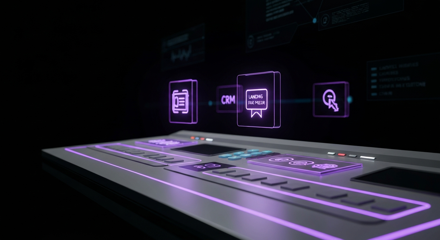
An interactive landing page that doesn’t pass data to your other marketing systems is a missed opportunity. Your chosen tool must integrate seamlessly with your Customer Relationship Management (CRM) system (like Salesforce or HubSpot) and your marketing automation platform (like Marketo or ActiveCampaign). This integration is crucial for automating lead nurturing. When a user completes your quiz, their contact information and answers should be automatically sent to your CRM, allowing you to trigger personalized follow-up sequences based on their specific needs.
| Tool Category | Best For | Pros | Cons |
|---|---|---|---|
| No-Code Builders (Unbounce) | Quickly launching campaigns with simple interactivity. | Easy to use, fast to deploy, great for A/B testing. | Limited advanced interactive features. |
| Specialized Platforms (Outgrow) | Marketers focused on rich interactive content like quizzes and calculators. | Powerful features, robust templates, detailed analytics. | Can be more expensive, another tool to learn. |
| Custom Development | Unique, enterprise-level experiences with complex requirements. | Unlimited flexibility and customization, seamless branding. | High cost, long development time, requires technical expertise. |

The design and functionality of your interactive landing page create the structure, but the copy breathes life into the experience. Writing for an interactive page is different from writing for a static one. It requires a more conversational, guiding tone. Every word, from the headline to the button text, plays a critical role in encouraging participation and leading the user toward conversion.
Your CTAs are the signposts that tell users what to do next. They must be clear, concise, and compelling. Instead of generic commands like “Submit” or “Click Here,” use action-oriented and value-focused language. For a quiz, a CTA like “Start the Quiz” can be improved to “Find My Personalized Plan.” The final CTA before the lead capture is the most critical. Instead of “Get Your Results,” try “See My ROI Calculation” or “Reveal My Skincare Matches.” This frames the lead form not as a barrier, but as the final, exciting step to receiving the promised value.
An interactive landing page is a dialogue. Your copy should reflect this by being conversational, friendly, and human. Write as if you’re speaking directly to the user, using “you” and “your” to make it personal. Ask questions in a natural way. The tone should align with your brand voice but lean towards being a helpful guide rather than a formal broadcaster. This approach builds rapport and makes the user feel comfortable sharing their information.
Microcopy refers to the small bits of text that guide users through an interface—button labels, error messages, tooltips, and placeholder text in form fields. While small, its impact on User Experience (UX) is huge. Good microcopy reassures users, clarifies instructions, and prevents confusion. For example, a small line of text under an email field that says, “We’ll email your personalized report here,” can significantly increase form completions by explaining *why* you need their email. Well-written error messages can turn a moment of frustration into a helpful correction (e.g., “Oops! That email doesn’t look right. Please check for typos.”).
The ultimate power of interactive copy lies in personalization. Use the data the user provides *during* the experience to tailor the subsequent copy. This technique is often known as “piping.” For instance, if a user selects “Marketing Manager” as their role in question one, question two could read, “Great! Now, what’s the biggest challenge for Marketing Managers like you?” This simple act of recalling a user’s previous answer makes the experience feel incredibly personal and dynamic. The final results page is the pinnacle of this strategy, where you can present a completely customized message based on all of their input.
Theory is important, but seeing real-world examples can provide the inspiration and clarity needed to create your own successful interactive landing page. Here are a few examples across different industries that showcase how to effectively pair an interactive element with a business goal.
Company: A direct-to-consumer (DTC) coffee subscription service.
Goal: Increase new subscriptions and segment customers by taste preference.
Interactive Element: A “Find Your Perfect Brew” quiz.
How it Works: The landing page features a prominent CTA to start the quiz. It asks engaging questions like, “How do you take your coffee? (Black, cream & sugar)”, “What time of day is your first cup?”, and “What flavors do you enjoy in other things? (Chocolate, fruity, nutty)”. Based on the answers, the page presents the user with a specific coffee blend that matches their profile. The results page provides details about the recommended coffee and a compelling offer, like “Try your perfect match, the ‘Morning Ritual’ blend, with 20% off your first order.” To claim the offer, the user provides their email, entering them into a nurturing sequence tailored to their flavor profile.
Company: A project management SaaS company.
Goal: Generate high-quality leads from enterprise clients.
Interactive Element: An “Efficiency Savings Calculator.”
How it Works: The page headline reads, “See How Much Inefficiency is Costing Your Team.” The calculator asks for simple inputs a prospect would know, such as the number of team members, their average hourly wage, and the hours per week they estimate are wasted on administrative tasks. The calculator instantly computes the total annual cost of this wasted time. The result is a powerful, eye-opening number. To get a detailed breakdown of the savings and a personalized report, the user provides their name, company, and email address. This not only captures a lead but also pre-qualifies them by demonstrating a clear financial need for the solution.
Company: A complex data analytics platform.
Goal: Qualify leads and shorten the sales cycle.
Interactive Element: A self-guided interactive product demo.
How it Works: Instead of a static “Request a Demo” form, the landing page offers an immediate, interactive walkthrough with the headline “Explore Our Platform Now – No Signup Required.” Users can click through a simulated version of the software’s interface. Tooltips and guided prompts explain key features and ask the user to complete simple tasks, like “Click here to create your first dashboard.” This gives prospects a tangible feel for the product’s value without the pressure of a live sales call. At the end of the walkthrough, a CTA appears: “Ready to build a dashboard with your own data? Book a personalized session with a specialist.” Leads from this page are highly qualified because they have already engaged with and understood the product’s core functionality.
Company: An online fashion retailer.
Goal: Drive sales and increase average order value.
Interactive Element: A “Discover Your Personal Style” survey.
How it Works: This page targets shoppers who are unsure of what to buy. The survey presents them with a series of images, asking them to choose which outfits or styles they prefer. The questions are visual and fun. At the end, the user is presented with a curated collection of products from the store that match their unique style profile (e.g., “Your style is ‘Modern Bohemian'”). The results page functions as a personalized store, making it easy for the user to add multiple recommended items to their cart, thus increasing the average order value and providing a delightful, concierge-like shopping experience.

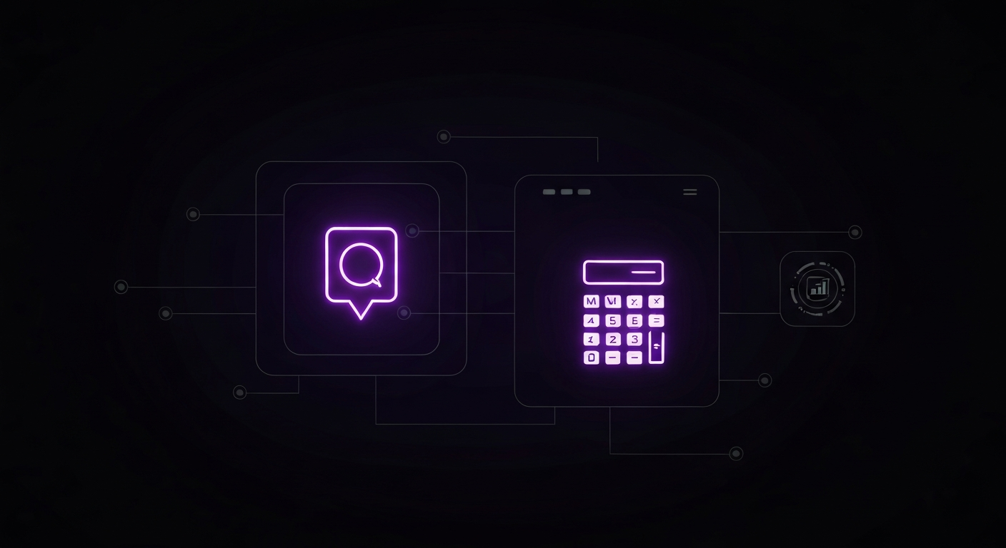
Launching your interactive landing page is not the end of the journey; it’s the beginning. Like any marketing asset, it must be measured, analyzed, and optimized over time. The interactive nature of these pages provides a wealth of data that can be used to refine your approach and continuously improve your Conversion Rate Optimization (CRO) efforts.
To understand performance, you need to track the right metrics. Go beyond standard vanity metrics and focus on data that reflects true engagement and business impact.
Quantitative data tells you *what* is happening, while qualitative tools help you understand *why*. Heatmaps (from tools like Hotjar or Crazy Egg) are visual representations of where users click, move, and scroll on your page. They can reveal if users are trying to click on non-clickable elements or are ignoring your primary CTA. Session recordings allow you to watch anonymized videos of real user sessions, providing invaluable insight into where they get stuck or confused. Funnel analytics can pinpoint the exact step in your quiz or calculator where users are abandoning the process.
Never assume your first version is the best one. Continuous A/B testing is the key to incremental improvements. You can test almost any part of your interactive landing page:
To get clear results, test one variable at a time to ensure you can attribute any change in performance to that specific element.
Optimization is a cycle. Use the data from your analytics, heatmaps, and A/B tests to form a hypothesis (e.g., “We believe that reducing the number of questions from 10 to 7 will increase the quiz completion rate”). Then, create a new version of your page to test that hypothesis. Measure the results, learn from them, and repeat the process. This iterative, data-driven approach is how you turn a good interactive landing page into a great one that consistently delivers results.

While interactive landing pages offer immense potential, they also present unique challenges. Being aware of these common pitfalls can help you avoid costly mistakes and ensure your page delivers a positive User Experience (UX) that drives conversions.
The temptation with interactive tools is to use every feature available. However, complexity is the enemy of conversion. A quiz with 20 questions, complex branching logic, and multiple animations might seem impressive, but it can overwhelm and frustrate the user. The best interactive experiences are simple, focused, and intuitive. Every step should have a clear purpose. Aim for clarity and ease of use above all else. If a user has to think about how to use your tool, you’ve likely already lost them.
Interactive elements, with their scripts and images, can be heavier than static content. This can lead to slow page load times, which is a known conversion killer. Studies consistently show that even a one-second delay can cause a significant drop in conversions. Optimize your images, minify your code (CSS and JavaScript), and use a reliable hosting provider. Before you launch, test your page’s performance with tools like Google PageSpeed Insights. A fast, snappy interactive experience feels professional and respects the user’s time.
Your landing page should be usable by everyone, including people with disabilities who may use screen readers or other assistive technologies. This is not just a matter of compliance; it is a matter of good business and ethics. Ensure your page is navigable via a keyboard, all images have descriptive alt text, form fields are properly labeled, and there is sufficient color contrast. Failing to adhere to Web Content Accessibility Guidelines (WCAG) can alienate a significant portion of your potential audience and damage your brand’s reputation.
This is perhaps the most critical pitfall. Your headline and copy make a promise to the user: “Calculate your savings,” “Find your perfect product,” or “Discover your marketing score.” After the user has invested their time and provided their information, you must deliver on that promise. If the results are generic, unhelpful, or feel like a bait-and-switch, you will destroy any trust you have built. The payoff must be worth the effort. A detailed, personalized, and genuinely valuable result is what turns a visitor into a qualified lead and a brand advocate.

The evolution from static to interactive landing pages is just one step in a much larger trend toward deeply personalized digital experiences. As technology advances, the landing pages of the future will become even more intelligent, dynamic, and tailored to the individual user. Artificial Intelligence (AI) and machine learning are at the forefront of this transformation.
Imagine a landing page that doesn’t just offer one predefined experience, but dynamically assembles the most relevant questions and content in real-time based on a visitor’s firmographic data, browsing history, and on-page behavior. An ROI calculator could pre-populate fields based on the visitor’s industry and company size. A product quiz could change its questions on the fly as it learns about the user’s preferences, creating a truly conversational and adaptive journey.
This level of hyper-personalization, powered by AI, will move beyond simple rule-based logic to predictive modeling. Landing pages will anticipate a user’s needs before they are even expressed, presenting the perfect content and call-to-action at the perfect moment. The line between a landing page and a personal consultation will continue to blur, creating experiences that are not only highly converting but also genuinely helpful and memorable. The marketers who embrace this future of dynamic, intelligent, and user-centric design will be the ones who win the attention and loyalty of customers in the years to come.