


In today’s digital landscape, marketers are inundated with data from website analytics, social media, ad platforms, and CRM systems. Without a clear way to consolidate, visualize, and interpret this information, it remains just noise. A well-designed marketing dashboard transforms this data from an overwhelming flood into an indispensable tool for strategic decision-making. It is more than a collection of charts; it is a dynamic, visual narrative of your marketing performance that centralizes key metrics, provides at-a-glance insights, and empowers your team to shift from reactive problem-solving to proactive strategy optimization. This guide provides best practices for building and using marketing dashboards that drive real business growth.

The days of relying on gut feelings and disconnected spreadsheets are over. To succeed, modern marketing teams need access to timely, consolidated, and easily digestible information. A marketing dashboard provides the clarity and agility required to navigate complex challenges and capitalize on emerging opportunities. It bridges the gap between raw data and actionable intelligence, making it an essential asset for any data-driven team.
For years, spreadsheets were the default tool for tracking marketing data. While functional for basic analysis, they create significant problems as an organization scales. Data becomes siloed, trapped in different files owned by different people. Your Google Ads data is in one sheet, your social media metrics in another, and your website analytics in yet another. This fragmentation makes it nearly impossible to gain a holistic view of performance.
The consequences of siloed data are severe:
Marketing is a discipline that demands constant adaptation. A new competitor can emerge, a social media algorithm can change, or a paid ad campaign can suddenly underperform. Dashboards connected to live data sources provide the real-time feedback loop necessary for agile marketing. Instead of waiting for a month-end report to discover a problem, you can spot trends as they happen.
This immediacy allows you to pivot quickly. Is a campaign’s cost-per-acquisition (CPA) skyrocketing? You can pause it and reallocate the budget within hours, not weeks. Is a new blog post driving a surge in organic traffic? You can double down on promoting it across other channels to maximize its impact. Real-time insights empower marketers to optimize performance continuously, maximizing return on investment (ROI) and minimizing wasted spend.
One of the most powerful functions of a marketing dashboard is its ability to create alignment. When everyone from the CMO to the marketing intern is looking at the same Key Performance Indicators (KPIs), conversations shift from debating whose data is correct to strategizing on how to improve the numbers. A shared dashboard becomes the central hub for performance, establishing a common language and a unified understanding of what success looks like.
This alignment fosters a culture of accountability and collaboration. Channel managers can see how their individual efforts contribute to larger company goals. The SEO team understands how their work impacts lead generation, and the content team sees which topics are driving the most valuable traffic. By making performance data accessible, dashboards break down internal silos and unite the entire team around a shared mission: driving measurable business results.

Not all dashboards are created equal. An effective dashboard is a carefully crafted tool designed for a specific purpose and audience. It balances a high-level overview with the ability to drill down into details, presenting complex information in a simple, intuitive format. Understanding its core components is the first step toward building a dashboard that informs rather than overwhelms.
The terms “dashboard” and “report” are often used interchangeably, but they serve distinct purposes. A dashboard is a monitoring tool for quick, at-a-glance insights, while a report is an analytical tool for deep, periodic analysis. Grasping this difference is key to creating effective data visualizations.
| Feature | Marketing Dashboard | Marketing Report |
|---|---|---|
| Purpose | To monitor performance at a glance and spot trends or issues quickly. | To provide a deep, comprehensive analysis of performance over a specific period. |
| Format | Dynamic, interactive, and highly visual. Often a single screen. | Static, detailed, and often text-heavy. Typically a multi-page document (e.g., PDF, slide deck). |
| Data Frequency | Real-time or near real-time (updated daily or hourly). | Periodic (e.g., weekly, monthly, quarterly). A snapshot in time. |
| Audience Interaction | High. Users can filter, drill down, and change date ranges. | Low. The reader consumes the information as presented. |
| Key Question Answered | “What is happening right now?” | “What happened over the last month and why?” |
An effective dashboard is built on three fundamental pillars:
A great dashboard guides the user toward insight and action. The best dashboards share several key characteristics:

Before connecting a single data source, you must answer the most important question: “What are we trying to achieve?” A dashboard without clear goals is merely a collection of data points, not a strategic tool. The foundation of any effective marketing dashboard is a well-defined set of goals and the Key Performance Indicators (KPIs) that measure progress toward them. This step ensures that your dashboard is focused, relevant, and directly tied to business value.
To ensure your objectives are clear and trackable, use the SMART framework. This methodology helps transform vague aspirations into concrete targets that can be measured on a dashboard.
A SMART marketing goal would be: “Increase marketing qualified leads (MQLs) from our organic search channel by 20% over the next fiscal quarter (Q3).” This goal is specific, measurable, achievable, relevant, and time-bound.
Once you have your goals, select KPIs that track your progress. It’s crucial to include a mix of both lagging and leading indicators.
An effective dashboard includes both. Lagging indicators show the ultimate business impact for executives, while leading indicators provide tactical insights for the marketing team to optimize daily activities.
The customer journey is not a single event, and your dashboard should reflect that. Structuring KPIs around the marketing funnel provides a comprehensive view of your entire marketing engine, helping you identify bottlenecks and opportunities at each stage.
| Funnel Stage | Objective | Example KPIs |
|---|---|---|
| Awareness | Introduce your brand to a new audience. |
|
| Consideration | Engage prospects and encourage them to learn more. |
|
| Conversion | Turn interested prospects into customers or leads. |
|
| Loyalty & Advocacy | Retain existing customers and turn them into promoters. |
|

With your goals and KPIs defined, the next step is to gather your data. An effective dashboard brings together disparate data streams into a single, unified view. This requires identifying your key data sources and establishing reliable connections to pull that information into your dashboard platform. This technical foundation is critical for ensuring your dashboard is accurate, comprehensive, and up-to-date.
Modern marketing campaigns span numerous channels, each generating its own data. Your dashboard needs to consolidate these silos. Common data sources include:
How does data get from these platforms into your dashboard? The process relies on APIs and connectors.
For most marketers, the native connectors within their chosen dashboard platform are sufficient. However, as data needs become more complex, you might require specialized tools.

Once you have a strategy and have identified your data sources, it’s time to select the platform where your dashboard will live. The market is filled with Business Intelligence (BI) and data visualization tools, each with its own strengths and price points. Choosing the right one depends on your budget, technical expertise, and integration needs. A thoughtful decision at this stage will save significant time and frustration later.
Dashboard platforms generally fall into two categories: free tools with robust functionality and paid enterprise-grade platforms with advanced capabilities. Google Looker Studio is the most popular free option, while Tableau and Microsoft Power BI lead the paid market.
| Feature | Google Looker Studio (Free) | Tableau / Microsoft Power BI (Paid) |
|---|---|---|
| Cost | Completely free. | Subscription-based, often per user, per month. Can become costly for large teams. |
| Ease of Use | Relatively intuitive, especially for those familiar with the Google ecosystem. Gentle learning curve. | Steeper learning curve. More complex interfaces but offer greater power and flexibility. |
| Data Connectors | Excellent native integration with Google products (GA4, Google Ads, BigQuery). A large library of third-party connectors is available. | Extensive libraries of native connectors for hundreds of data sources, including databases, cloud services, and enterprise applications. |
| Data Handling | Best for moderate data volumes. Can slow down with very large or complex data sets. | Engineered to handle massive data sets and complex data modeling with high performance. |
| Customization | Good customization options, but can be somewhat limited in advanced calculations and visual formatting. | Nearly limitless customization. Advanced features for creating calculated fields, complex data blending, and pixel-perfect designs. |
| Best For | Startups, small to medium-sized businesses, and marketing teams heavily invested in the Google Marketing Platform. | Large enterprises, data analytics teams, and organizations with complex data warehousing needs. |
When evaluating different platforms, consider these critical features:
Think about where your business will be in two to five years. Your chosen dashboard tool should be able to grow with you. Ask yourself:
While it might be tempting to start with the simplest free tool, consider its limitations. Migrating dashboards from one platform to another is a significant undertaking. Choosing a scalable solution from the outset can be a wise long-term investment.

Building a dashboard is not just about plugging data into charts; it’s about communication. The goal of data visualization is to present complex information in a way that is quickly understood, revealing the story hidden within the numbers. By following established design principles, you can create dashboards that are informative, compelling, and intuitive.
The type of chart you choose critically impacts how your data is interpreted. Using the wrong one can confuse your audience or lead to incorrect conclusions. Each chart type has a specific purpose.
| Chart Type | Best Used For | Example |
|---|---|---|
| Line Chart | Showing trends and changes over a continuous period of time. | Tracking website traffic by day over the last month. |
| Bar / Column Chart | Comparing distinct categories or values against each other. | Comparing conversion rates across different marketing channels. |
| Scorecard / KPI Card | Displaying a single, important metric for quick reference. | Showing total leads generated this quarter. |
| Pie / Donut Chart | Showing the percentage breakdown of a whole. Use sparingly, best for 2-4 categories. | Visualizing the percentage of traffic from each device type (desktop, mobile, tablet). |
| Table | Displaying precise values and detailed information across multiple dimensions. | A list of top-performing blog posts with metrics like sessions, engagement rate, and conversions. |
| Geographic Map | Visualizing data broken down by location (country, state, city). | Showing where your website visitors are located. |
A good dashboard layout guides the viewer’s eye through the information in a logical sequence. Since most Western audiences read from top-left to bottom-right, you should place your most important, high-level information in the top-left corner.
Color is a powerful tool in data visualization but should be used purposefully, not just for decoration.
Even with the best intentions, it’s easy to make mistakes that undermine your dashboard’s clarity.
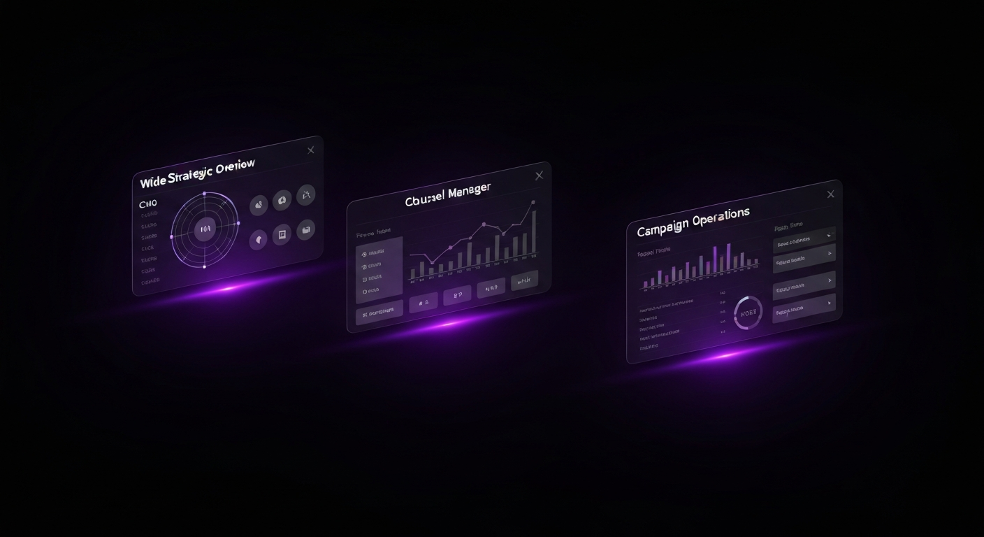
A one-size-fits-all dashboard rarely works. The information a CMO needs is vastly different from the data a social media manager requires. Effective dashboarding involves creating tailored views for different stakeholders, ensuring each user sees the most relevant metrics for their role.
This dashboard is designed for strategic oversight and answers the question, “How is marketing contributing to the bottom line?” It focuses on lagging indicators and business impact metrics, providing a quick summary of overall performance.
This type of dashboard is built for the practitioner who manages a specific marketing channel. It is more granular than an executive dashboard and includes a mix of leading and lagging indicators that help the manager optimize performance and diagnose problems.
This is the most granular type of dashboard, designed to monitor the performance of a specific, time-bound marketing campaign, such as a product launch or a holiday promotion. It is often used for daily monitoring to make real-time adjustments.

Creating an accurate dashboard is only half the battle. Its true value is realized when it becomes an integral part of your team’s workflow, consistently informing strategy and driving action. To foster a culture of data-driven decision-making, establish clear processes for reviewing, interpreting, and acting on the insights your dashboard provides.
Data should be reviewed with a regular cadence. Scheduled reviews ensure that performance is consistently monitored and that insights are discussed as a team. The frequency should match the dashboard’s purpose:
By embedding dashboard reviews into your existing meeting rhythms, you make data a central part of the conversation.
Looking at data is not the same as understanding it. The key is to move from simply observing a metric to deriving an insight. A useful framework for this is “What? So What? Now What?”
Encourage your team to repeatedly ask “why” to uncover the root causes behind performance changes.
The final, most critical step is to turn insights into concrete actions. An insight that doesn’t lead to a change in strategy is a wasted opportunity. Create a clear process for documenting and assigning action items that arise from dashboard reviews.
For example, if your dashboard reveals that leads from LinkedIn Ads have a much higher sales conversion rate than leads from other platforms, your action plan might be:
By consistently following this cycle of review, analysis, and action, your marketing dashboard evolves from a passive reporting tool into an active driver of strategic growth.

Many marketing dashboard projects fail to deliver on their promise. They end up being ignored, mistrusted, or so confusing that they create more problems than they solve. By being aware of common pitfalls, you can proactively steer your project toward success.
Vanity metrics are numbers that look impressive on the surface but don’t correlate with business success, such as social media followers or page views. While they might feel good to report, they don’t tell you if you’re acquiring customers or generating revenue.
How to Avoid It: Always tie your dashboard KPIs back to tangible business goals. Instead of tracking ‘likes,’ track ‘engagement rate’ or ‘website clicks from social.’ Instead of ‘page views,’ focus on ‘conversion rate’ or ‘leads generated.’ Every metric on your dashboard should help answer a question about business impact.
In an effort to be comprehensive, it’s easy to cram a dashboard with every metric imaginable. This results in a cluttered, overwhelming interface that is impossible to read. The purpose of a dashboard is to provide clarity, but an overcomplicated design causes confusion and user fatigue.
How to Avoid It: Be ruthless in your curation. Adhere to the principle of “less is more.” If a chart doesn’t contribute to the primary goal of the dashboard, remove it. Use whitespace effectively and create separate dashboards for different audiences rather than trying to build one master dashboard for everyone.
Your dashboard is only as reliable as the data feeding it—the “garbage in, garbage out” principle. If your website tracking is broken or your UTM parameters are inconsistent, your dashboard will display inaccurate information. Once stakeholders lose trust in the data, the dashboard becomes useless.
How to Avoid It: Before and after building your dashboard, conduct a data audit. Regularly check your tracking codes, establish strict guidelines for campaign tagging, and implement data hygiene processes in your CRM. Cross-reference key metrics between your dashboard and the source platforms to ensure they match. Data quality is an ongoing commitment.
Often, a dashboard is built by an analyst based on what they think is important, including complex charts that are not relevant or understandable to the intended audience. If the dashboard doesn’t answer the user’s specific questions in a language they understand, it will not be adopted.
How to Avoid It: Start the design process by interviewing the end-users. Ask them: What are your primary goals? What decisions do you need to make? What questions do you struggle to answer? Build the dashboard to solve their problems, not to showcase your technical skills. Involve them in the development process and gather feedback on early drafts.

Once you have mastered the fundamentals, you can explore advanced features that enhance your dashboard’s power. These techniques help you move from reactive analysis to proactive management, saving time and flagging critical issues before they become major problems.
Manually taking screenshots of your dashboard for weekly emails is inefficient. Most BI platforms have built-in features to automate this process. You can schedule regular exports of your dashboard as a PDF or image and have it automatically emailed to stakeholders.
This ensures that key decision-makers receive a consistent snapshot of performance at a predictable cadence (e.g., every Monday at 9 AM). It keeps marketing performance top-of-mind and frees up your team’s time for more strategic work.
Looking at past performance is essential, but looking toward the future drives strategy. Many dashboard tools allow you to add a simple trend line to time-series charts, which visually represents the general direction of your data and makes it easy to see your momentum.
Some platforms, like Tableau or Power BI, offer more advanced, built-in forecasting models. With a few clicks, you can project future performance based on historical data. While not a perfect prediction, this feature is useful for setting realistic goals and identifying potential gaps between your forecasted trajectory and your targets.
You cannot monitor your dashboard 24/7, but critical performance changes can happen at any time. Custom alerts turn your dashboard into a proactive monitoring system. You can set up rules that trigger an automatic notification (via email or Slack) when a specific condition is met.
Examples of useful alerts include:
By setting up these automated watchdogs, you can manage by exception and focus your attention where it’s needed most.

The most important thing is to include Key Performance Indicators (KPIs) that directly align with your specific business goals. A dashboard without goal-oriented KPIs is just a collection of data, not a tool for decision-making.
The update frequency depends on the metrics and the audience. For operational dashboards tracking daily campaigns, real-time or daily updates are best. For strategic executive dashboards, weekly or monthly updates are often sufficient to track long-term trends.
A dashboard is a dynamic, visual tool for monitoring performance at a glance, often in real-time, designed for quick insights. A report is a static document that provides a detailed, comprehensive analysis of performance over a specific period (e.g., a monthly PDF).
Yes, you can build basic marketing dashboards in Excel or Google Sheets. However, they often require manual updates and lack the robust data integration and interactive visualization capabilities of dedicated BI platforms like Looker Studio or Tableau.
A good data visualization is clear, concise, and tells a story. It uses the appropriate chart type for the data, avoids clutter, uses color effectively to highlight key information, and provides context so the viewer can quickly understand the insight.
Ensure data accuracy by using reliable data connectors, regularly auditing your data sources (like tracking codes and CRM entries), establishing clear data definitions, and cross-referencing metrics across different platforms to spot discrepancies.