


In the digital landscape, where speed and user experience reign supreme, images are a double-edged sword. They can captivate an audience and make content more engaging, but if not handled correctly, they can become the single largest bottleneck to your website’s performance. Large images drag down page load times, frustrate users, and ultimately harm your search engine rankings. Mastering image optimization is no longer an optional tweak; it is a fundamental component of any successful technical SEO strategy.
This guide provides a technical dive into every facet of image optimization, from file formats and compression to advanced delivery techniques like lazy loading and CDNs. Whether you’re a developer shaving milliseconds off load times or an SEO professional aiming to dominate visual search, you’ll learn how to turn images from a performance liability into a powerful asset. By the end, you will understand how to deliver visually rich experiences that satisfy users and signal quality to search engines.

Image optimization is more than a housekeeping task; it’s a strategic imperative at the intersection of technical SEO, user experience, and content strategy. Because Google prioritizes page experience, the way you deliver images directly impacts search visibility. Unoptimized images are a primary cause of slow websites, leading to negative effects that search algorithms detect and penalize. Effective optimization is not just about making files smaller—it’s about improving core performance metrics, enhancing user engagement, and unlocking new traffic through visual search.
Page load speed is a confirmed ranking factor for Google, and images are frequently the heaviest elements on a webpage. According to the HTTP Archive, images make up, on average, over 50% of a total webpage’s weight. When a user requests a page, their browser must download every resource, and large image files can dramatically increase this download time. This directly affects key performance metrics, most notably the Largest Contentful Paint (LCP), one of Google’s three Core Web Vitals. LCP measures the time it takes for the largest image or text block to become visible. A slow LCP, often caused by a large, unoptimized hero image, creates the perception of a slow website and results in a poor PageSpeed Insights score.
Search engines are increasingly sophisticated in their ability to measure user satisfaction. Metrics like bounce rate and time on page are indirect signals of a page’s quality and relevance. A slow-loading page creates a poor user experience from the very first interaction. Studies consistently show that as page load time increases, the probability of a user bouncing (leaving the site) increases dramatically. Google’s algorithms interpret this behavior as a sign that the page did not meet the user’s needs. By optimizing images to improve speed, you directly enhance the user experience, encouraging visitors to stay longer and sending positive signals to search engines about your site’s quality.
The way users search is evolving. Google Images is one of the world’s largest search engines, and the rise of tools like Google Lens is pushing visual search to the forefront. Optimizing your images isn’t just about page performance; it’s about making your visual content discoverable. When you provide descriptive file names, well-written alt text, and relevant structured data, you give Google’s crawlers the context they need to understand what an image is about. This allows your images to rank for relevant queries in Google Images, driving a significant stream of targeted traffic. A well-optimized image can appear in standard search results, image packs, and Google Discover, creating multiple new entry points for users to find your content.

The foundation of effective image optimization is selecting the appropriate file format. Each format has unique characteristics; choosing the wrong one can lead to unnecessarily large files or a loss of essential features like transparency. The goal is to find the format that provides the best balance between image quality and file size for a specific use case. Modern formats range from established standards like JPEG and PNG to next-generation options like WebP and AVIF, which offer superior compression. Understanding their technical differences is the first and most crucial step toward a faster website.
JPEG (Joint Photographic Experts Group) is the most common image format on the web. It uses lossy compression, which is incredibly effective at reducing the file size of images with millions of colors and complex details, such as photographs. When you save a JPEG, you can choose the level of compression, allowing you to strike a balance between file size and visual quality. While it excels with photographic content, JPEG does not support transparency, and its compression algorithm can create noticeable artifacts, especially around sharp edges or text if compressed too aggressively.
PNG (Portable Network Graphics) is the format of choice for images that require transparency, such as logos, icons, and graphics that need to be overlaid on different backgrounds. It uses lossless compression, meaning it reduces file size without discarding any image data, thus preserving the original quality. This makes it ideal for graphics with sharp lines, solid colors, and text, where artifacts from JPEG compression would be highly visible. The trade-off is that for photographic images, PNG files are significantly larger than their JPEG counterparts, making them unsuitable for that purpose.
Developed by Google, WebP is a modern image format designed for the web. Its primary advantage is its superior compression algorithm, which can produce files that are, on average, 25-35% smaller than equivalent JPEGs and PNGs with no perceptible loss in quality. WebP is incredibly versatile, supporting both lossy and lossless compression, as well as transparency and animation. With near-universal support across all major modern browsers, WebP has become the recommended format for most web use cases, offering both high quality and small file sizes.
AVIF (AV1 Image File Format) is an even newer format that often provides better compression than WebP, resulting in smaller file sizes at the same quality level. While its browser support is growing rapidly, it is not yet as universal as WebP, so it should be used with fallbacks. In contrast, SVG (Scalable Vector Graphics) is fundamentally different. It is a vector format that uses XML code to describe shapes, lines, and colors rather than a grid of pixels. This makes SVGs resolution-independent; they can be scaled to any size without any loss of quality. This quality, combined with their typically tiny file sizes, makes them the perfect choice for logos, icons, and simple illustrations.
| Feature | JPEG | PNG | WebP | AVIF | SVG |
|---|---|---|---|---|---|
| Best For | Photographs, complex images | Logos, icons, graphics with transparency | All-purpose web images | High-quality, low-size images | Logos, icons, scalable graphics |
| Compression | Lossy | Lossless | Lossy & Lossless | Lossy & Lossless | N/A (Vector) |
| Transparency | No | Yes | Yes | Yes | Yes |
| File Size | Good for photos | Large for photos, good for graphics | Excellent (Smaller than JPEG/PNG) | Best (Smaller than WebP) | Excellent (Typically smallest) |
| Browser Support | Universal | Universal | Excellent (97%+) | Very Good (92%+) | Universal |
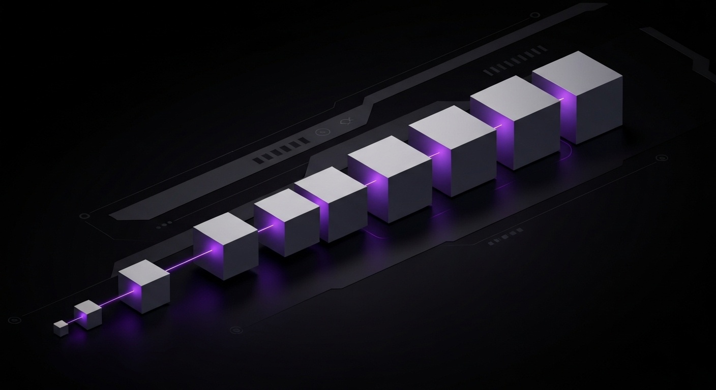
After choosing the right file format, the next critical step is image compression. Compression is the process of applying algorithms to reduce an image’s file size, which directly translates to faster download times and improved page speed. The two primary methods of compression are lossy and lossless, and understanding the distinction is key to applying the right technique for the right situation. The goal is to reduce the file size as much as possible without degrading the visual quality to a point that it negatively impacts the user experience.
Effective compression is a balancing act. Over-compressing an image can result in unpleasant visual artifacts, while under-compressing it leaves performance gains on the table. Fortunately, a wide array of powerful tools exists to help automate and perfect this process. By mastering these techniques and leveraging the right tools, you can ensure your images are lean, fast-loading, and visually appealing.
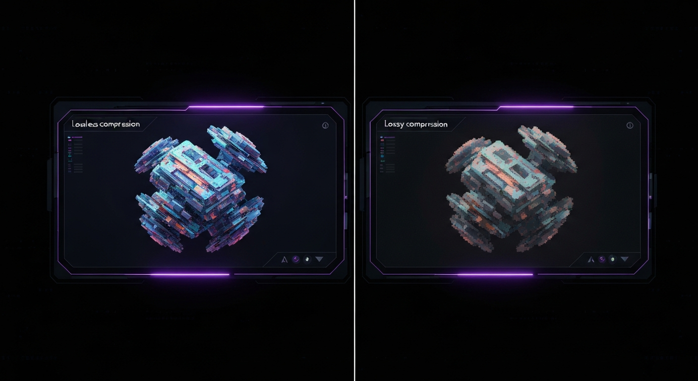
Lossy compression works by intelligently and permanently removing some data from the image file. The algorithms are designed to discard information that the human eye is least likely to notice, resulting in a dramatic reduction in file size. This is the compression method used by JPEGs and can also be applied to WebP and AVIF formats. The trade-off is a slight, and often imperceptible, reduction in image quality. For most photographic content on the web, a moderate level of lossy compression is the ideal choice, as the significant savings in file size far outweigh the minor loss of detail.
Lossless compression, as the name implies, reduces file size without discarding any image data. It works by identifying and eliminating inefficient or redundant information within the file’s code, such as unnecessary metadata. When the browser uncompresses the image, it is a perfect, pixel-for-pixel reconstruction of the original. This method is used by PNGs and is an option for WebP and AVIF. Lossless compression should be used when image quality is paramount and absolutely no detail can be sacrificed. This makes it the perfect choice for logos, technical diagrams, icons, and graphics containing crisp text, where even minor artifacts from lossy compression would be noticeable.
A variety of excellent tools can handle both lossy and lossless compression, catering to different workflows. For quick, manual compression, web-based tools are ideal. For automated, large-scale optimization, command-line tools or CMS plugins are more efficient.
In today’s multi-device world, users access websites on everything from small smartphones to massive desktop monitors. Serving the same large, high-resolution image to every device is a major performance anti-pattern. A 2000-pixel-wide image that looks great on a desktop is a massive waste of bandwidth for a mobile user on a 400-pixel-wide screen. The browser still has to download the entire large file, only to shrink it visually. This is why properly sizing and scaling images is a cornerstone of modern web performance and responsive design.
The solution is to serve different image sizes tailored to different screen resolutions and viewports. By providing the browser with multiple versions of an image using the `srcset` attribute, you allow it to intelligently select and download only the most appropriate file for the user’s current device. This technique ensures faster load times on smaller devices, saves user data, and contributes to a better overall user experience.
The most fundamental principle of image sizing is to avoid using images that are significantly larger than their rendered size on the screen. Before considering responsive techniques, you should resize your images to match their maximum display dimensions. For example, if a blog post’s content area is 800 pixels wide, there is no reason to upload a 3000-pixel-wide image for that post. Relying on CSS (`width: 100%;`) to shrink images is not an optimization; it’s a performance problem. The browser is forced to download the oversized file and then use processing power to scale it down. Always resize images to their intended dimensions as a first step.
The `srcset` attribute is a powerful HTML feature that allows you to define a set of image sources for the browser to choose from. Paired with the `sizes` attribute, it creates a robust system for delivering responsive images. The `srcset` attribute lists the available image files and their intrinsic widths (e.g., `image-500.jpg 500w`), while the `sizes` attribute tells the browser how wide the image will be displayed at different viewport sizes (e.g., `(max-width: 600px) 100vw, 50vw`). The browser then uses this information, along with its knowledge of the device’s screen density, to download the most efficient image from the set.
Here is a practical example:
<img src=\"image-800.jpg\" srcset=\"image-400.jpg 400w, image-800.jpg 800w, image-1200.jpg 1200w\" sizes=\"(max-width: 700px) 100vw, 800px\" alt=\"A detailed description of the image.\">
In this code, the browser knows that on viewports up to 700px wide, the image will take up the full viewport width (`100vw`), and on larger screens, it will be 800px wide. It will then select the smallest image from the `srcset` that is large enough to fill that space crisply.
To prevent content from jumping around as images load—a phenomenon known as Cumulative Layout Shift (CLS), a Core Web Vital—it’s crucial to specify an image’s dimensions. By including the `width` and `height` attributes in the `` tag, you allow the browser to reserve the correct amount of space in the layout before the image file has even started downloading. These attributes should reflect the image’s intrinsic aspect ratio. For example, for a 1200×800 image, you would use `width=\”1200\”` and `height=\”800\”`. CSS can then be used to make the image responsive (e.g., `width: 100%; height: auto;`) while still preventing layout shift. This simple practice is one of the easiest ways to improve your CLS score.

While technical optimizations address performance, the textual elements associated with images are critical for SEO and accessibility. Search engine crawlers cannot ‘see’ images as humans do; they rely on text-based metadata to understand an image’s content and context. Alt text, file names, titles, and captions provide this essential information, helping your images rank in visual search and making your content accessible to all users.
Crafting descriptive, relevant text for your images is a high-impact SEO activity. It bridges the gap between your visual content and the text-based world of search engines, creating a richer signal of your page’s topic and relevance. This not only boosts your potential for image-based traffic but also aligns with web accessibility best practices.
The `alt` attribute, commonly known as alt text, serves two primary functions. First and foremost, it is an accessibility feature. For users with visual impairments who use screen readers, the alt text is read aloud, describing the content of the image. An empty or non-descriptive alt text denies these users access to the information conveyed by the image. Second, alt text provides crucial context to search engines. A well-written alt text that accurately describes the image and naturally incorporates relevant keywords helps Google understand the image’s subject matter, increasing its chances of ranking in Google Images for those terms.
Before you upload an image, its file name offers an important SEO signal. Generic file names like `IMG_8432.jpg` or `screenshot-2.png` provide zero context to search engines. Instead, you should rename your image files to be descriptive and reflective of their content. Use lowercase letters and separate words with hyphens, as this is the standard and most easily parsed format for URLs. Where appropriate, include your primary keyword, but prioritize accurate description over keyword stuffing.
The image `title` attribute is distinct from alt text. It typically appears as a tooltip when a user hovers their mouse over the image. While it has a minimal direct impact on SEO compared to alt text, it can provide additional, non-essential information. A more powerful element is the image caption. Captions are visible text on the page, usually placed directly below the image. They are read by both users and search engines and provide excellent context. The text immediately surrounding an image, including captions, helps search engines further understand the image’s relevance to the overall page content.

Once your images are properly formatted, compressed, and sized, the next frontier of optimization lies in how you deliver them. Advanced delivery techniques focus on improving both perceived and actual performance by controlling *when* and *from where* images are loaded. Two of the most powerful techniques are lazy loading and the use of a Content Delivery Network (CDN). These methods address critical performance bottlenecks related to initial page load and network latency, respectively.
Implementing lazy loading ensures that the browser only downloads what’s immediately necessary, making the initial page view appear much faster. A CDN, on the other hand, closes the physical distance between your server and your users, dramatically reducing the time it takes to transfer image files across the globe. Together, they form a powerful combination for delivering a world-class user experience.
Lazy loading is a technique that defers the loading of off-screen images until the user scrolls and they are about to enter the viewport. This is incredibly effective for long pages with many images, such as blog posts or product galleries. By not loading images \”below the fold\” initially, you significantly reduce the number of requests and the amount of data needed for the initial page render. This leads to a much faster LCP and a better PageSpeed score. Historically, this required JavaScript libraries, but modern browsers now support native lazy loading with a simple HTML attribute: `loading=\”lazy\”`.
Implementation is as simple as adding the attribute to your `` tag:
<img src=\"heavy-image.jpg\" loading=\"lazy\" width=\"800\" height=\"600\" alt=\"An image that will be lazy-loaded.\">
It’s important to avoid applying `loading=\”lazy\”` to images that are visible in the initial viewport (e.g., a hero image), as this can delay the LCP. For all other images, it’s a highly recommended, low-effort, high-impact optimization.
A Content Delivery Network (CDN) is a globally distributed network of servers that caches your website’s static assets, such as images, CSS, and JavaScript. When a user visits your site, the CDN serves these assets from a server that is geographically closest to them, rather than from your single origin server. This reduction in physical distance significantly decreases network latency—the time it takes for data to travel between the user and the server. For a global audience, a CDN can be the single most effective way to speed up image delivery, ensuring that users in Tokyo have a similarly fast experience to users in New York.
Many excellent CDN providers are available, each with different features and pricing models. Some of the most popular choices include:
Many modern CDNs also offer advanced, on-the-fly image optimization services, which can automatically resize, compress, and convert images to next-gen formats like WebP, further simplifying your optimization workflow.

Structured data, also known as Schema Markup, is a standardized vocabulary of code that you can add to your website’s HTML to help search engines better understand the context of your content. While search engines are getting smarter, they still benefit from explicit clues about what your page is about. When you apply structured data to pages containing images, you can make those images eligible for rich results and more prominent placement in Google’s search results, including Google Images.
By marking up your images within the context of the content they belong to—such as a product, a recipe, or an article—you provide a much richer signal to Google. This can lead to your images appearing with additional information, like product prices or recipe ratings, making them more compelling and increasing the likelihood of a click-through.
The core schema for an image is `ImageObject`. This type allows you to provide specific details about an image, such as its URL, height, width, and a caption. While you can mark up a standalone image, the real power of image schema comes from nesting it within a more specific content type. For example, the `image` property is available in dozens of other schema types, allowing you to associate an image directly with the entity it represents.
The most common and effective way to use image schema is by embedding it within other schema types. This gives Google the full context.
Here is a simplified JSON-LD example for an `Article` with an embedded `ImageObject`:
<script type=\"application/ld+json\">{ \"@context\": \"https://schema.org\", \"@type\": \"Article\", \"headline\": \"A Guide to Image Optimization\", \"image\": { \"@type\": \"ImageObject\", \"url\": \"https://example.com/images/image-optimization.jpg\", \"width\": 1200, \"height\": 800 }}</script>
Implementation errors can prevent your structured data from being recognized by search engines. It is essential to validate your code before and after deploying it. Google provides two key tools for this:
Regularly using these tools ensures your markup is correct and eligible for the enhanced visibility you’re aiming for.

While Google’s crawlers are excellent at discovering content by following links, they can sometimes miss images, especially those loaded via JavaScript. An image sitemap is an XML file that provides an explicit list of all the important images on your site, giving you a direct way to tell Google about your visual content and ensure it gets indexed.
Creating and submitting an image sitemap is a best practice for any site where visual content is a key component. It helps guarantee the discovery of your images and allows you to provide additional metadata, such as captions and titles, directly within the sitemap itself. This can improve the speed and thoroughness of Google’s image indexing process.
An image sitemap is an extension of a standard XML sitemap. For each page URL in your sitemap, you can add specific tags to list the images associated with that page. This is particularly useful for:
If images are a critical part of your business—for example, on an e-commerce site, a photography portfolio, or a recipe blog—an image sitemap is a non-negotiable part of your technical SEO toolkit.
There are several ways to generate an image sitemap, depending on your technical comfort level and website platform.
Here is a basic example of an entry in an image sitemap:
<url> <loc>https://example.com/page.html</loc> <image:image> <image:loc>https://example.com/images/photo.jpg</image:loc> <image:caption>A descriptive caption for the photo.</image:caption> </image:image></url>
Once you have your image sitemap generated and uploaded to your server, the final step is to inform Google of its location. This is done through Google Search Console (GSC). The process is straightforward:
GSC will then process your sitemap and begin using it to aid in the discovery and indexing of your images. You can check the status in the Sitemaps report to ensure it was processed successfully.

Manually optimizing every single image for a large website is inefficient and prone to human error. To ensure consistency and save valuable time, it’s essential to automate the image optimization process. By integrating optimization into your development or content creation workflow, you can guarantee that every image is compressed, resized, and formatted correctly before it ever reaches the user. Automation turns best practices into standard procedure.
The right automation strategy depends on your technical stack and workflow. Developers can leverage build tools and command-line interfaces, while users of content management systems like WordPress can rely on powerful plugins. For maximum scalability and flexibility, cloud-based services offer a hands-off, on-the-fly processing solution.
For developers working with modern front-end build processes, tools like Webpack, Gulp, or Grunt can be configured to handle image optimization automatically. Using plugins like `image-webpack-loader` or `gulp-imagemin`, you can create a pipeline that runs every time you build your project. This pipeline can:
This approach ensures that all images deployed to production are fully optimized without any manual intervention required from the developer.
For the millions of websites built on WordPress, plugins are the easiest way to automate image optimization. These tools typically work by hooking into the WordPress media library. When you upload a new image, the plugin automatically processes it in the background. Popular and highly-regarded plugins include:
These plugins make professional-grade image optimization accessible to everyone, regardless of their technical expertise.
For ultimate power and scalability, cloud-based image management and processing services offer a comprehensive solution. Services like Cloudinary, Imgix, and Akamai Image & Video Manager work by having you upload a single, high-resolution master image to their servers. Then, by simply manipulating parameters in the image URL, you can request a version of that image that is perfectly resized, cropped, compressed, and formatted on the fly. For example, you can request a 400px wide, 80% quality WebP version of an image just by changing the URL. This approach offloads all the processing from your server, simplifies your workflow, and provides powerful features for dynamic image manipulation.

Optimization without measurement is guesswork. To understand the true value of your image optimization efforts and justify the resources invested, you must track their impact on performance and SEO. By using the right tools, you can quantify improvements in page speed, monitor user experience metrics, and directly attribute organic traffic gains to your enhanced visual content. This data-driven approach allows you to refine your strategy and demonstrate the tangible benefits of technical SEO.
Key areas to monitor include core performance metrics identified by Google, the health of your Core Web Vitals, and the traffic your site receives from image-based search. Combining data from these sources provides a holistic view of how your optimizations are influencing both search engine crawlers and real users.
Google PageSpeed Insights (PSI) is an essential tool for diagnosing performance issues. Before and after implementing your image optimizations, run your key pages through PSI. Pay close attention to the ‘Opportunities’ section, which often directly calls out image-related problems. Look for improvements in recommendations like:
Also, monitor your overall Performance Score and the individual metric scores (like LCP and Speed Index) to see a quantitative improvement.
Core Web Vitals are a set of user-centric performance metrics that Google uses as a ranking signal. Image optimization directly impacts two of them:
You can monitor your site’s Core Web Vitals performance over time using the dedicated report in Google Search Console, which provides data from real users via the Chrome User Experience Report (CrUX).
Ultimately, a key goal of image SEO is to drive more traffic. You can measure this directly in Google Search Console. In the ‘Performance’ report, you can change the ‘Search type’ filter from ‘Web’ to ‘Image’. This will show you the clicks, impressions, and average position for your images in Google Images search results. A steady increase in this traffic after implementing optimizations like descriptive alt text and image sitemaps is a clear sign of success. In Google Analytics, you can also analyze referral traffic from domains like `images.google.com` to see how users from image search are behaving on your site.

Even with the best intentions, it’s easy to make mistakes that undermine your image optimization efforts. Being aware of these common pitfalls can help you avoid them and ensure your strategy is as effective as possible. These errors often stem from overlooking simple steps or misunderstanding the core principles of performance and accessibility. By double-checking your work against this list, you can catch and correct issues before they impact your users and your search rankings.

Mastering image optimization involves many moving parts. To ensure you’ve covered all your bases, use this comprehensive checklist as a guide for every image you add to your website. Following these steps systematically will lead to faster load times, better user experience, improved accessibility, and greater visibility in search results. Think of this as your final pre-flight check before publishing content.