









Usability Testing for CRO: A Step-by-Step Tutorial for Identifying Conversion Barriers
In the competitive world of digital marketing, driving traffic to your website is only half the battle. The real challenge is converting those visitors into customers. This is the core principle of Conversion Rate Optimization (CRO), a systematic process for increasing the percentage of website visitors who take a desired action. While analytics tools like Google Analytics can tell you *what* is happening on your site—where users drop off, which pages have high bounce rates—they can’t explain *why* users behave a certain way. Usability testing fills this critical gap. By observing real users as they interact with your website, you can uncover the hidden friction points, moments of confusion, and frustrating experiences that hinder conversions.
This comprehensive guide provides a step-by-step tutorial on how to leverage usability testing to identify and resolve conversion barriers. We will walk you through the entire process, from planning your first test and recruiting participants to analyzing findings and translating them into powerful, data-driven hypotheses for A/B testing. By the end of this article, you will have a clear framework for integrating usability testing into your CRO program, enabling you to move beyond guesswork and start making changes that genuinely improve the user experience and, ultimately, your bottom line.
What is Usability Testing and Why is it Crucial for CRO?

Before diving into the step-by-step process, it’s essential to understand the fundamentals of usability testing and its symbiotic relationship with Conversion Rate Optimization (CRO). At its core, usability testing is a research method that helps you evaluate how easy your website or product is to use. It involves watching real people attempt to accomplish specific tasks on your site and observing where they struggle. This direct observation is the key to unlocking insights that quantitative data alone cannot provide.
Defining Usability Testing in the Context of CRO
In the context of CRO, usability testing is not just about discovering if users *can* use your site; it’s about understanding the quality of their experience. A user might eventually figure out how to complete a purchase, but if the process was confusing, frustrating, or created a sense of distrust, they are far less likely to return or recommend your brand. Usability testing for CRO focuses specifically on tasks critical to conversion, such as finding a product, understanding a value proposition, completing a lead form, or navigating the checkout process. It aims to identify any friction, hesitation, or confusion—the so-called ‘conversion killers’—that prevent a smooth journey through your conversion funnel.
The Direct Link Between User Experience (UX) and Conversion Rates
User Experience (UX) and conversion rates are intrinsically linked. A positive UX builds trust, creates clarity, and makes it effortless for users to achieve their goals, which directly translates to higher conversion rates. Conversely, a poor UX—characterized by confusing navigation, unclear calls-to-action (CTAs), or a difficult checkout process—creates friction and anxiety, causing users to abandon your site. Imagine a user trying to buy a product on a mobile site where the ‘Add to Cart’ button is too small to tap accurately. After several failed attempts, they will likely give up and go to a competitor. This is a classic usability issue with a direct, negative impact on conversions. By improving usability, you are directly improving the user’s ability and motivation to convert.
Moving Beyond Analytics: The ‘Why’ Behind User Behavior
Website analytics are powerful for identifying problem areas. For instance, Google Analytics might show a 70% drop-off rate on your checkout page. This tells you *what* the problem is and *where* it’s happening, but it offers no clues as to *why* users are leaving. Are they surprised by shipping costs? Is the form asking for too much information? Is a required field not working correctly? This is the critical gap that usability testing fills. By watching a handful of users attempt to complete the checkout, you might hear them say, “I don’t want to create an account; I just want to check out as a guest,” or see them struggle to find the credit card input field. These qualitative insights reveal the ‘why’ behind the quantitative data, giving you a clear direction for what to fix.
Step 1: Planning Your Usability Test for Maximum Impact

A successful usability test begins long before you sit down with a participant. Thorough planning is the most critical phase of the process, as it ensures your test will yield relevant, actionable insights that directly inform your CRO efforts. A test without clear goals is merely a collection of opinions; a well-planned test is a strategic tool for diagnosing conversion problems.
Defining Clear Objectives and Success Metrics
The first step is to ask: “What do we want to learn?” Your objectives should be specific, measurable, and tied to your business goals. Avoid vague goals like “See if the site is easy to use.” Instead, focus on specific parts of the conversion funnel. Effective objectives might include:
- Identify the top three friction points in our new user registration process.
- Determine if users can easily find and apply a discount code during checkout.
- Assess whether our new product page clearly communicates the value proposition and key features.
- Understand why users abandon carts after viewing the shipping options page.
Alongside these objectives, define what success looks like. Key Performance Indicators (KPIs) for usability tests often include metrics like Task Success Rate (the percentage of users who successfully complete a task), Time on Task (how long it takes), and error rates. For qualitative insights, a success metric might be identifying at least five actionable improvement opportunities.
Identifying Key User Personas for Testing
You cannot test with everyone, so it is crucial to test with people who represent your target audience. This is where user personas are invaluable. A user persona is a semi-fictional character based on market research and real data about your existing customers, detailing their demographics, goals, motivations, and pain points. For example, an e-commerce site selling high-end hiking gear might have a persona named “Adventure Alex,” a 30-year-old experienced hiker who values durable equipment and detailed product specs. When testing your site, you should recruit participants who match the key characteristics of “Adventure Alex,” not someone who has never been hiking. Testing with the wrong audience will yield misleading feedback that could lead your CRO strategy astray.
Crafting Realistic Task Scenarios for Users to Complete
Task scenarios are the specific instructions you give to participants during the test. The goal is to create realistic situations that prompt users to interact with your site naturally, rather than simply instructing them where to click. A good scenario provides context and a goal, but not the specific steps to achieve it.
| Poor Task Scenario | Good Task Scenario |
|---|---|
| “Click on ‘Products’, find the blue running shoe, and add it to your cart.” | “You’ve started training for a 10k race and need a new pair of running shoes. Find a pair you like in your size and add them to your cart.” |
| “Sign up for our newsletter.” | “You want to stay informed about upcoming sales and new product arrivals. Find a way to receive updates from the company.” |
The second example in each row is more effective because it mirrors a real-life motivation. It allows you to see if your site’s navigation, search functionality, and information architecture align with a user’s natural thought process. Well-crafted scenarios are the foundation for uncovering genuine usability issues within your conversion funnel.
Step 2: Recruiting the Right Participants for Your Test

Once you have a solid plan, the next step is to find people to participate in your test. The quality of your insights is directly dependent on the quality of your participants. Recruiting people who accurately represent your target user personas is paramount for gathering relevant and actionable feedback that will drive your CRO strategy forward.
How Many Participants Do You Really Need?
This is one of the most common questions in usability testing, and the answer depends on your goal. For qualitative testing—the kind most often used for CRO to uncover *why* problems exist—you need fewer participants than you might think. Seminal research by the Nielsen Norman Group famously found that testing with just **five users** will typically uncover about 85% of the usability problems in an interface. The reasoning is that you will quickly start seeing the same issues repeated by multiple participants. After the fifth user, you will encounter diminishing returns, where you observe more of the same problems rather than uncovering new ones. For this reason, it is often more effective to run multiple small tests with five users each throughout your design and development process rather than one large test.
Finding Your Target Audience: Recruitment Methods
There are several methods for finding participants, each with its own pros and cons. The best method depends on your budget, timeline, and how specific your target audience is.
- Usability Testing Platforms: Services like UserTesting, Lyssna (formerly UsabilityHub), and Maze have large panels of pre-screened testers. You can filter them by demographics, income, technical proficiency, and more. This is often the fastest and easiest way to recruit.
- Your Existing Customer List: Recruiting from your email list or customer database can provide high-quality participants who are already familiar with your brand. This is ideal for testing new features with existing users.
- Social Media and Online Communities: Posting recruitment calls on platforms like LinkedIn, Facebook, or Reddit can be effective, especially if you are targeting a niche community. Be sure to post in relevant groups where your target audience congregates.
- Website Intercepts: You can use tools like Hotjar or Ethnio to display a pop-up on your website inviting visitors to participate in a study. This allows you to recruit users who are actively engaged with your site in real-time.
Screening and Compensating Test Participants
Recruitment doesn’t end with finding potential participants; you must also screen them to ensure they fit your user persona. A screener is a short questionnaire designed to filter out unqualified candidates. For example, if you’re testing a new feature for your project management software, your screener might ask about their job role, company size, and the tools they currently use. This ensures you’re not getting feedback from a student when your target user is a senior project manager.
Finally, it’s crucial to compensate participants for their time and effort. Compensation shows that you value their input and encourages higher-quality feedback. The amount can vary based on the length and complexity of the test session, but a common range is $50-$150 per hour for a moderated session. Compensation is typically provided as a gift card or cash payment. Failing to compensate fairly can lead to no-shows and low-effort participation, undermining the value of your test.
Step 3: Choosing the Right Usability Testing Method
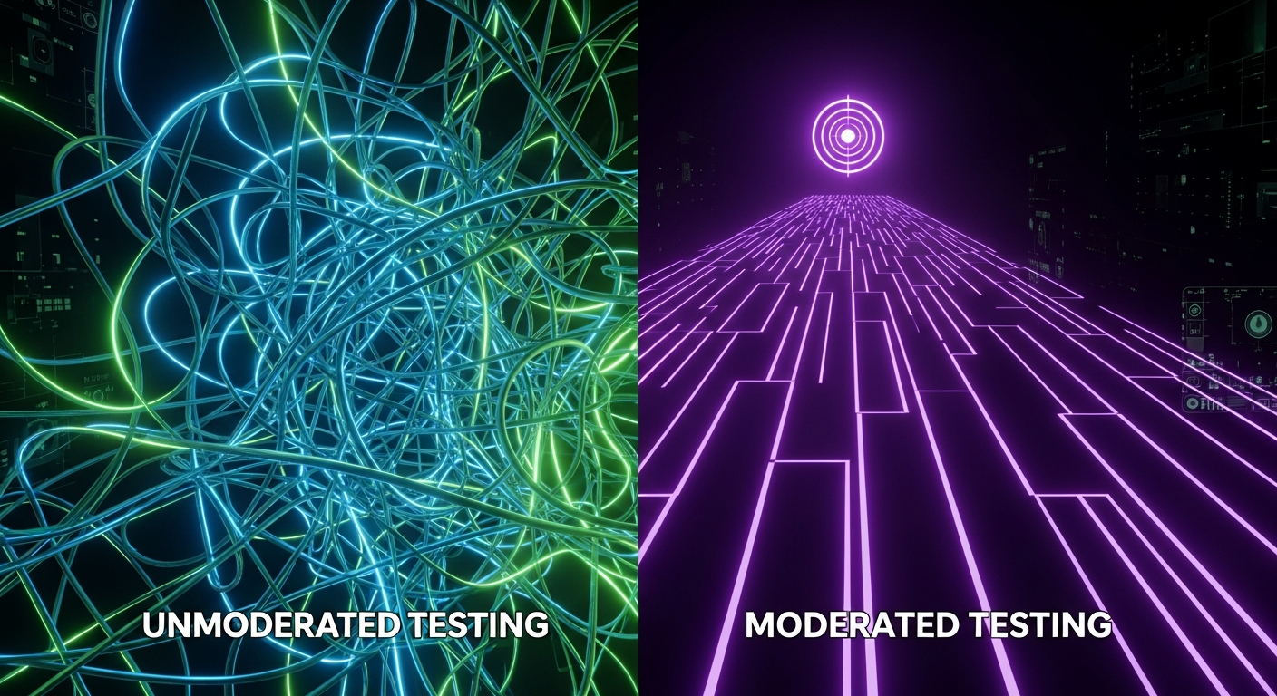
With your plan in place and recruitment underway, you need to select the testing methodology that best fits your objectives and resources. The choices you make here—between moderated and unmoderated, remote and in-person—will shape how you conduct the test and the type of data you collect. Each method has distinct advantages and is suited for different stages of the CRO process.
Moderated vs. Unmoderated Testing: Pros and Cons
The primary distinction in usability testing is whether a facilitator (moderator) is present during the session.
- Moderated Testing: A trained moderator guides the participant through the tasks in real-time, either in person or remotely via screen-sharing. The key advantage is the ability to ask follow-up questions like, “What did you expect to happen when you clicked that?” or “Tell me more about why that was confusing.” This dynamic interaction allows you to dig deeper into the user’s thought process and uncover the root causes of their behavior.
- Unmoderated Testing: Participants complete the tasks on their own time without a moderator present. They are given instructions through an online tool, which records their screen and, often, their voice as they think aloud. This method is typically faster, less expensive, and allows for a larger number of participants, making it great for gathering feedback quickly.
Here’s a breakdown to help you choose:
| Factor | Moderated Testing | Unmoderated Testing |
|---|---|---|
| Depth of Insight | High (can ask follow-up questions) | Lower (cannot probe deeper in real-time) |
| Cost | Higher (requires a skilled moderator’s time) | Lower (automated process) |
| Time to Results | Slower (scheduling and conducting sessions takes time) | Faster (can get results within hours) |
| Best For | Exploring complex tasks, understanding motivations, early-stage design feedback | Validating specific issues, testing simple flows, benchmarking against competitors |
Remote vs. In-Person Testing: Which is Better for CRO?
Another key decision is whether to conduct the test with the participant in the same physical location or remotely.
- In-Person Testing: This traditionally takes place in a usability lab where you can observe the user’s body language, facial expressions, and overall demeanor. It’s valuable for testing physical devices or when non-verbal cues are important. However, it is geographically limiting, more expensive, and logistically complex.
- Remote Testing: The participant is in their own environment (home or office) using their own device. This has become the default method for most digital product testing. It is cost-effective, allows you to recruit participants from anywhere in the world, and provides a more natural context of use. For most website and app-focused CRO efforts, remote testing is the more practical and scalable choice.
Qualitative vs. Quantitative Usability Testing
Finally, consider the type of data you need to collect.
- Qualitative Testing: This focuses on collecting insights, observations, and anecdotes. The goal is to understand the ‘why’ behind user actions. Think-aloud protocols, where users narrate their thoughts as they perform tasks, are a hallmark of this method. This is the primary type of testing used to identify conversion barriers.
- Quantitative Testing: This focuses on collecting numerical data and metrics. It answers questions of ‘how many’ and ‘how much.’ Examples include measuring task success rates, time on task, or user satisfaction scores through surveys like the System Usability Scale (SUS). This type of testing requires a much larger sample size to be statistically significant and is often used for benchmarking or comparing design variations.
For a robust CRO program, you will likely use a mix of these methods. You might start with a qualitative, moderated test to identify major friction points and later run a quantitative, unmoderated test to measure the impact of your redesign.
Step 4: Conducting the Test and Gathering Data

This is where the planning pays off. The test session itself is your opportunity to gather the raw data—user quotes, behaviors, and error patterns—that will form the basis of your CRO hypotheses. A well-conducted session is one where the participant feels comfortable, the technology works seamlessly, and the observers capture high-quality, unbiased notes.
Essential Tools and Software for Usability Testing
The right tools can streamline the entire process, from conducting sessions to analyzing data. Your choice of tool will largely depend on the testing method you selected.
- For Remote Moderated Testing: Standard video conferencing tools like Zoom, Google Meet, or Microsoft Teams are often sufficient. They allow for screen sharing, recording, and have features for observers to join silently. Specialized tools like Lookback offer added features like time-stamped notes and a dedicated observer view.
- For Unmoderated Testing: All-in-one platforms are the way to go. UserTesting, Maze, and Lyssna handle everything from participant recruitment and task delivery to data collection and analysis. They automatically record screens and audio, and many provide AI-powered analysis to help you synthesize results faster.
- For Note-Taking and Analysis: While a simple spreadsheet or document works, dedicated tools can be more efficient. Dovetail and Condens are popular research repositories that help you tag observations, create video clips, and identify patterns across multiple test sessions.
Best Practices for Moderating a Test Session
If you’re conducting a moderated test, the facilitator’s skill is crucial. The goal is to guide the session without influencing the participant’s behavior. Here are some key best practices:
- Build Rapport: Start the session with a few minutes of small talk to put the participant at ease. Reassure them that you’re testing the website, not them, and that there are no right or wrong answers. Emphasize that their honest feedback is the most helpful thing they can provide.
- Encourage Thinking Aloud: The most valuable insights come from hearing the user’s thought process. Constantly prompt them with phrases like, “What are you looking at now?” or “What are you trying to do here?”
- Use Open-Ended, Neutral Questions: Avoid leading questions that suggest a desired answer. Instead of asking, “Was that button easy to find?” (a yes/no question), ask, “How was the experience of looking for that button?”
- Embrace the Silence: When a user gets stuck or pauses, resist the urge to immediately jump in and help. Allowing for a few moments of silence often prompts them to verbalize their confusion, which is valuable data. Only provide assistance if they are truly stuck and becoming frustrated.
- Remain Neutral: Do not defend the design or explain how things are “supposed to work.” Your role is to be a neutral observer and listen to their experience, even if you disagree with their feedback.
Observing and Taking Notes Without Leading the User
For team members observing the session, the primary role is to listen and take detailed notes. Good note-taking goes beyond transcribing what the user says; it involves capturing a holistic view of their experience.
- Record Direct Quotes: Capture powerful, verbatim quotes, especially those that express confusion, frustration, or delight (e.g., “I have no idea what this icon means.”).
- Note Specific Behaviors: Document actions like repeatedly clicking on a non-clickable element, scrolling up and down the page looking for information, or hesitating before making a choice.
- Separate Observation from Interpretation: In your notes, clearly distinguish between what you observed (e.g., “User spent 45 seconds on the pricing page before clicking back”) and your interpretation of that behavior (e.g., “User seems confused by the pricing tiers.”). This keeps your data clean and reduces bias during the analysis phase.
By following these practices, you ensure that the data you collect is a rich and accurate representation of the user’s experience, setting you up for a successful analysis.
Step 5: Analyzing Findings to Uncover Conversion Barriers

After conducting your test sessions, you will be left with a wealth of raw data: recordings, transcripts, and notes. The analysis phase is where you transform this data into a clear, prioritized list of usability issues and, most importantly, understand the root causes behind them. This systematic synthesis is what turns observations into actionable insights for your CRO program.
Synthesizing Qualitative Feedback and Observations
The first step is to organize your qualitative data. A common and effective method is affinity mapping. This involves writing each distinct observation, quote, or pain point on a separate virtual (or physical) sticky note. Once you have all your notes, you and your team can start grouping them based on common themes or patterns. For example, you might find several notes like “Couldn’t find the return policy,” “Wasn’t sure about shipping costs,” and “Looked for a trust badge” that can all be grouped under a larger theme of “Trust and Transparency Issues During Checkout.” This bottom-up approach allows themes to emerge naturally from the data, rather than being imposed by preconceived notions. The goal is to move from a long list of individual problems to a more manageable set of core usability issues.
Analyzing Quantitative Metrics (e.g., Task Success Rate, Time on Task)
If you collected quantitative data, now is the time to analyze it. These metrics provide objective evidence to support your qualitative findings.
- Task Success Rate: This is the most basic usability metric. Calculate the percentage of participants who were able to complete each task successfully. A low success rate on a critical task, like adding an item to the cart, is a major red flag that demands immediate attention.
- Time on Task: Measure the average time it took users to complete each task. A longer-than-expected time can indicate an inefficient or confusing user flow. Compare this across different user segments if possible.
- Error Rate: Count how many errors users made while attempting a task. This could be anything from clicking the wrong link to entering data in an incorrect format. A high error rate points to a design that is not intuitive or forgiving.
- Satisfaction Scores: If you used a post-test survey like the System Usability Scale (SUS) or asked users to rate the difficulty of each task, you can calculate average scores to benchmark user satisfaction and perceived ease of use.
Combining these metrics with your qualitative themes creates a powerful narrative. For instance, you can state that “75% of users failed to complete the task of applying a coupon code (quantitative), and qualitative feedback reveals this was because the input field was easily missed and labeled unclearly (qualitative).”
Identifying Patterns and Root Causes of Usability Issues
The final and most critical part of analysis is to dig deeper and identify the root cause of the problems you’ve observed. A single usability issue can often be a symptom of a larger, underlying problem. For example, if users consistently struggle to find information about product specifications, the observation is “Users can’t find specs.” But the root cause might be poor information architecture, inconsistent terminology, or a visual design that de-emphasizes important details. Asking “Why?” multiple times can help you get to the core issue. Why couldn’t they find it? Because it was hidden in a tab. Why was it in a tab? Because the page design prioritizes large images over text. This deeper understanding is essential for developing effective solutions rather than just patching up surface-level symptoms.
Step 6: Translating Insights into Actionable CRO Hypotheses

The ultimate goal of usability testing in a CRO context is to drive change. The insights you have carefully gathered and analyzed are worthless if they remain locked in a report. This final step is about communicating your findings effectively, prioritizing what to fix, and formulating strong, testable hypotheses that will fuel your A/B testing program and lead to measurable conversion lifts.
Creating a Clear and Concise Usability Report
Your findings need to be shared with stakeholders—designers, developers, product managers, and executives—in a way that is easy to digest and compelling. A good usability report should be more than just a list of problems; it should tell a story about the user’s experience.
A typical report includes:
- Executive Summary: A one-page overview of the study’s goals, methods, and the top 3-5 most critical findings and recommendations. This is for stakeholders who may not have time to read the full report.
- Methodology: A brief description of who you tested with (personas), how many participants there were, and the tasks and methods you used.
- Key Findings: This is the core of the report. For each major usability issue, present the finding, provide evidence (quotes, video clips, quantitative data), and explain the impact on the user experience and your conversion goals. Using short video highlight reels can be incredibly powerful for building empathy and demonstrating the severity of an issue.
- Recommendations: For each finding, provide clear, actionable recommendations for how to solve the problem.
Prioritizing Fixes with Frameworks (e.g., P.I.E., I.C.E.)
You will likely uncover more issues than you can fix at once. Prioritization is key to ensuring your team focuses its efforts on the changes that will have the greatest impact. Frameworks can help you do this objectively:
- P.I.E. Framework: Rate each potential fix on a scale of 1-10 for three criteria:
- Potential: How much room for improvement is there on this page/flow?
- Importance: How valuable is the traffic to this page? (e.g., high-traffic or checkout pages are more important).
- Ease: How easy is it to implement the fix, technically?
- I.C.E. Framework: Similar to P.I.E., this framework scores fixes based on:
- Impact: If this works, what will the likely impact be on our key metric?
- Confidence: How confident are we that this change will have the desired impact? (Usability testing insights can greatly increase this score).
- Ease: How much development effort is required?
By scoring and ranking your list of potential fixes using one of these frameworks, you can create a data-informed roadmap for your optimization efforts.
Developing Strong, Testable Hypotheses for A/B Testing
The final step is to translate your prioritized recommendations into formal hypotheses for A/B testing. A strong hypothesis connects a proposed change to an expected outcome, supported by a rationale based on your usability findings.
A common hypothesis format is: “By [making a specific change], we expect [a specific outcome] for [a specific user segment] because [a specific reason from your research].”
Here’s an example:
- Observation from Usability Test: “Users expressed anxiety and hesitation on the payment page because there were no visible security seals or trust badges.”
- Prioritization: High potential, high importance (checkout page), low ease (easy to add images).
- Hypothesis: “By **adding a prominent trust badge and security seal logos near the ‘Complete Purchase’ CTA on the payment page**, we expect to **increase the checkout completion rate by 5%** because **our usability testing showed that users felt insecure and were looking for reassurance about the safety of their payment information**.”
This hypothesis is specific, measurable, and directly tied to a real user problem you observed. It transforms a vague idea (“add trust badges”) into a scientific test that can validate whether your proposed solution actually improves conversions.
Common Conversion Barriers Uncovered by Usability Testing

While every website is unique, usability testing often reveals recurring patterns of issues that act as significant barriers to conversion. By being aware of these common pitfalls, you can be more attuned to them during your own testing and analysis. Here are some of the most frequent conversion killers that usability tests bring to light.
Confusing Navigation and Information Architecture
If users can’t find what they’re looking for, they can’t convert. A common finding is that a website’s navigation labels are based on internal company jargon rather than language that customers actually use. For example, a company might label a category “Integrated Solutions” when users are simply searching for “Software for Small Business.” Usability testing quickly reveals this disconnect when users are asked to find a product and are observed struggling with the main menu, unable to predict what lies behind each link. Poorly organized site structure, or information architecture, can also hide critical pages like pricing, contact information, or FAQs, leading to frustration and site abandonment.
Unclear Value Proposition and Calls-to-Action (CTAs)
A website’s homepage and key landing pages must answer three questions for a visitor within seconds: Where am I? What can I do here? Why should I do it? Usability testing often uncovers a weak or unclear value proposition. Participants will land on a page and, when asked what the company does, give vague or incorrect answers. This confusion is a conversion killer. Similarly, weak Calls-to-Action (CTAs) are a frequent problem. Buttons with vague labels like “Learn More” or “Submit” don’t tell the user what will happen next. Testing might reveal users hesitating to click because they’re unsure if they’ll be taken to another page or be forced to sign up for something. Clear, benefit-oriented CTAs like “Get Your Free Demo” or “Create My Account” perform much better because they set clear expectations.
Friction in Forms and Checkout Processes
Forms are a necessary part of most conversion funnels, whether for lead generation or e-commerce checkout, but they are also a major source of friction. Usability testing is brilliant at exposing form-related issues. Common problems include asking for too much information (e.g., a phone number for a simple newsletter signup), unclear error messages that don’t explain how to fix a problem, and a lack of trust signals on payment pages. One of the most-cited conversion killers is forcing users to create an account before they can make a purchase. Watching users groan and abandon their cart when faced with a mandatory registration page provides powerful, undeniable evidence to advocate for a guest checkout option.
Mobile Responsiveness and Performance Issues
With a majority of web traffic coming from mobile devices, a poor mobile experience is no longer excusable. Usability testing on mobile phones frequently uncovers a host of conversion barriers. These can range from technical issues like slow page load times that cause users to lose patience, to design flaws like text that is too small to read, buttons that are too close together (the “fat finger” problem), or pop-ups that are impossible to close on a small screen. What looks great on a large desktop monitor can be a frustrating, unusable mess on a smartphone, and the only way to be sure is to watch real users interact with your site on their own mobile devices.
Integrating Usability Testing into Your Continuous CRO Program

The most successful companies view optimization not as a one-time project, but as an ongoing, iterative process. To truly maximize your conversion rates, usability testing must be woven into the fabric of your CRO program. It should become a continuous source of insight that fuels your experimentation and keeps your organization focused on the evolving needs of your users.
Making Usability Testing a Regular Practice, Not a One-Off Project
Instead of conducting a large, infrequent usability test every few years, aim to establish a regular research rhythm. This could mean running a small-scale test with five users every quarter to check the health of your core conversion funnels. It could also mean integrating rapid usability tests into your design and development sprints. Before launching a major new feature or a site redesign, conduct tests on prototypes to catch issues early when they are cheap and easy to fix. By making testing a regular habit, you create a continuous feedback loop that prevents major usability debt from accumulating and ensures your optimization efforts are always guided by fresh user insights.
Combining Usability Insights with Other Data Sources (Analytics, Heatmaps)
Usability testing is most powerful when it is not used in a silo. The best CRO programs synthesize insights from multiple data sources to get a complete picture of the user experience. This is often called a ‘data triad’:
- Analytics (e.g., Google Analytics): Tells you *what* is happening and at what scale. For example, “There is a 60% exit rate on the shipping selection page.”
- Behavioral Analytics (e.g., Heatmaps, Session Recordings): Shows you *where* on the page users are clicking, scrolling, and moving their mouse. For example, “Users are not scrolling far enough to see all shipping options.”
- Usability Testing: Explains *why* the behavior is occurring. For example, “Users assume the first shipping option shown is the only one available and abandon the checkout when they perceive the cost to be too high.”
By combining these sources, you can validate the qualitative insights from your usability test with quantitative data, leading to more confident and impactful optimization decisions.
Building a Culture of User-Centric Optimization
Finally, the impact of usability testing extends beyond the CRO team. It can be a catalyst for creating a more user-centric culture throughout your entire organization. Share your findings widely. Instead of just sending a report, present your findings in a company-wide meeting. Share a two-minute video highlight reel of users struggling with a key feature. These moments are incredibly effective at building empathy for the user among developers, marketers, and even executives. When everyone in the company starts thinking about problems from the user’s perspective, your optimization efforts become more aligned and effective. Usability testing stops being just a CRO tool and becomes a shared language for building better products and experiences.
Frequently Asked Questions

How much does usability testing cost?
The cost of usability testing varies widely based on the method, tools used, and participant compensation. Unmoderated remote testing can be relatively inexpensive, while in-person moderated tests require more resources. Costs can range from a few hundred to several thousand dollars.
How many users do I need for a usability test?
For qualitative usability testing, studies by the Nielsen Norman Group show that testing with just 5 users can uncover around 85% of the usability problems. For quantitative testing, you will need a much larger sample size to achieve statistical significance.
What’s the difference between usability testing and A/B testing?
Usability testing is a qualitative method used to identify ‘why’ users are having problems. A/B testing is a quantitative method used to validate which of two or more designs (‘A’ or ‘B’) performs better against a specific goal. Usability testing often provides the hypothesis for what to A/B test.
Can I conduct usability testing on my competitors’ websites?
Yes, conducting usability tests on competitor sites is a great way to understand their strengths and weaknesses. It can reveal industry conventions, user expectations, and opportunities to create a better experience on your own site.
What are some popular usability testing tools?
Popular tools for usability testing include UserTesting, Maze, Lookback, Hotjar, and Lyssna (formerly UsabilityHub). These platforms help with participant recruitment, test execution, and data analysis for both moderated and unmoderated studies.
How often should I conduct usability tests for CRO?
For an effective CRO program, usability testing should be a continuous process. It is ideal to conduct tests during the design phase of a new feature, before a major site redesign, and on a recurring basis (e.g., quarterly) to continually identify and address user friction points.